 Design
 Vue
Vue Flutter
Anatomy
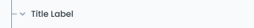
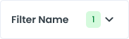
Label to indicate the action.
Containers that contain labels and icons that are also useful as click area identifier.
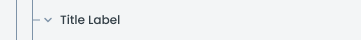
Label to indicate the action.
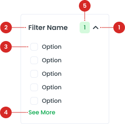
Displays interactive elements for filtering when expanded.
Provides the option to display additional filter choices if the list is too long.
Displays the count of selected items or active filters
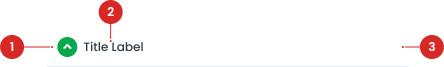
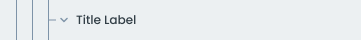
Label to indicate the action.
Containers that contain labels and icons that are also useful as click area identifier.
- -
- -
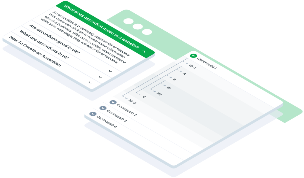
Variant on Accordion
To distinguish between UI activities of varying relevance, you can change the color of the primary button according to the specified state, using the colors that have been prepared in the color styles. utilize the following variations:


| VARIANT | USAGE RECOMMENDATION |
|---|---|
Heading | Focuses on displaying section headers. Ideal for summarizing the content that can be expanded, providing a clear overview of each section. |
Active | Highlights the currently active section that is expanded, drawing user attention to the content that is currently in view. |
Detail | Designed to display detailed information within each section, suitable for content-rich areas that require extensive explanation or data presentation. |
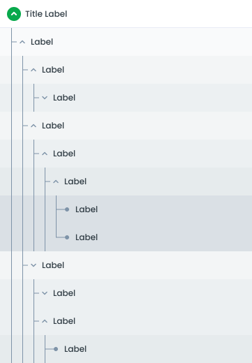
Variant on Tree Accordion
The Tree Accordion component is designed to present hierarchical data in a collapsible and expandable format, allowing users to navigate through nested levels of content. This component is ideal for displaying structured information, such as directories, categories, or any data that has a tree-like hierarchy.


| VARIANT | USAGE RECOMMENDATION |
|---|---|
Heading | Displays the main categories or top-level nodes, providing an overview of the hierarchical structure. |
Level 1 | Represents the first level of nodes or subcategories under the heading. Ideal for primary categorization. |
Level 2 | Represents the second level of nodes under Level 1, allowing further subdivision and detailed categorization. |
Level 3 | Represents the third level of nodes under Level 2, providing even deeper hierarchical organization. |
Level 4 | Represents the third level of nodes under Level 3, providing even deeper hierarchical organization.. |
Level 5 | Represents the third level of nodes under Level 4, providing even deeper hierarchical organization. |
Color Hierarchy on Tree Accordion
| COLOR | USAGE | VISUAL PURPOSE |
|---|---|---|
background-white | The Heading represents the top-level item in the accordion. It serves as the main entry point for the nested items. | The background-white ensures that the Heading stands out prominently as the primary section header. This color choice makes it immediately recognizable and visually distinct from the nested items below it. |
background-light | Level 1 items are the first level of nested items under the Heading. These items can be further expanded to reveal Level 2 items. | The background-light provides a subtle yet noticeable differentiation from the Heading. This helps users recognize that these items are part of a sub-level, indicating their hierarchical position below the Heading. |
LGrey100 | Level 2 items are nested under Level 1 items. These items can be further expanded to reveal Level 3 items. | The LGrey100 compared to Level 1 items creates a clear visual distinction, showing that these items belong to a deeper hierarchical level. This differentiation helps users understand the depth of the nested structure. |
LGrey150 | Level 3 items are nested under Level 2 items. These are the most detailed level of nested items in the hierarchy, providing the deepest level of information or options. | The LGrey150 provides a subtle yet noticeable differentiation from the Heading. This helps users recognize that these items are part of a sub-level, indicating their hierarchical position below the Heading. |
LGrey200 | Level 4 items are nested under Level 3 items. These are the most detailed level of nested items in the hierarchy, providing the deepest level of information or options. | The LGrey200 provides a subtle yet noticeable differentiation from the Heading. This helps users recognize that these items are part of a sub-level, indicating their hierarchical position below the Heading. |
LGrey300 | Level 5 items are nested under Level 4 items. These are the most detailed level of nested items in the hierarchy, providing the deepest level of information or options. | The LGrey300 provides a subtle yet noticeable differentiation from the Heading. This helps users recognize that these items are part of a sub-level, indicating their hierarchical position below the Heading. |
Variant Filter Accordion
The Filter Accordion component is designed to help users refine and narrow down search results or content lists by applying various filters. This component organizes filter options into expandable and collapsible sections, providing a clean and efficient way to manage multiple filtering criteria.

Guidelines for Filter Accordion
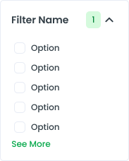
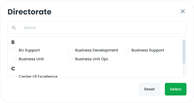
In certain filter components, only the first 5 options are displayed by default to maintain a clean and organized interface. Users have the ability to view additional options by clicking the "Show More" button to expand several option or using modal for many option.

- You can use these components by accessing the provided resource files.
- Preview animations are examples and may not suit Mobile Widgets. Press 'View Code' to access the Widgetbook Playground and see the Flutter widget displaying all created components and interactive.
Usage
Import this line to your file:
import 'package:buma_design_system/buma_design_system.dart';
Attributes
If there is a question mark ? in the Data Type, it means that the properties are optional.
| Properties | Data Type | Description |
|---|---|---|
| items | List<UIAccordionNode>? | Displays item of accordion with label and details. |
UINode
Representing a UI Node in an accordion structure
| Properties | Data Type | Description |
|---|---|---|
| title | String? | Represents the main text of the node |
| isExpanded | bool | Indicates whether the node is expanded or collapsed. |
| label | String? | Additional information for the node. |
| children | List<UINode>? | List of child nodes. |
| onTap | VoidCallback? | Callback triggered when the node is tapped. |
| isLastLevel1 | bool | Indicates if the node is the last in the first level. |
| isLastLevel2 | bool | Indicates if the node is the last in the second level. |
UIAccordionNode
The UIAccordionNode class, with title and detail properties of type String, extends the abstract class UINode, inheriting its properties and methods. However, UINode cannot be instantiated directly.
| Properties | Data Type | Description |
|---|---|---|
| title | String | Represents the main text of the node. |
| detail | String? | Additional information for the node. |
UIAccordionTreeNode
A class representing a node in an accordion tree structure.
| Properties | Data Type | Description |
|---|---|---|
| title | String | Represents the main text of the node. |
| label | String? | Additional information for the node. |
| children | List<UINode>? | List of child nodes. |
| onTap | VoidCallback? | Callback triggered when the node is tapped. |
Variants
You can call the components with Class.namedConstructor() with different variants.