
 Design
 Vue
Vue Flutter
Anatomy


Usage
- Divider help in arranging the space between them. This helps create a more organized and visually appealing look.
- Divider makes it possible to clarify the hierarchy of the user interface. For example, using dividends to separate titles and content in a section of the page.
- Divider helps divide between user interface elements such as navigation menus, headers, main content, and footers. This helps make the UI layout more structured and easy to understand.
Variant on Style

Example Use Case

Accessibility
A divider prevents the screen reader from proceeding to read material in a new segment. Users must swipe forward to pass through the divider and signify the beginning of a new part of content. Dividers should be used sparingly and only when white space is not sufficient to divide information. Divides the content into distinct groups.
Content
Divider does not have its own content guidelines, but it does play an informational and semantic function in determining how content should be organized and separated. Such as:
- Divides the content into discrete groups.
- A divider is informative and must be perceivable by all users.
- Dividers should be used sparingly and only when the content cannot be separated by white space.
- A screen reader experience must reflect the visual experience to notify the user that a new "section" has begun once a separator is visually presented.
Usage
The package is already installed in the repository's shell. To use the component, you only need to add the following code:
<BDivider />
Attributes
If there is a question mark ? in the Data Type, it means that the properties are optional.
| Properties | Data Type | Description | Default Value |
|---|---|---|---|
| variant | string | Determines the button's solid or dash border | solid |
| vertical | boolean | variant used for change chips color | false |
| tranparent | boolean | small used for change chips use small size | false |
| rounded | boolean | Make badge width 100% | false |
| weight | string | for disabled remove | md |
Variants
The <BDivider /> component supports the following variants:
| Variant | Description |
|---|---|
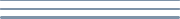
| solid | Divider using solid border |
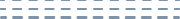
| dash | Divider using dash border |
<BDivider variant="solid" />
Weight
The <BDivider /> component supports the following weight:
| weight | Description |
|---|---|
| sm | Divider use borderwidth 2px |
| md | Divider use borderwidth 3px |
| lg | Divider use borderwidth 4px |
- You can use these components by accessing the provided resource files.
- Preview animations are examples and may not suit Mobile Widgets. Press 'View Code' to access the Widgetbook Playground and see the Flutter widget displaying all created components and interactive.
Usage
Import this line to your file:
import 'package:buma_design_system/buma_design_system.dart';
Attributes of all variants
If there is a question mark ? in the Data Type, it means that the properties are optional, this is namedConstructor from UIDivider
UIDivider.horizontal
Create an horizontal divider, The size of the divider is defined by the width and thickness
| Properties | Data Type | Description | Default Value |
|---|---|---|---|
| width | double | The width of the horizontal divider or the thickness of the vertical divider. | double.infinity |
| thickness | double | The thickness of the divider line | 1 |
| color | Color | The color of the divier | UIColors.strokeTertiary |
| transparent | bool | Whether the divider should be transparent | false |
| style | UIDividerStyle | The style of the divider UIDividerStyle.rectangle or UIDividerStyle.rounded | UIDividerStyle.rectangle |
| variant | UIDividerVariant? | A variant to make different divider | UIDIviderVariant.solid |
| dashLength | double | The length of each dash in the divider | 2 |
| dashGap | double | The gap between each dash in the divider | 2 |
UIDivider.vertical
Creates an vertical divider., The size of the divider is defined by the height and thickness
| Properties | Data Type | Description | Default Value |
|---|---|---|---|
| height | double | The width of the vertical divider or the thickness of the horizontal divider. | double.infinity |
| thickness | double | The thickness of the divider line | 1 |
| color | Color | The color of the divier | UIColors.strokeTertiary |
| transparent | bool | Whether the divider should be transparent | false |
| style | UIDividerStyle | The style of the divider UIDividerStyle.rectangle or UIDividerStyle.rounded | UIDividerStyle.rectangle |
| variant | UIDividerVariant? | A variant to make different divider | UIDIviderVariant.solid |
| dashLength | double | The length of each dash in the divider | 2 |
| dashGap | double | The gap between each dash in the divider | 2 |
Previews & Code
You can call the components with Class.namedConstructor() with different variants
Divider Vertical
 UIDivider.vertical(
   height: 100,
   thickness: 1,
   color: UIColors.strokeSecondary,
   transparent: false,
   style: UIDividerStyle.rounded,
   variant: UIDividerVariant.solid,
 )
Divider Horizontal
 UIDivider.horizontal(
   width: 200,
   thickness: 2,
   color: UIColors.strokeTertiary,
   transparent: false,
   style: UIDividerStyle.rectangle,
   variant: UIDividerVariant.solid
 )