
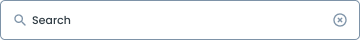
Anatomy

Represented by a magnifying glass, indicating the purpose of the input field.
A text input where users can type their queries.
State on Search
To distinguish between UI activities of varying relevance, you can change the color of the primary button according to the specified state, using the colors that have been prepared in the color styles. Utilize the following variations:
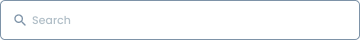
Default
"Default variant" is a term that generally refers to the standard configuration or default settings used by a system, device, or application.

Active
"Active variants" refer to configurations or settings that indicate the state when an element, feature, or component is active, selected, or used.
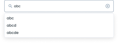
Active Text Dropdown
This dropdown displays text or a label representing the current option and allows the user to select another option by clicking or tapping on the drop-down list.
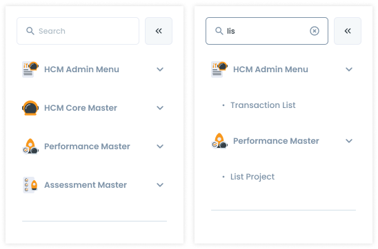
- Users must enter a minimum of 3 characters in the search field to initiate a search or to receive item suggestions.
- This requirement helps ensure meaningful and accurate search results.
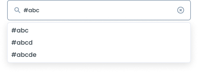
Active # Dropdown
Active # Dropdown can have various meanings, depending on the context of the application or system in which this element appears. For example:
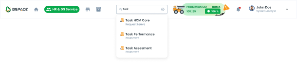
- "#" at the beginning of a word can open a dropdown with suggestions of popular or related tags, allowing users to select the appropriate tag.
- "#" may refer to a number or sequence selection, such as an order number, identification number, or order in a particular list.
- “#" can be used to select documents based on a specific reference number or ID.
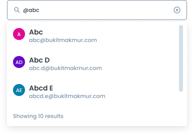
Active @ Dropdown
When you type "@" in front of a name, a dropdown will appear to help select the user you want to mention in a message or comment.
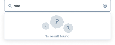
Active no Result
- If no matching items are found, the system will display a "No Results Found" message.
- This message indicates that there are no items in the database that match the search query.
- Users are encouraged to try different keywords or check the spelling of their search terms to improve their chances of finding the desired items.
Hover
“Hover variant” refers to a display or visual effect that appears when a user hovers the mouse or pointer over a particular element.
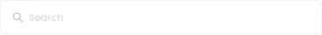
Disable
"Disable variant" refers to a condition where an element in a user interface or application is disabled, so that it cannot be interacted with or used by the user. When an element is disabled, there is usually a visual change indicating this status, helping users recognize that the element is unusable.
Error
"Error variance" is a visual display or indicator that indicates that an error or error has occurred in a system, application, or user interface. Its purpose is to notify the user that something is not working correctly, and is usually accompanied by a message or visual cue that provides details about the error.

Usage
Usage Recommendation:
- Search for specific information or items in a system or application.
- Search Resources: To find documents, files, or other resources.
- Place the search component in a prominent location, usually in the header or at the top of the page/table.
- Ensure the search input field is wide enough to accommodate typical search queries.
- When clicking on the search button, the application will redirect us to a new page to perform a search (Mobile Only)
Accessibility
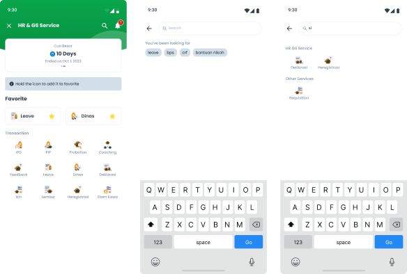
Example Search on Mobile
When the search icon or search field is activated on navigation bar, the user is directed to a new page specifically designed for searching.
Example Search on Desktop
When the user types at least 3 letters in the search field, the results of the search immediately appear according to the input from the user. Or the user can also display the search results by pressing the enter key.
Search Width
Don’t make the search field too narrow, limiting the visibility of longer queries.


Content
Placeholder Text
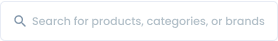
Besides using “search” as a placeholder, you can use concise, informative placeholder text that hints at the type of content users can search for (e.g., "Search for products, categories, or brands").

Usage
The package is already installed in the repository's shell. To use the component, you only need to add the following code:
<BInputSearch />
Attributes
If there is a question mark ? in the Data Type, it means that the properties are optional.
| Property | Data Type | Description | Default Value |
|---|---|---|---|
| modelValue | string | The input's value, supports two-way binding | none |
| debounce | boolean | Enable/disable the debounce mechanism | false |
| debounceTime | number | Custom debounce time in milliseconds | 400 |
- You can use these components by accessing the provided resource files.
- Preview animations are examples and may not suit Mobile Widgets. Press 'View Code' to access the Widgetbook Playground and see the Flutter widget displaying all created components and interactive.
Usage
Import this line to your file:
import 'package:buma_design_system/buma_design_system.dart';
Attributes of all variants
If there is a question mark ? in the Data Type, it means that the properties are optional, this is namedConstructor from UISearchInput.
UISearchInput
Displays base search input without dropdown, and have onchanged callback
| Properties | Data Type | Description | Default Value |
|---|---|---|---|
| controller | TextEditingController | A controller for an editable search input | null |
| focusNode | FocusNode? | An object that can be used by a stateful widget to obtain the keyboard focus and to handle keyboard events | null |
| enabled | bool | Enable all interaction for search input | true |
| onChanged | ValueChanged<String>? | Callback when user has tapped item from dropdown | null |
| validator | UISearchInputValidator? | An optional method that validates an input. Returns an error string to display if the input is invalid, or null otherwise | null |
UISearchInput with dropdown
Displays search input with dropdown suggestion, with the variant of: dropdown, hashtag, and user
| Properties | Data Type | Description | Default Value |
|---|---|---|---|
| listDropDown | List<UISearchInputItem> | A general list for dropdown | [] |
| onTapDropDown | ValueChanged<UISearchInputItem>? | Callback when user has tapped item from dropdown | null |
| debounce | int | Used to avoid unnecessary processing by setting a delay beforeexecuting a function, will return tu milliseconds | 300 |
| controller | TextEditingController | A controller for an editable search input | null |
| focusNode | FocusNode? | An object that can be used by a stateful widget to obtain the keyboard focus and to handle keyboard events | null |
| enabled | bool | Enable all interaction for search input | true |
| onChanged | ValueChanged<String>? | Callback when user has tapped item from dropdown | null |
| validator | UISearchInputValidator? | An optional method that validates an input. Returns an error string to display if the input is invalid, or null otherwise | null |
Search Input Base
Search Input Dropdown
Try input abc or something to show the dropdown
Search Input Hashtag
Try add # at the first letter, and input division of buma like: #mobile, #mobiledevs or uiux
Search Input User
Try add @ at the first letter, and input division of buma like: @Muhammad Rizqinovniari, @Rama MS