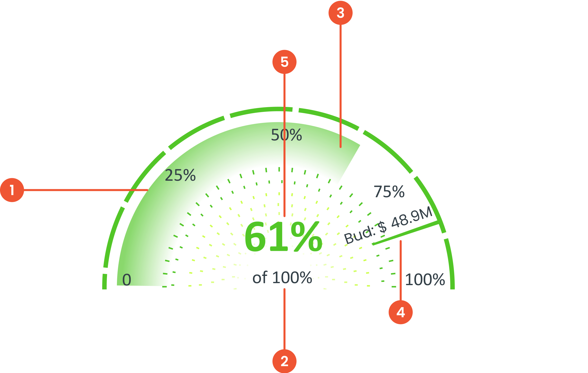
Buma UI - DocumentationBuma UI - Documentation
Get Started
Foundations
Components
Resources
Patterns
Data Visualization
Back to BSpace
Get Started
Foundations
Components
Resources
Patterns
Data Visualization
  • stacksFoundations
    • 💡 Overview
    • Color
    • Principle
    • Typography
  • brickComponents
    • 💡 Overview
    • Accordion
    • Alert
    • Avatar
    • Badge
    • Bottom Sheet
    • Bread Crumb
    • Button
    • Button Link
    • Button Navigation
    • Calendar
    • Card
    • Chat
    • Checkbox
    • Chips
    • Choice Tile
    • Comment
    • Date Picker
    • Divider
    • Download
    • Drawer
    • Dropdown
    • Empty State
    • Floating Button
    • Form Input
    • Header
    • Hint
    • Icon
    • List Choice
    • Loading
    • Modal
    • Navigation Bar
    • Notification
    • Pagination
    • Progress Bar
    • Radio Button
    • Search
    • Scrolling Bar
    • Segmented Switch
    • Side Menu
    • Side Tab
    • Slider
    • Switch
    • Tab
    • Table
    • Text Area
    • Text Input
    • Time Picker
    • Title
    • Toast
    • Tooltip
    • Wizzard
  • splitscreenPattern
    • 💡 Overview
    • Filter
      upcoming
    • Form
      upcoming
    • Notification
    • PWA
      upcoming
    • table
      upcoming
    • Upload Download
      upcoming
  • insert_chartData Visualization
    • 💡 Overview
    • Tiering
    • Pattern
    • Chart and Graph
      • Chart Selection Guide
      • Map Selector
      • Donut Chart
      • Donut Progress Bar Chart
      • Spider Chart
      • Line Chart
      • Chart Area
      • Speedometer
      • Heat Map
      • Scatter Plot
      • Pie Chart
      • Bar Chart
      • Waterfall Chart
      • Sunburst Chart
      • Tree Decomposition Chart
      • Scorecards
      • Table
      • Micro Visualization
    • Typography
    • Color Palette
  • data_objectTokens
    upcoming
  • inventory_2Resources
    • 💡 Overview
    • Mobile
      new
      • 💡 Introduction
      • Installation
      • General
        • Important Rules
        • Naming Convention
        • Clean Architecture
    • Web
      upcoming

Speedometer

Anatomy

Is a circular data visualization that represents progress, performance, or a specific value within a predefined range.
 Is the element that points to the current value on the gauge
 The metric refers to the data being measured or tracked. It represents the subject or performance variable visualized by the gauge.
 The text indicator provides additional context to the data displayed on the gauge.
 The value text displays the exact numerical value represented by the indicator.
Guidelines for Speedometer
  • The label in the middle should be displayed. The center label provides clear information about the value indicated by the needle
    • Percentage; the values ​​on the speedometer are presented in percentage form.
    • Other Values; Speedometers can also provide other metrics (e.g., counts, ratings), but the units must be clearly indicated.
  • Color coding tells the meaning of the color to the user about the current condition of the value whether it is positive or negative for color coding use Specialty Color Scheme.
  • Thresholds sets certain limits or thresholds on the speedometer to categorize the indicated value in positive or negative conditions
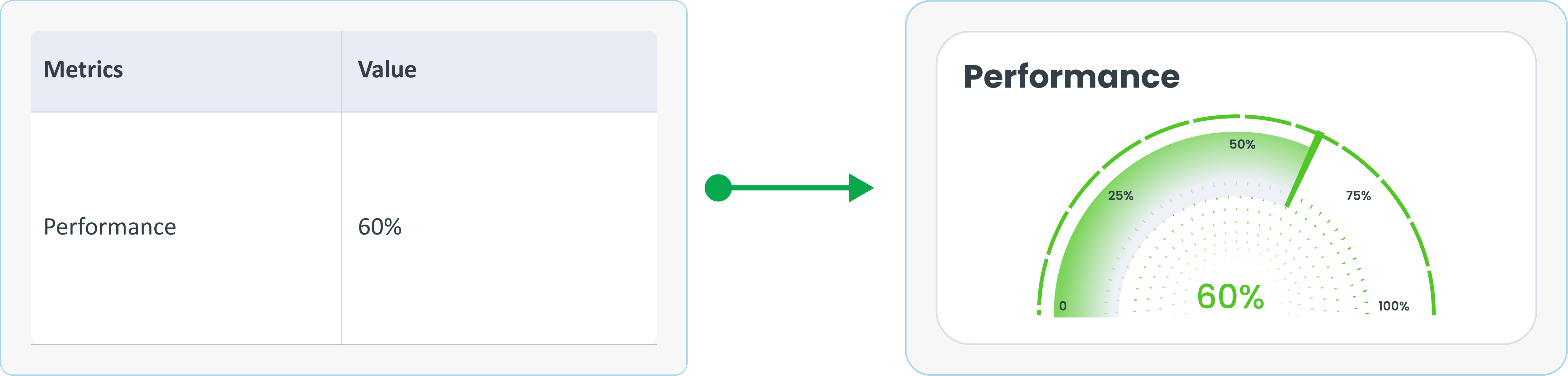
Example of Source Data

When to Use a Speedometer?
  • Shows progress towards a certain point.​
  • Measures performance level.​​
  • Visualize one metric within a certain range.​
arrow_back
Previous Chart Area
Next Heat Map
arrow_forward