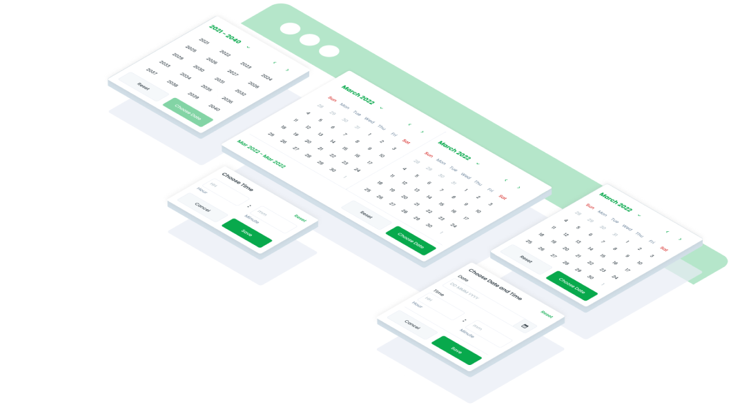
ComponentsCalendarA UI (User Interface) date picker is a graphical element that allows users to select a specific date or range of dates from a calendar-style interface in web or mobile interfaces.
Guidelines
Web
Oops Sorry! This Page Is Under Maintenance
We are improving this page, and will be back soon! You can explore other page.
Mobile
Resources
- You can use these components by accessing the provided resource files.
- Preview animations are examples and may not suit Mobile Widgets. Press 'View Code' to access the Widgetbook Playground and see the Flutter widget displaying all created components and interactive.
Usage
Import this line to your file:
import 'package:buma_design_system/buma_design_system.dart';
Attributes of all variants
If there is a question mark ? in the Data Type, it means that the properties are optional, this is namedConstructor from UICalendar
showCalendar
Displays base of calendar with format date of dd MMM yyyy
| Properties | Data Type | Description | Default Value |
|---|---|---|---|
| context | BuildContext | A handle to the location of a widget in the widget tree | none |
| onCalendarItemChanged | void Function(DateTime)? | The callback of specific single wheel item of DateTime | none |
| minDate | DateTime? | Minimum date value to display on wheel date | DateTime.now() |
| maxDate | DateTime? | Maximum date value to display on wheel date | DateTime.now() |
| initialDate | DateTime? | Displays initial date | DateTime.now() |
UICalendar.showCalendarPickDateRange
Displays date picker with start and finish callback, with format date of dd MMM yyyy
| Properties | Data Type | Description | Default Value |
|---|---|---|---|
| context | BuildContext | A handle to the location of a widget in the widget tree | none |
| onCalendarRangeItemChanged | UICalendarRangeChanged | The callback of start and finish item in the wheel of DateTime | null |
| minDate | DateTime? | Minimum date value to display on wheel date | DateTime.now() |
| maxDate | DateTime? | Maximum date value to display on wheel date | DateTime.now() |
| initialDate | DateTime? | Displays initial date | DateTime.now() |
UICalendar.showCalendarTimeOnly
Displays time only calendar with format date of Hm
| Properties | Data Type | Description | Default Value |
|---|---|---|---|
| context | BuildContext | A handle to the location of a widget in the widget tree | none |
| onCalendarItemChanged | void Function(DateTime)? | The callback of specific single wheel item of DateTime | none |
| minDate | DateTime? | Minimum date value to display on wheel date | DateTime.now() |
| maxDate | DateTime? | Maximum date value to display on wheel date | DateTime.now() |
| initialDate | DateTime? | Displays initial date | DateTime.now() |
UICalendar.showCalendarTimeAndDate
Displays time and date calendar with format date of EEE, dd MMM HH:mm
| Properties | Data Type | Description | Default Value |
|---|---|---|---|
| context | BuildContext | A handle to the location of a widget in the widget tree | none |
| onCalendarItemChanged | void Function(DateTime)? | The callback of specific single wheel item of DateTime | none |
| minDate | DateTime? | Minimum date value to display on wheel date | DateTime.now() |
| maxDate | DateTime? | Maximum date value to display on wheel date | DateTime.now() |
| initialDate | DateTime? | Displays initial date | DateTime.now() |
showCalendarDetail
Displays complex and detailed calendar, users will be able to easily select dates by select start date to finish date, and it is also easy to set the month and year
| Properties | Data Type | Description | Default Value |
|---|---|---|---|
| context | BuildContext | A handle to the location of a widget in the widget tree | none |
| onCalendarItemChanged | void Function(DateTime)? | The callback of specific single wheel item of DateTime | none |
| minDate | DateTime? | Minimum date value to display on detail date | DateTime.now() |
| maxDate | DateTime? | Maximum date value to display on detail date | DateTime.now() |
| initialDate | DateTime? | Displays initial date | DateTime.now() |
| listEvent | List<DateTime>? | Displays conditional event or big day | [] |
| showNextPreviousDate | bool | Displays a detailed calendar that allows users to easily select a date range (start to finish) and adjust the month and year | true |
showCalendarRangeDetail
Similar to calendar detail, this variant can select range of date time.
| Properties | Data Type | Description | Default Value |
|---|---|---|---|
| context | BuildContext | A handle to the location of a widget in the widget tree | none |
| onCalendarRangeItemChanged | UICalendarRangeChanged | The callback of start and finish item in the detail date calendar | none |
| minDate | DateTime? | Minimum date value to display on detail date | DateTime.now() |
| maxDate | DateTime? | Maximum date value to display on detail date | DateTime.now() |
| initialDate | DateTime? | Displays initial date | DateTime.now() |
| listEvent | List<DateTime>? | Displays conditional event or big day | [] |
| showNextPreviousDate | bool | Displays a detailed calendar that allows users to easily select a date range (start to finish) and adjust the month and year | true |
Previews & Code
You can call the components with Class.namedConstructor() with different variants
Calendar Base/Default
UICalendar.showCalendar(
    context,
    minDate: DateTime(2014),
    maxDate: DateTime(2025),
    initialDate: DateTime(2024, 01, 02),
    onCalendarItemChanged: (DateTime date){
        //Do something here
    },
);
Calendar Pick Date Range
UICalendar.showCalendarPickDateRange(
    context,
    minDate: DateTime(2014, 12, 02),
    maxDate: DateTime(2024, 12, 20),
    initialDate: DateTime(2024, 12, 12),
    onCalendarRangeItemChanged: (DateTime start, DateTime end){
        //Do something here
    },
);
Calendar Time Only
 UICalendar.showCalendarTimeOnly(
    context,
    initialDate: DateTime.now().copyWith(hour: 0, minute: 0),
    onCalendarItemChanged: (DateTime date){
        //Do something here
    },
);
Calendar Time & Date
UICalendar.showCalendarTimeAndDate(
  context,
  minDate: DateTime(2010),
  maxDate: DateTime(2040),
  initialDate: DateTime.now(),
  onCalendarItemChanged: (DateTime date) {
    // Do something
  }
)
Calendar Detail
UICalendar.showCalendarDetail(
    context,
    minDate: DateTime(2014, 12, 02),
    initialDate: DateTime.now(),
    showNextPreviousDate: widget.showNextPreviousDate,
    listEvent: [
        DateTime(now.year, now.month, 15),
        DateTime(now.year, now.month, 17),
        DateTime(now.year, now.month, 28),
        DateTime(now.year, now.month + 1),
    ],
    onCalendarItemChanged: _onChangeDate,
);
Calendar Range Detail
UICalendar.showCalendarRangeDetail(
    context,
    initStartDate: DateTime(2024, 12, 12),
    initFinishDate: DateTime(2024, 12, 20),
    listEvent: [
        DateTime(now.year, now.month, 15),
        DateTime(now.year, now.month, 17),
        DateTime(now.year, now.month, 28),
    ],
    onCalendarRangeItemChanged: (DateTime start, DateTime end){
        //Do something here
    },
);