Persona
Executive Dashboard
Focus on KPI (Key Performance Indicators). Use simple yet comprehensive visualizations that quickly convey information. High-level insights, strategic decision-making, and overall business performance.
- Provides a brief summary of key performance indicators (KPIs) and critical metrics.
- Tracks progress toward goals and strategic objectives, ensuring alignment with organizational priorities.
- Includes impactful visual representations like bar charts, pie charts, and trend lines for quickly understanding trends and insights.
- Enables customization of the dashboard view to focus on specific metrics or areas of interest, improving flexibility in data analysis and presentation.
- Allows for comparisons between different time periods (e.g., monthly, yearly, quarterly) to assess trends and performance.
Managerial Dashboard
More detailed than an Executive Dashboard. Provides deeper analysis and includes data to support tactical decisions. Department performance, team management, project monitoring, and resource allocation.
- Provides the capability to explore detailed data behind complex metrics, facilitating deeper analysis and easier decision-making.
- Delivers up-to-date information and metrics for timely decision-making and proactive management.
- Displays team and individual performance metrics, enabling managers to monitor progress and identify areas for improvement.
- Presents resource allocation and utilization, helping managers optimize labor distribution and productivity.
Operational Dashboard
Highly detailed, covering daily operational data. Provides analytical tools and detailed reports. Daily operations, process optimization, and efficiency tracking.
- Presents detailed metrics and KPIs related to operational performance, providing visibility into efficiency and effectiveness.
- Measures specific key performance indicators (KPIs) for process efficiency and operational effectiveness, supporting continuous improvement initiatives.
- Tracks and optimizes resource allocation (e.g., personnel, equipment) to maximize efficiency and minimize operational costs.
- Monitors and manages operational issues and incidents in real-time, ensuring quick resolution and minimizing disruptions.
Tier Guide in Power BI
Tier Without Personas
- Organize tiers according to the hierarchy of information: High-level dashboards (Tier 1) provide an overview, while detailed dashboards (Tier 2) focus on specifics.
Guidelines for Implementation
- Define the main KPIs for the overall project, such as total incidents, total costs, or efficiency metrics.
- Identify specific data points that require deeper analysis, such as individual incident types, specific cost details, or more detailed efficiency metrics.
- Ensure the dashboard logically flows from the general overview (Tier 1) to detailed insights (Tier 2). Use navigation buttons or links to allow users to seamlessly explore from Tier 1 to Tier 2 dashboards.
- Maintain consistent design across all tiers to provide a cohesive user experience. Use the same color schemes, fonts, and chart types wherever possible.
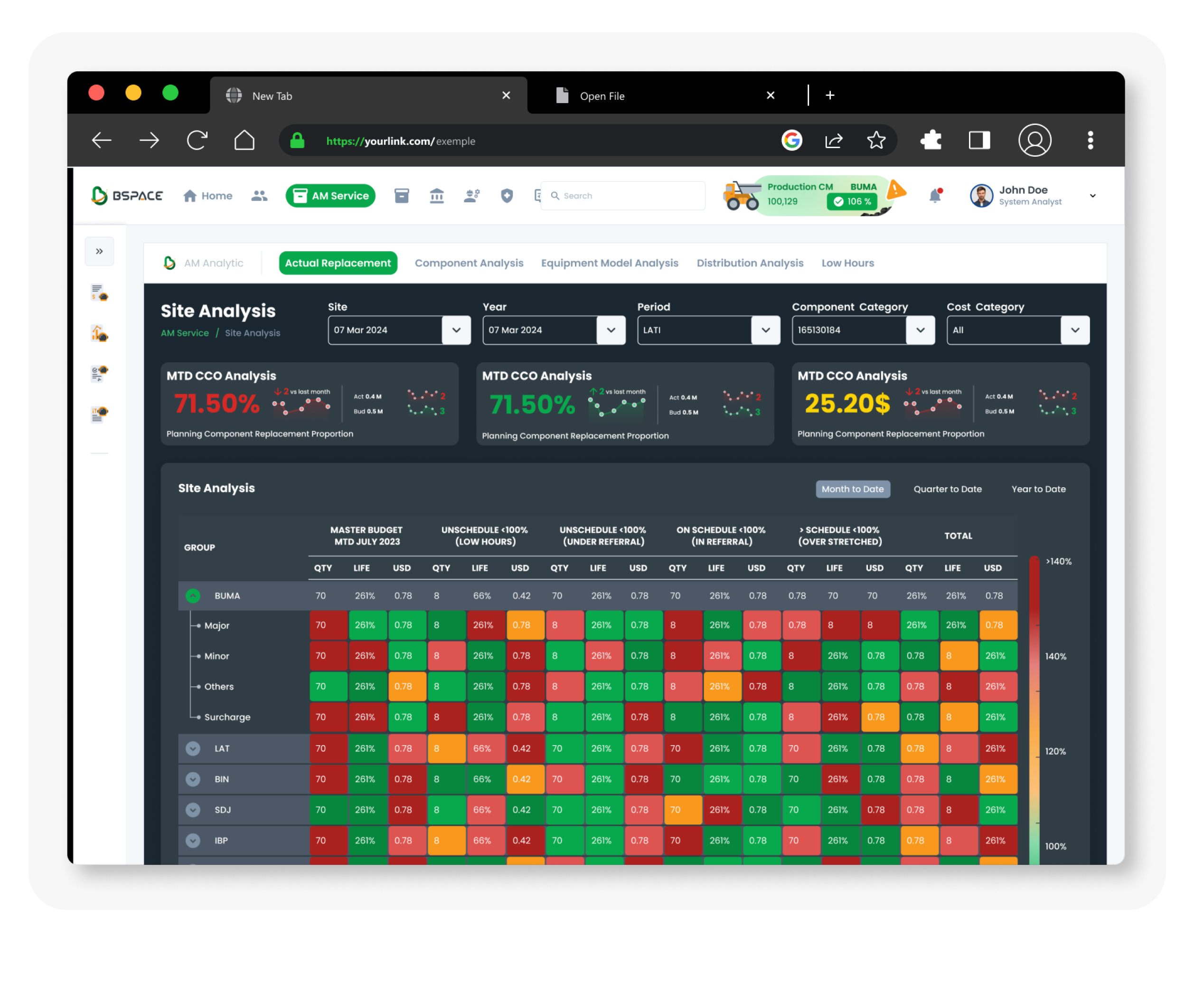
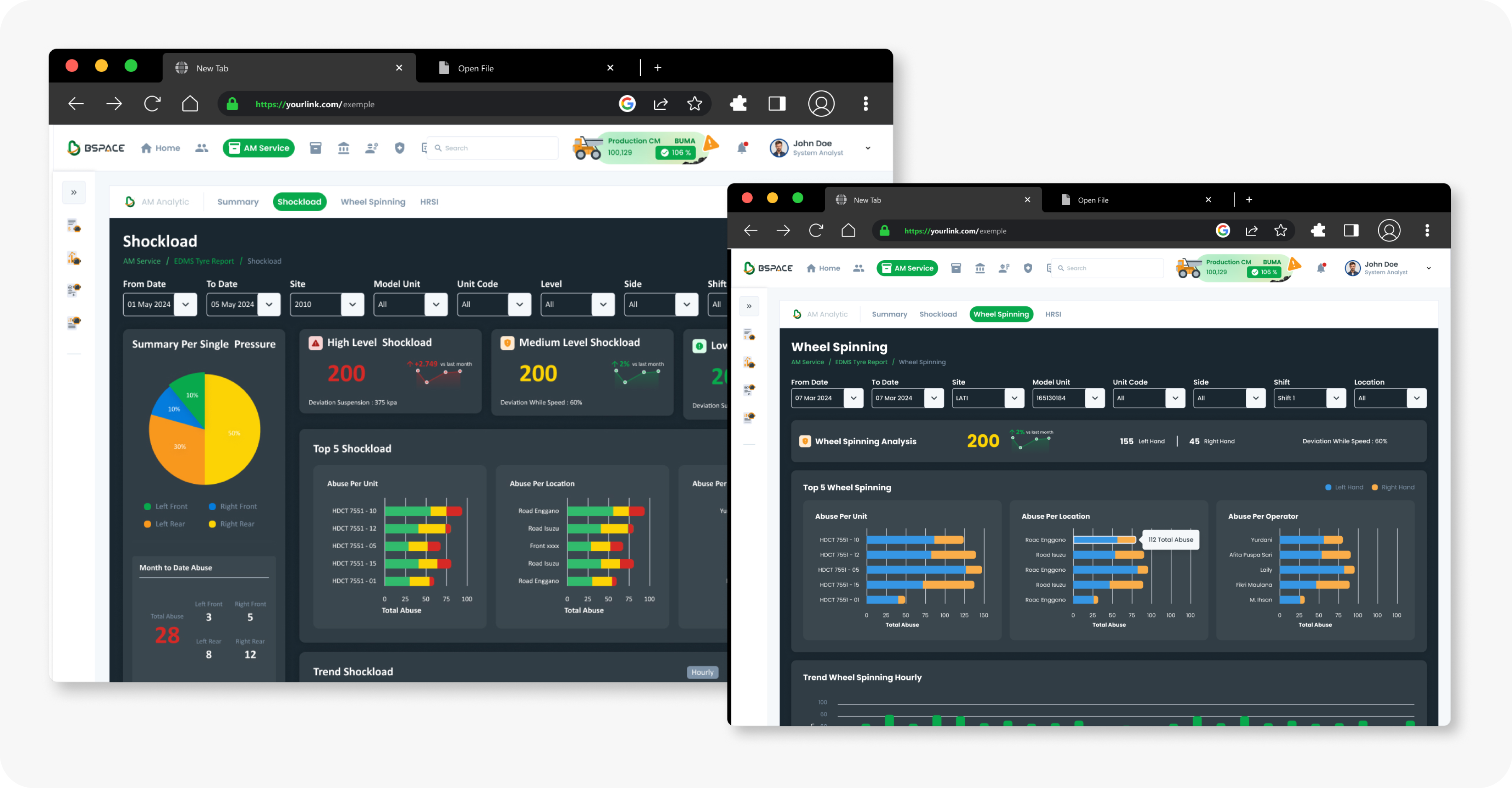
Example: EDMS Tyre Project
Tier 1 : EDMS Tyre Dashboard
High-level metrics and KPIs for the entire tyre project.
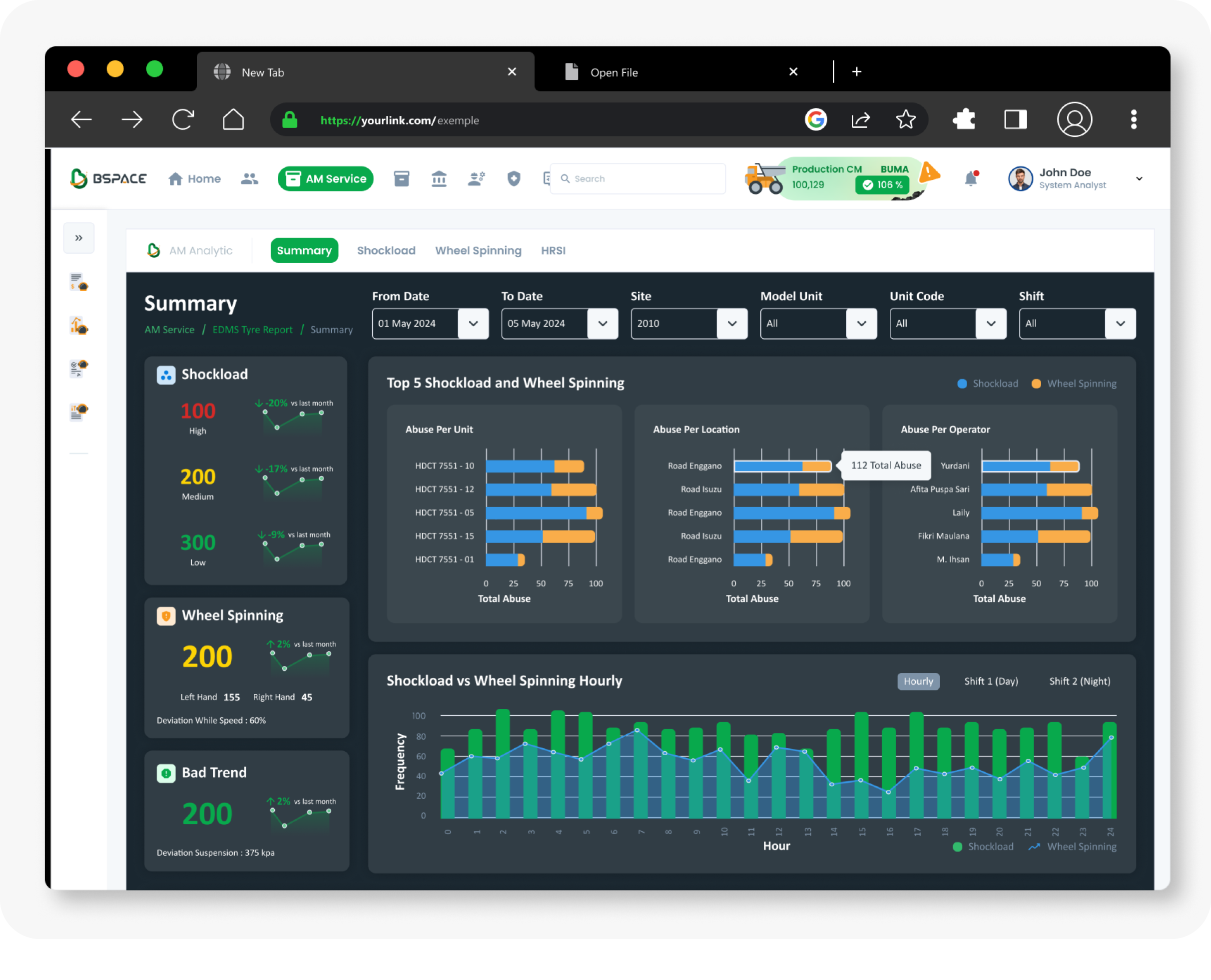
Tier 2 : Shockload and Wheel Spinning Dashboards
Shockload: Detailed analysis of the impact of shock loads Wheel Spinning: In-depth data on wheel spinning metrics.
Tier With Personas
- Organize tiers according to user roles and access levels. Customize dashboards or sections to meet the needs of different personas.
Guidelines for Implementation
- Define the various user roles accessing the dashboard (e.g., Managers, Supervisors, Analysts).
- Specify which roles can access Tier 1 and which roles can access Tier 2. Use role-based access controls in Power BI to manage this.
- Align the presented data with the needs of each role. For example, Managers may require high-level summaries, while Analysts may need more detailed data.
- Consider creating personalized dashboard views for different roles. This might involve showing or hiding specific data visualizations based on the user's role.
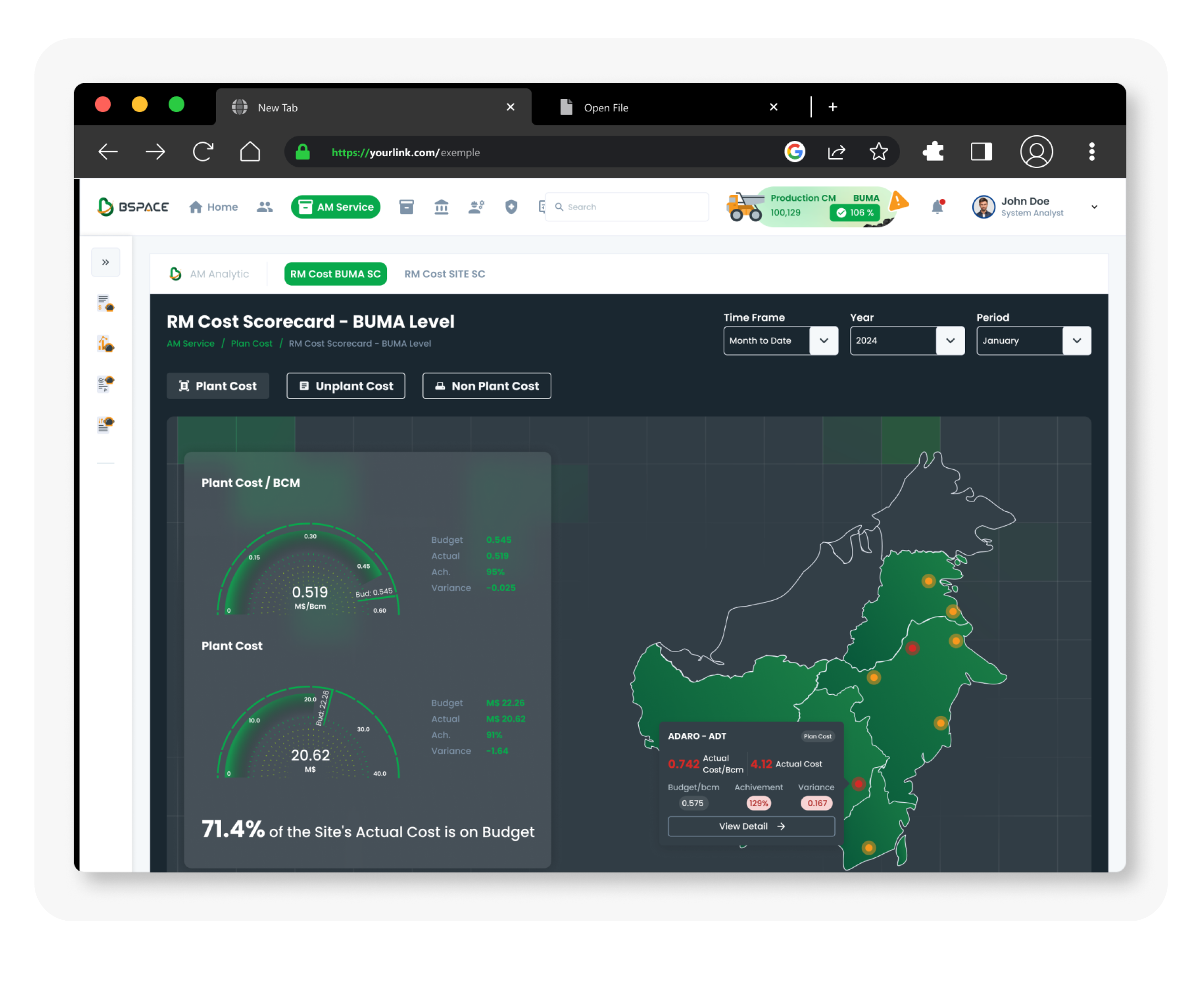
Example: RM Cost and CCO Dashboards
Tier 1 : RM Cost Dashboard
Managers and Supervisors.
Provides an overview of general project costs and summary metrics, offering insights that can be viewed across multiple locations.
Tier 2 : CCO Dashboard
Certain roles such as Manager.
Focuses on detailing the cost of components that need to be replaced and provides information on the life of each component.