 Design
Overview
This documentation outlines the detailed guidelines for implementing a notification pattern using a red dot and a hint with a number inside the dot. This pattern is designed to enhance user experience by providing clear, non-intrusive alerts and directing user attention effectively. The principles described here align with UX laws to ensure optimal usability.
Purpose
The notification pattern is a foundational element in user interface design, providing an effective mechanism to keep users informed without disrupting their workflow. It plays a critical role in ensuring that users can easily identify and respond to new or pending actions requiring their attention.
Key Objectives
- Notifications act as real-time indicators for actions or updates that require user attention. The red dot ("titik merah") is a visual shorthand for urgency and relevance, compelling users to engage.
- This pattern provides a subtle yet noticeable means of communication. It is carefully designed to integrate seamlessly with the interface, avoiding excessive distractions or interruptions.
- By highlighting relevant updates in a timely manner, this pattern increases user interaction and ensures critical information is not overlooked.
Components
1. Red Dot
The red dot is a highly effective visual cue used to immediately draw the user's attention to new or pending updates. Its minimalist design, combined with the urgency conveyed by its red color, makes it a universal standard for notifications.
Behavior
- The red dot appears only when there are unread or pending notifications, ensuring users are only alerted when necessary.
- Once the user interacts with the notification or the associated content, the red dot disappears immediately, providing clear feedback.
- The dot should adjust dynamically to the state of notifications, ensuring real-time accuracy.
Placement
- Position the red dot near the top-right corner of the associated icon (e.g., bell, message, or user profile) to create a predictable and recognizable pattern.
- Ensure precise alignment with the icon to avoid visual clutter or interference with other elements. The placement should complement the design aesthetic of the interface.
Animation
To enhance engagement, consider adding subtle animations, such as a brief pulse effect when the dot first appears. This can make the notification feel more dynamic and immediate, but should be used sparingly to avoid distraction.
2. Number Inside the Dot (Hint)
The number inside the dot serves as an informative extension of the red dot, providing users with specific context about the volume of pending items or actions. By indicating an exact count, it allows users to gauge the urgency or importance of the notification at a glance.
Behavior
- The displayed number changes in real-time to reflect the current count of unread or pending notifications.
- When there are no unread notifications, both the number and the red dot should disappear completely to signify a cleared state.
- Upon user interaction with the notification or when notifications are resolved programmatically, the count updates or clears instantaneously.
Content Rules

- Numbers are displayed directly for counts ranging from 1 to 99, ensuring clarity.
- For counts exceeding 99, use "99+" to maintain visual simplicity and prevent overcrowding within the limited space of the dot.
- Ensure number formats comply with regional conventions (e.g., commas for thousands in English vs. spaces in European locales).
Typography
- Use a font size between 10px and 12px, carefully adjusted to fit within the dot while remaining legible.
- Opt for bold sans-serif fonts to enhance clarity and readability, even at small sizes.
- Center the number within the dot, ensuring visual balance and avoiding any misalignment with the surrounding elements.
Animation
- Consider smooth fade-in and fade-out animations when the count changes or the dot disappears, adding a polished feel to the user experience.
User Behavior
Expected Actions
Users interact with notification systems in predictable ways based on the design’s effectiveness and intuitiveness.
- The red dot's bright color and strategic placement naturally draw the user’s attention, ensuring they quickly notice new notifications. This behavior is enhanced by the inherent association of the color red with urgency or importance.
- When a number is displayed within the red dot, users perceive an increased urgency. This quantitative hint encourages them to address the notification more promptly, as they can immediately gauge the scope of pending tasks or updates.
- Users expect responsive interactions with notifications. Once they interact with the notification or mark it as read, the red dot and its associated count should disappear instantly, signaling successful completion or acknowledgment.
Avoiding Notification Fatigue
To ensure the notification system remains effective without overwhelming the user, the following principles should be adhered to:
- Limit the use of the notification dot to critical or high-priority alerts. Overuse can lead to desensitization, where users start ignoring the dot altogether.
- Display notifications that are highly relevant to the user’s context. Avoid showing updates that are repetitive or unrelated to their immediate tasks or goals.
- Provide immediate and clear feedback upon user interaction. For instance:
- Remove the red dot with a smooth fade-out animation when a notification is addressed.
- Reflect real-time changes in the count when new notifications arrive or existing ones are resolved.
- Where possible, allow users to customize notification preferences. This could include setting thresholds for when the red dot appears or choosing which types of updates trigger it.
By maintaining a balance between visibility and restraint, the notification system can remain a helpful tool without becoming a source of frustration for users.
Visual References
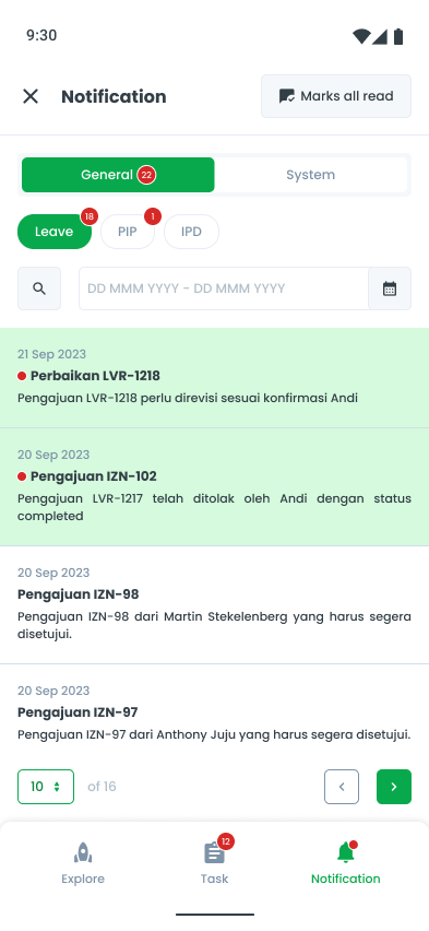
Notification System
A clear representation of how a notification is used to indicate unread messages or updates. The number in the bell notification indicates unread notifications, and it decreases as soon as the user reads or opens them.
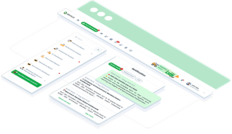
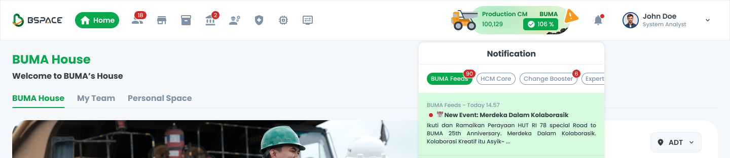
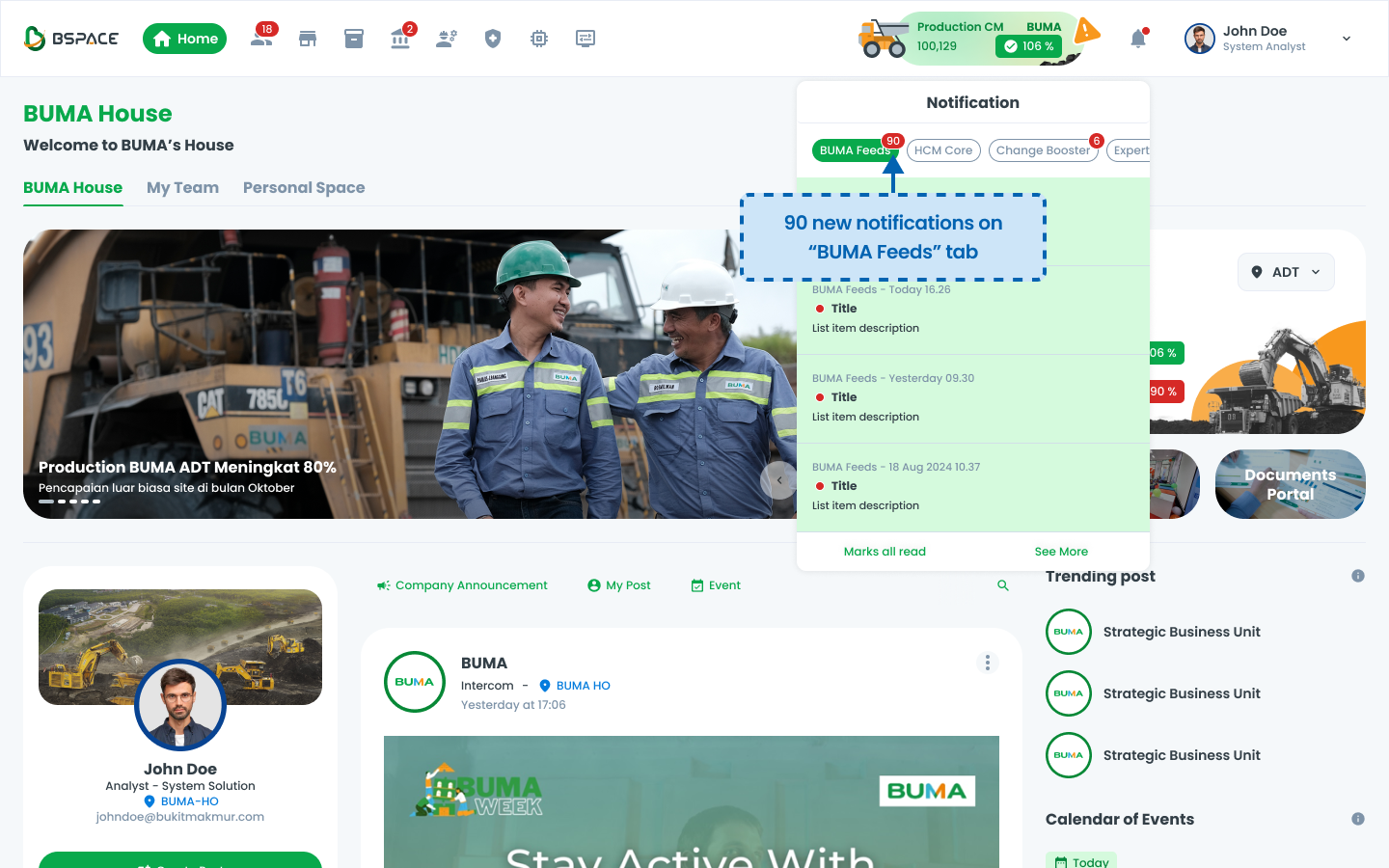
Illustration #1: Bell Notification
Users receive notifications in the system, indicated by a red badge on the notification bell.
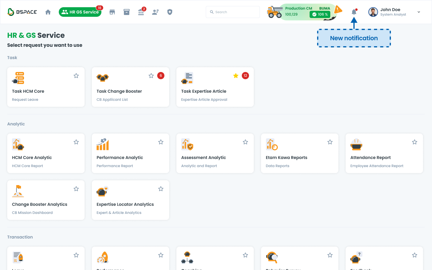
Clicking the notification icon opens a list of unread notifications.
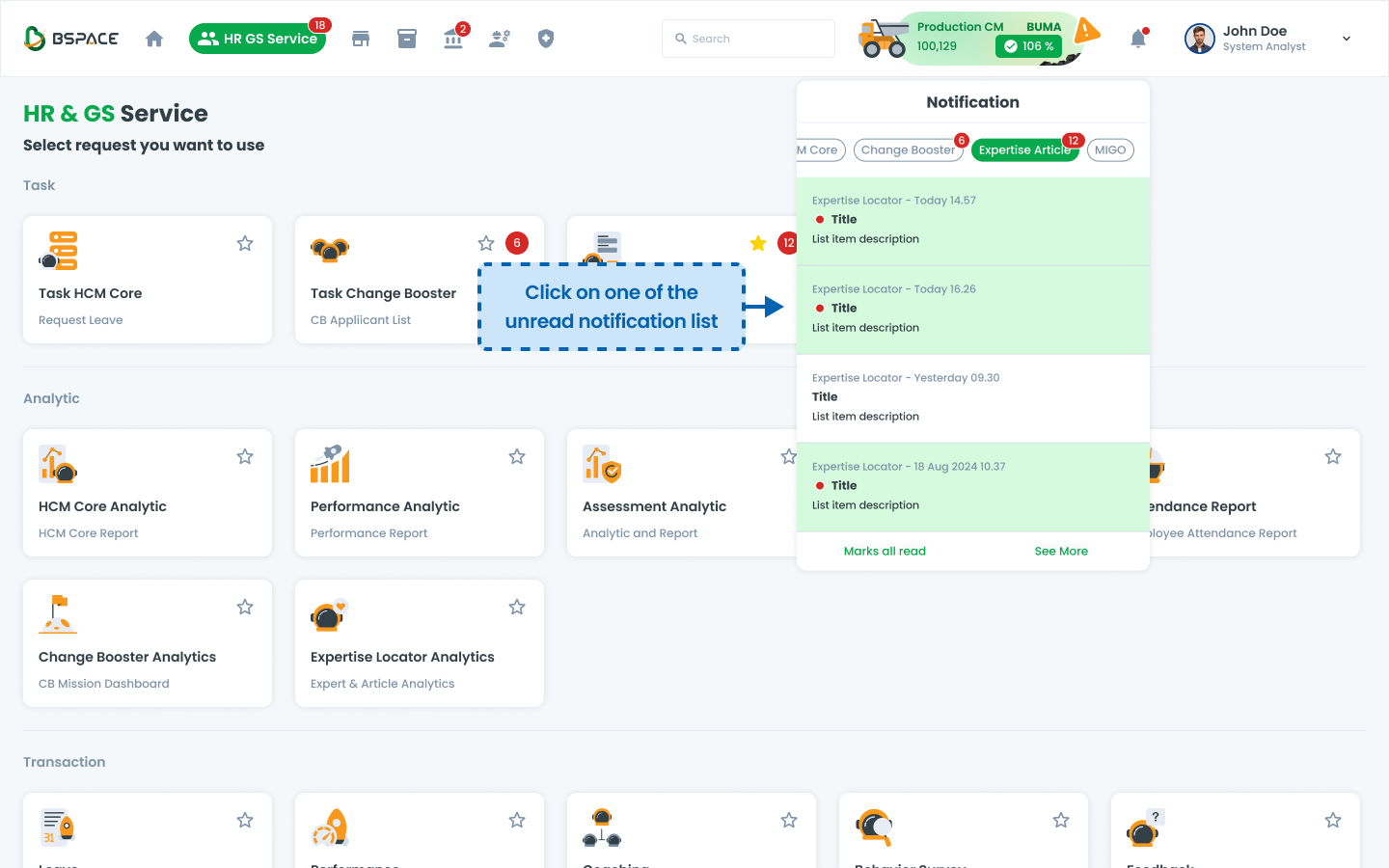
Once a user opens a list on the notification, the unread count decreases automatically.
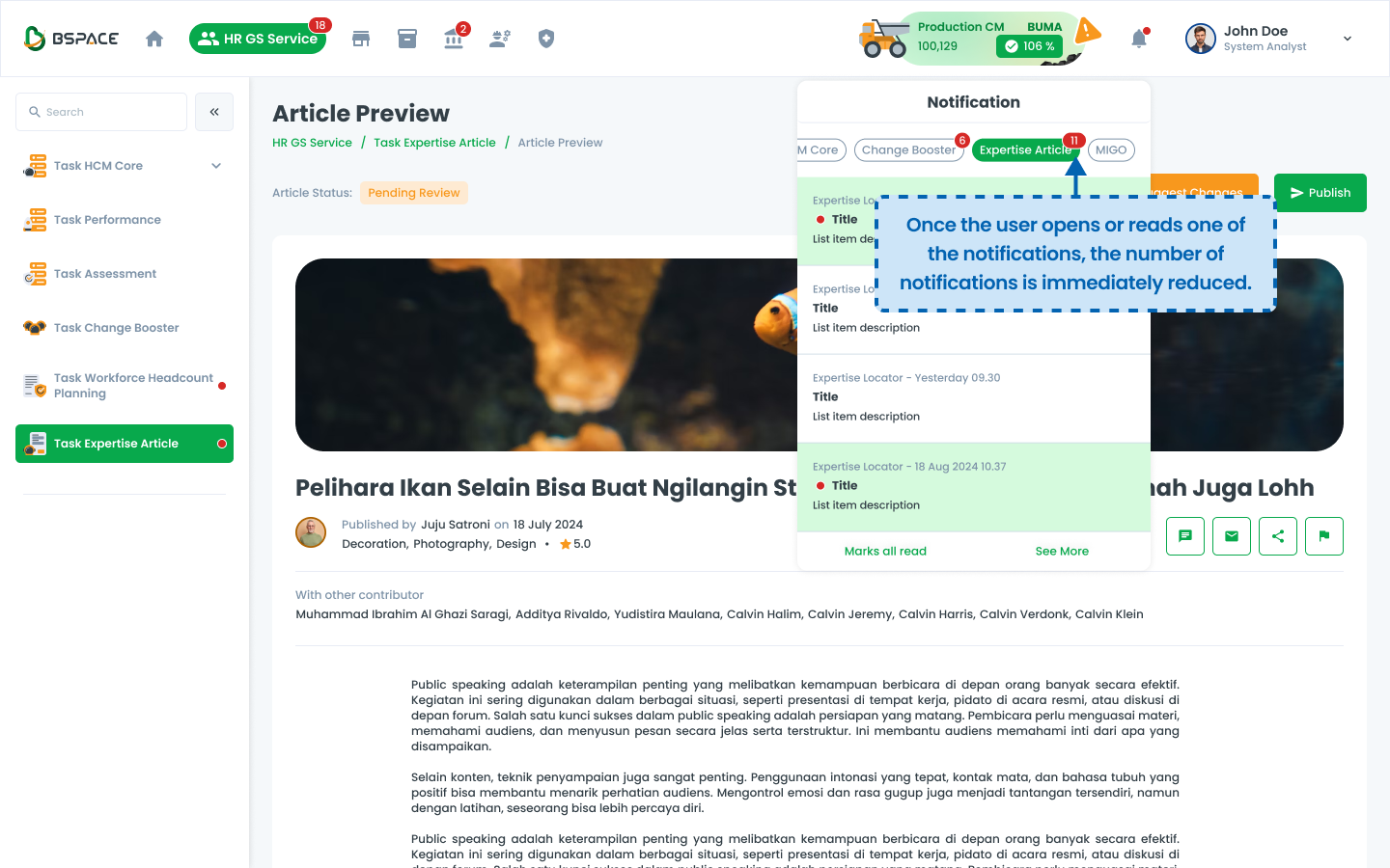
Illustration #2: Marking Notifications as Read
Notifications are categorized based on different available features (e.g., HCM Core, Change Booster, Expertise Article, etc.).
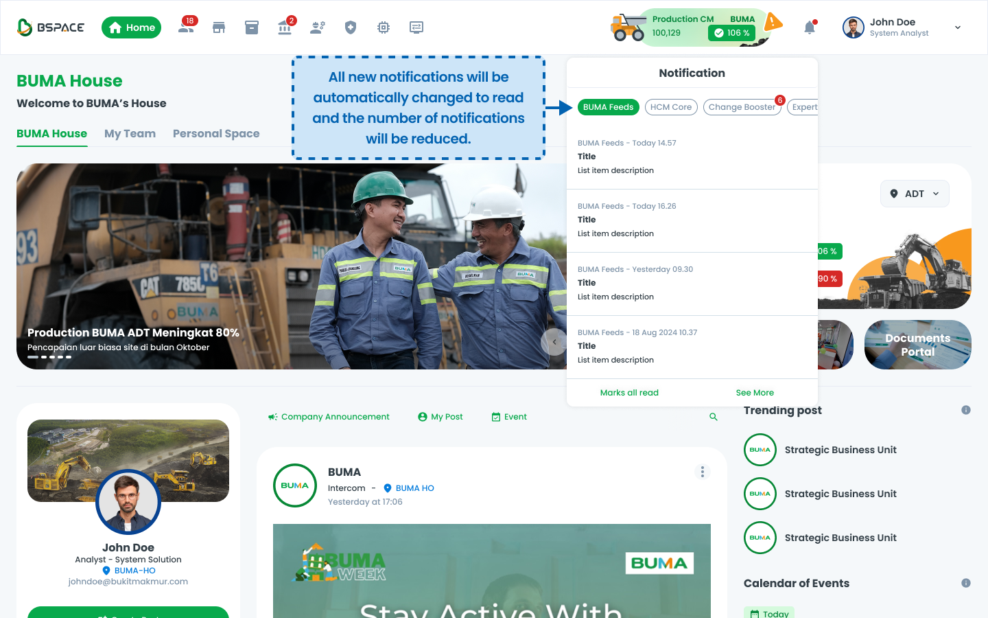
Users can automatically mark all notifications as read by selecting "Mark all read."
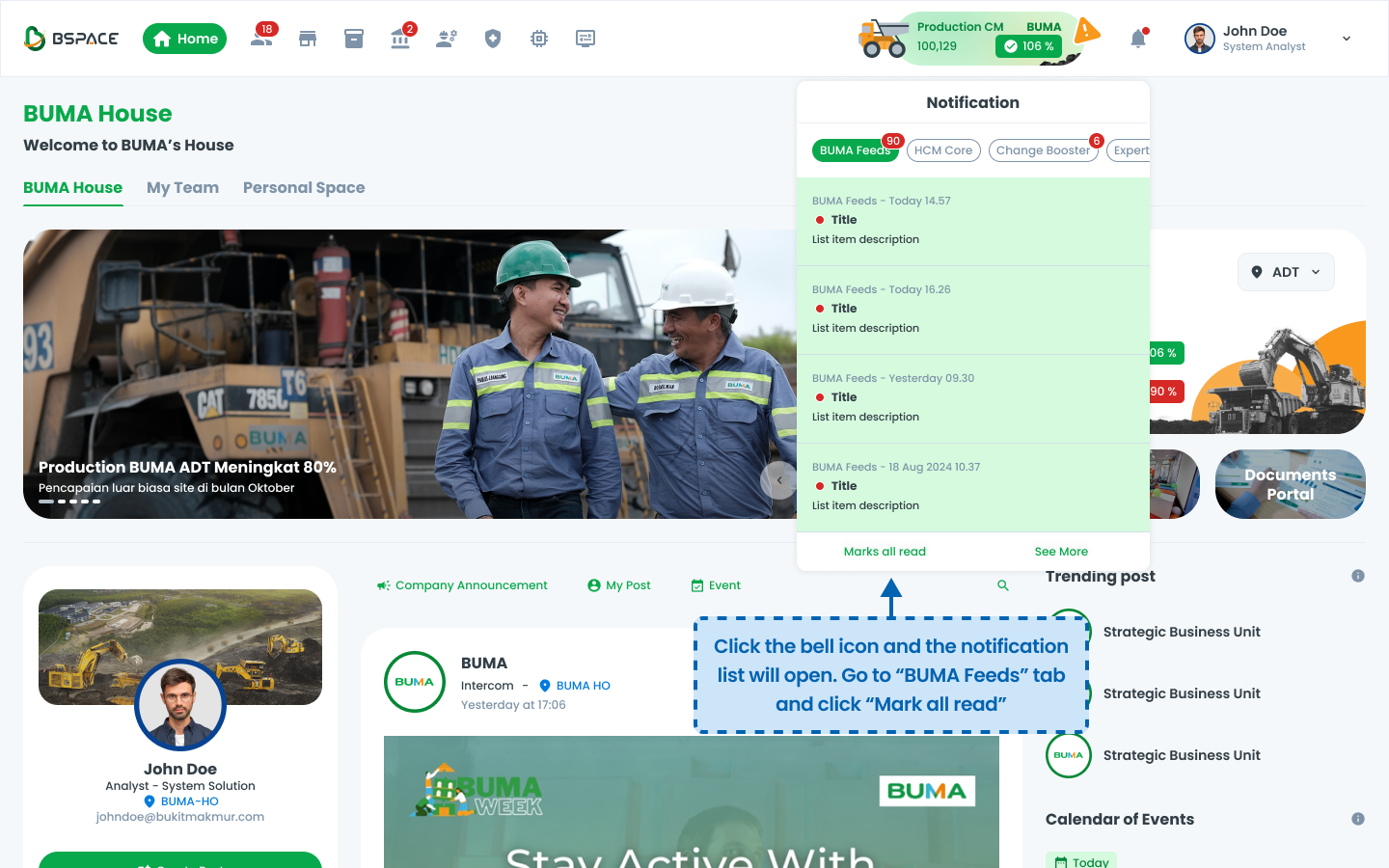
The notification count on selected tab is reduced after performing this action.
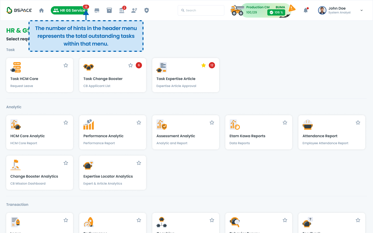
Outstanding Task
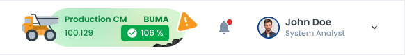
The difference between the hint with numbers in the Cluster Service menu and the number in the bell notification lies in their purpose and behavior.
The number in the bell notification indicates unread notifications, and it decreases as soon as the user reads or opens them. In contrast, the number in the Cluster Service menu represents the number of outstanding tasks that require user action. This number does not decrease simply by opening the task page; it will only be reduced or removed once the task has been fully completed or acted upon.
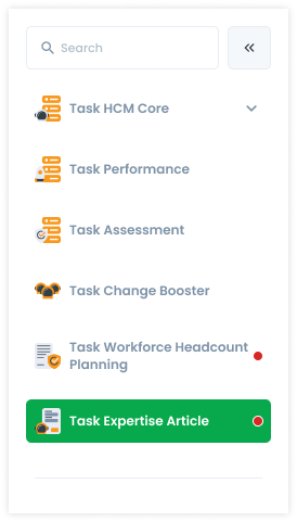
Illustration: Hint on Menu
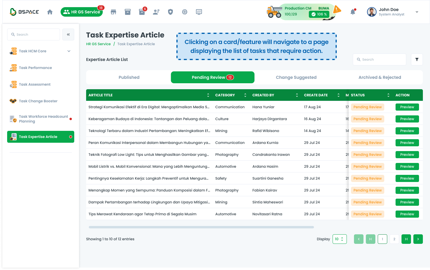
The system displays outstanding tasks in the top menu, indicating pending actions.
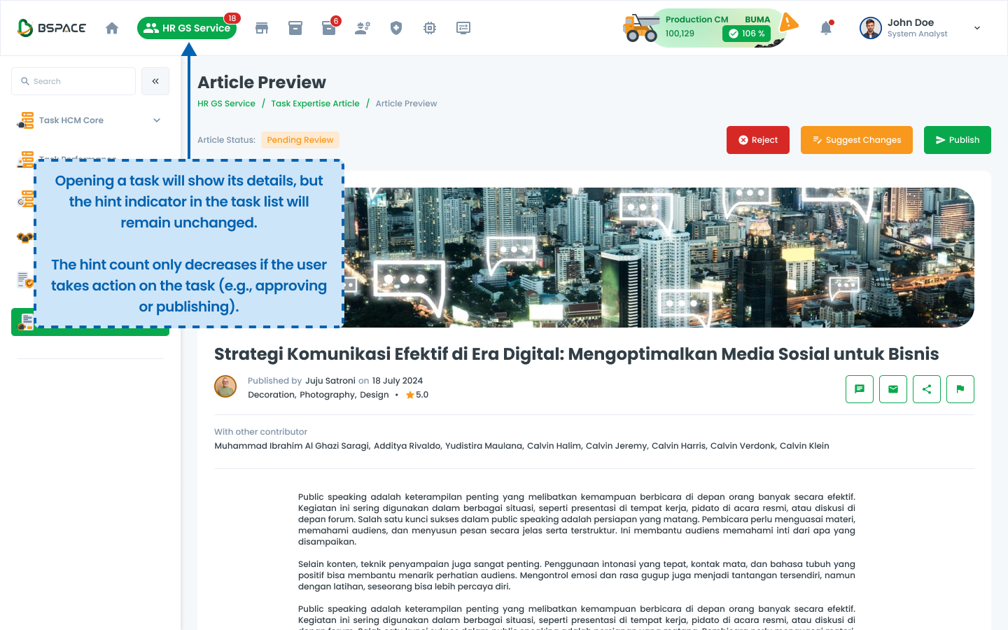
Clicking a task opens the detailed task list for review and approval.
Opening an article task moves it from the pending list to an updated status.
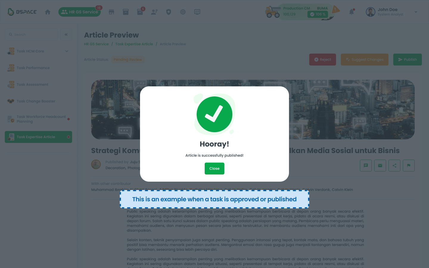
When a task is approved, a success confirmation appears.
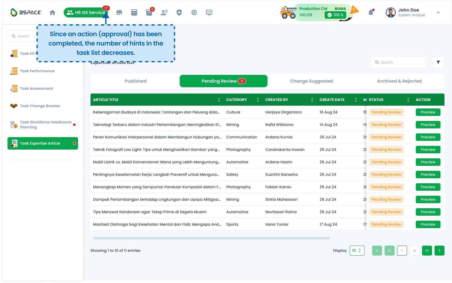
The number of pending tasks decreases in the menu header.
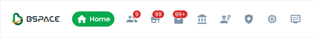
Placement on Icons
These examples illustrate the correct implementation of the notification pattern, including size, placement, and design elements.
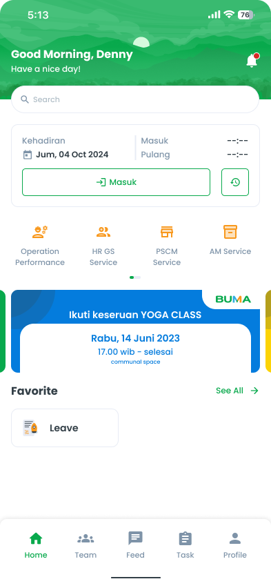
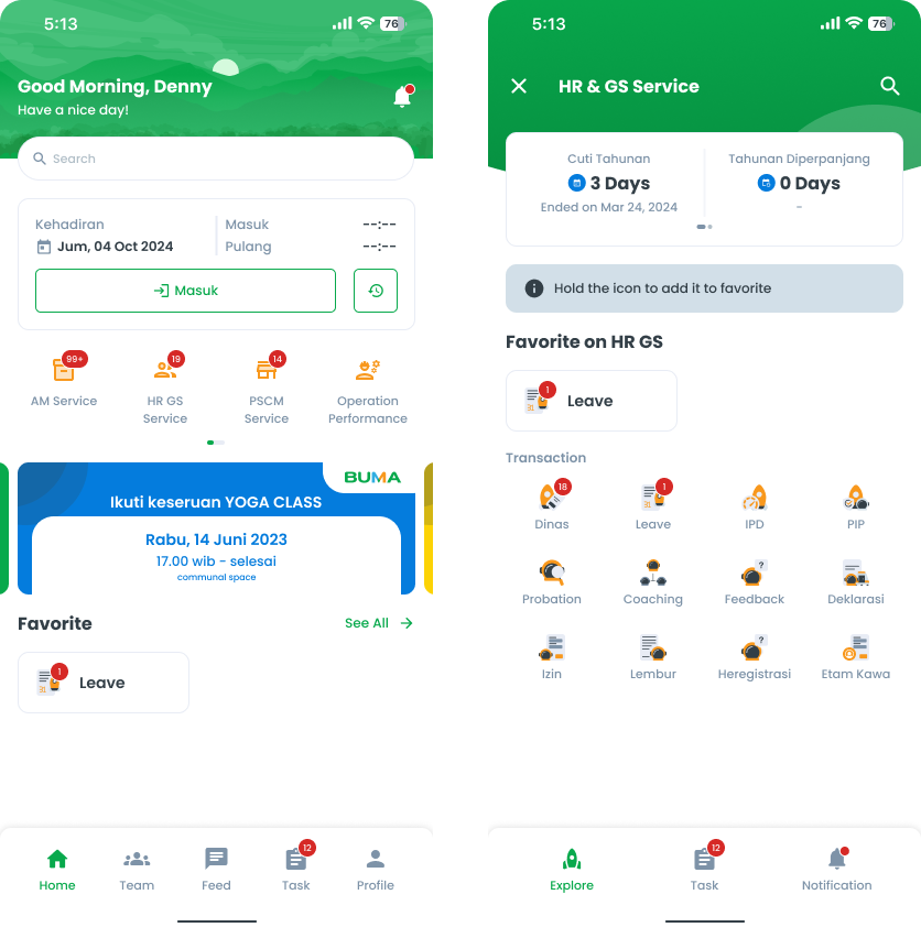
Mobile Hint Notification
Here is an example of flow notification on mobile
Hint on Notification
Features that have notifications will always appear on the far left.
Hint on Menu (Outstanding Task)
By default, the service menu order follows this sequence: Operation Performance, HRGS, PSCM, AM, Finance, and so on.
However, when there are outstanding tasks, the order changes dynamically. The service with the highest number of outstanding tasks moves to the far left, ensuring that the most critical or backlogged tasks receive priority attention.
- If the notification count exceeds 99 (e.g., 123), display "99+" instead. This approach ensures better readability, prevents UI clutter, and maintains a clean, user-friendly design. Additionally, the space allocated for the notification indicator is usually very small, making it impractical to display larger numbers clearly. Displaying an exact count for high numbers is often unnecessary and could overwhelm users.