 Design
 Vue
Vue Flutter
Anatomy
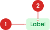
Have a Label.
- Circle as an instance of the swap component
- The use of the icon on the badge will be taken from the Material Design Icon that has been provided
Usage
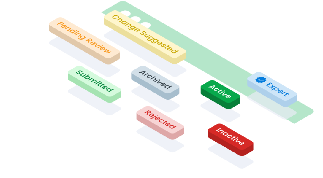
Badges serve the purpose of showing numerical information, such as total items, pending tasks, or unread messages. When an interactive annotation is required, opting for a label might be more appropriate. Typically, badges are used in filtering interfaces to represent the count of selected options within a toolbar or dropdown menu.
- Give a status update on a piece of information or action.
- Marking something as “recommended” or “requiring attention.”
- Highlight that an object has been recently added.
- Highlight e.g. offers.
Usage Variant Color
| VARIANT | USAGE RECOMMENDATION |
|---|---|
Success |
|
Secondary |
|
Info |
|
Warning |
|
Danger |
|
Neutral |
|
Accessibility
Using Icon
Used to to provide additional context or visual representation alongside the textual content of the badge. Icons can enhance understanding and recognition, particularly for users who rely on visual cues.
Using Color Reverse
Badge component offers a reverse color option, presenting an alternative bold visual style for users who prefer a more prominent display.
Color Reverse as a State
The reverse state is used to highlight information or draw special attention to a specific element within a table, especially when the table row is selected.
Color Reverse as a Variant
A badge with the reverse variant is used outside of tables to draw attention to important information or to differentiate it from the surrounding context.
Content
Use one word and use only two words if you need to describe a complex state.
Don’t use special characters as part of badge text.
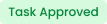
Use past tense to describe the status of an action that is completed.
Each badge should only indicate one status.
Usage
The package is already installed in the repository's shell. To use the component, you only need to add the following code:
<BBadge />
Attributes
If there is a question mark ? in the Data Type, it means the property is optional.
| Property | Data Type | Description | Daefault Value |
|---|---|---|---|
| label | string? | The label text displayed on the button. | Badge |
| variant | string? | The style variant of the badge | success |
| reverse | boolean ? | Switches text and background colors. | false |
| block | boolean ? | Makes the badge take up the full width of its container. | false |
Variants
This badge component supports the following variants:
| Variant | Description |
|---|---|
| success | Used to indicate that a process, action, or request is pending or in progress. |
| waiting | Used to indicate that a process, action, or request is pending or in progress. |
| draft | Used to to denote content or items that are in a preliminary or unfinished state. |
| revise | Used to to indicate that content or elements require review or revision before finalization. |
| reject | Used to to signify that content, actions, or requests have been declined or rejected. |
| neutral | Used to represent a neutral or standard state, lacking any particular status or significance. |
- You can use these components by accessing the provided resource files.
- Preview animations are examples and may not suit Mobile Widgets. Press 'View Code' to access the Widgetbook Playground and see the Flutter widget displaying all created components and interactive.
Usage
Import this line to your file:
import 'package:buma_design_system/buma_design_system.dart';
Attributes
If there is a question mark ? in the Data Type, it means that the properties are optional
| Properties | Data Type | Description | Default Value |
|---|---|---|---|
| label | String | Displays text to the center of badge | null |
| state | UIBadgeState | A state option to display several badge variants | UIBadgeState.success |
| leftIcon | IconData? | Displays the icon on the left of label | null |
| reverseColor | bool? | A switch to make the background and label colors reverse | false |
| alignment | MainAxisAlignment | The alignment label | MainAxisAlignment.center |
UIBadgeState
A variant state for different state badges.
| Properties | Description |
|---|---|
| Used to indicate that successfull process or action | |
| Used to indicate that a process, action, or request is pending or in progress | |
| Used to to denote content or items that are in a preliminary or unfinished state, typically requiring further editing or completion | |
| Used to to indicate that content or elements require review or revision before finalization | |
| Used to to signify that content, actions, or requests have been declined or rejected | |
| Used to represent a neutral or standard state, lacking any particular status or significance |
Variants
You can call the components with Class.namedConstructor() with different variants.
Success
Used to indicate that a process, action, or request is submitted or done. Example use cases:
- Confirmation of a successful submission
- Completion of a task or process without errors
- Achievement of a milestone or goal
 UIBadge(
   label: 'Label',
   state: UIBadgeState.success,
 )
Waiting
Used to indicate that a process, action, or request is pending or in progress. Example use cases:
- Indication of a pending approval or confirmation
- Displaying the status of a task that is currently being processed
- Signifying a waiting period for a user action or response
 UIBadge(
   label: 'Label',
   state: UIBadgeState.waiting,
 )
Draft
Used to to denote content or items that are in a preliminary or unfinished state, typically requiring further editing or completion. Example use cases:
- Identifying draft versions of documents or projects
- Marking incomplete forms or entries that need further refinement
- Highlighting work in progress that has not yet been finalized
 UIBadge(
   label: 'Label',
   state: UIBadgeState.draft,
 )
Revise
Used to to indicate that content or elements require review or revision before finalization. Exaxmple use cases:
- Notifying users about content that needs revision or updating
- Flagging errors or inconsistencies that need correction
- Requesting additional edits or improvements before approval
 UIBadge(
   label: 'Label',
   state: UIBadgeState.revise,
 )
Reject
Used to to signify that content, actions, or requests have been declined or rejected. Example use cases:
- Communicating rejection of submitted content or requests
- Indicating declined actions
- Denoting items that do not meet specific criteria or standards
 UIBadge(
   label: 'Label',
   state: UIBadgeState.reject,
 )
Neutral
Used to represent a neutral or standard state, lacking any particular status or significance. Eaxmple use cases:
- Displaying default or standard items without any special attributes
- Indicating items that are neither in progress nor completed
- Providing a visual distinction for items that do not fall into other predefined categories
 UIBadge(
   label: 'Label',
   state: UIBadgeState.neutral,
 )
With Icon
Used to to provide additional context or visual representation alongside the textual content of the badge. Icons can enhance understanding and recognition, particularly for users who rely on visual cues.
- Circle as an instance of the swap component
- The use of the icon on the button will be taken from the Material Design Icon that has been provided
 UIBadge(
   label: 'Approve',
   state: UIBadgeState.success,
   leftIcon: Icons.check,
 )
Alert Color Reverse
Alert offers a reverse color option, presenting an alternative bold visual style. This is particularly used for floating and non-fixed alerts.
UIBadge(
   label: 'Label',
   state: { badge_state },
   colorReverse: true,
 )