Buma UI - DocumentationBuma UI - Documentation
Get Started
Foundations
Components
Resources
Patterns
Data Visualization
Back to BSpace
Get Started
Foundations
Components
Resources
Patterns
Data Visualization
  • stacksFoundations
    • 💡 Overview
    • Color
    • Principle
    • Typography
  • brickComponents
    • 💡 Overview
    • Accordion
    • Alert
    • Avatar
    • Badge
    • Bottom Sheet
    • Bread Crumb
    • Button
    • Button Link
    • Button Navigation
    • Calendar
    • Card
    • Chat
    • Checkbox
    • Chips
    • Choice Tile
    • Comment
    • Date Picker
    • Divider
    • Download
    • Drawer
    • Dropdown
    • Empty State
    • Floating Button
    • Form Input
    • Header
    • Hint
    • Icon
    • List Choice
    • Loading
    • Modal
    • Navigation Bar
    • Notification
    • Pagination
    • Progress Bar
    • Radio Button
    • Search
    • Scrolling Bar
    • Segmented Switch
    • Side Menu
    • Side Tab
    • Slider
    • Switch
    • Tab
    • Table
    • Text Area
    • Text Input
    • Time Picker
    • Title
    • Toast
    • Tooltip
    • Wizzard
  • splitscreenPattern
    • 💡 Overview
    • Filter
      upcoming
    • Form
      upcoming
    • Notification
    • PWA
      upcoming
    • table
      upcoming
    • Upload Download
      upcoming
  • insert_chartData Visualization
    • 💡 Overview
    • Tiering
    • Pattern
    • Chart and Graph
      • Chart Selection Guide
      • Map Selector
      • Donut Chart
      • Donut Progress Bar Chart
      • Spider Chart
      • Line Chart
      • Chart Area
      • Speedometer
      • Heat Map
      • Scatter Plot
      • Pie Chart
      • Bar Chart
      • Waterfall Chart
      • Sunburst Chart
      • Tree Decomposition Chart
      • Scorecards
      • Table
      • Micro Visualization
    • Typography
    • Color Palette
  • data_objectTokens
    upcoming
  • inventory_2Resources
    • 💡 Overview
    • Mobile
      new
      • 💡 Introduction
      • Installation
      • General
        • Important Rules
        • Naming Convention
        • Clean Architecture
    • Web
      upcoming
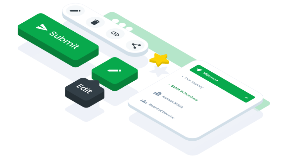
ComponentsList ChoiceThe List Choice component offers users a selection interface presented in a list format. It provides variations to accommodate different use cases and user preferences, such as including descriptions, icons, buttons, or checkboxes within each list item.
Guidelines
Web
Mobile
Resources
  • You can use these components by accessing the provided resource files.
  • Preview animations are examples and may not suit Mobile Widgets. Press 'View Code' to access the Widgetbook Playground and see the Flutter widget displaying all created components and interactive.

Usage

Import this line to your file:

import 'package:buma_design_system/buma_design_system.dart';

Attributes

If there is a question mark ? in the Data Type.

PropertiesData TypeDescriptionDefault Value
titleString?Displays title of choicenull
subTitleString?Displays subtitle of choicenull
iconIconData?Displays a prefix iconnull
hasIntroduceDismissablebool?Optional to displays introduction usage for dismissible widgetfalse
suffixButtonUIChoiceButton?Displays a suffix buttonnull
checkboxUICheckboxButton?Displays a checkboxnull
onConfirmDismissUIConfirmDismiss?Callback confirmation dismissnull
onDismissedUIOnDismissed?Callback dismissiblenull
onTapVoidCallback?Callback when user pressed/tap the choice itemnull

Previews & Code

You can call the components with Class.namedConstructor() with different variants

UIChoice
 UIChoice(
   key: UniqueKey(), //Required
   title: 'Label',
   subTitle: 'Label',
   icon: Icons.abc,
   hasIntroduceDismissable: false,
   checkbox: UIChoiceCheckbox(
    value: true,
    onChanged: (bool? value){
      // Do something
    }
   ),
   onConfirmDismiss: (DismissDirection direction){
     // Do something
   return false;
   },
   onDismissed: (DismissDirection direction){
     // Do something
   },
   onTap: (){
     // Do something
   }
 )
arrow_back
Previous Icon
Next Loading
arrow_forward