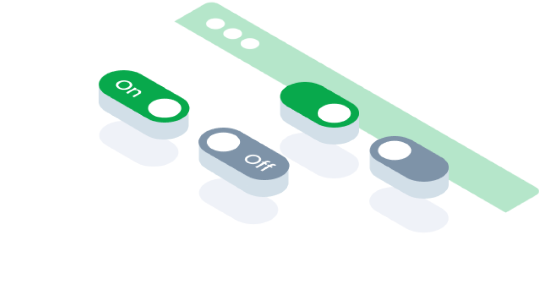
ComponentsSwitchA switch button is a user interface element that toggles between two states, typically on and off, allowing users to enable or disable a specific setting or feature.
Guidelines
Web
Resources You can use these components by accessing the provided resource files.
Usage
The package is already installed in the repository's shell. To use the component, you only need to add the following code:
<BSwitch />
Attributes
If there is a question mark ? in the Data Type, it means that the properties are optional.
| Properties | Data Type | Description | Default Value |
|---|---|---|---|
| id | string? | Identifier for the switch button | none |
| modelValue | string | The value of the switch button | none |
| disabled | boolean | Disables the switch button | none |
| required | boolean | Marks the switch as required | none |
| inputClass | string | Adds a custom class to the input element | none |
| variant | string | Switch variant (e.g., color style) | primary |
| small | boolean | Renders a smaller version of the switch | none |
| labelOn | string? | Label displayed when the switch is "on" | none |
| labelOff | string? | Label displayed when the switch is "off" | none |
| disabledLabel | string? | Label displayed when the switch is disabled | none |
| noLabel | boolean | Hides the label for the switch | none |
| filled | boolean | Applies a filled style to the switch | none |
| label | string? | Label text for the switch | none |
Variant
The <BSwitch> component supports the following variants:
| variant | Description |
|---|---|
| primary | switch use primary color |
| danger | switch use danger color |
Mobile
Resources
- You can use these components by accessing the provided resource files.
- Preview animations are examples and may not suit Mobile Widgets. Press 'View Code' to access the Widgetbook Playground and see the Flutter widget displaying all created components and interactive.
Usage
Import this line to your file:
import 'package:buma_design_system/buma_design_system.dart';
Attributes
If there is a question mark ? in the Data Type, it means that the properties are optional.
| Properties | Data Type | Description |
|---|---|---|
| value | T? | Displays value of actions. |
| label | String? | Displays additional label right of different action widget. |
| isFilled | bool | Make action has container, background and bordered. |
| isError | bool | When user interface indicates that something has gone wrong or that user input is incorrect or invalid |
| onChanged | ValueChanged<T?>? | Callback when action has changed. |
Previews & Code
You can call the components with Class.namedConstructor() with different variants.
Switch
This switch variant includes a hierarchical design, where a parent switch dynamically reflects the state of its child switches. If all child switches are enabled, the parent switch turns on; if none are enabled, it turns off. A mixed state is indicated when some, but not all, child switches are enabled.