 Design
 Vue
Vue Flutter
Anatomy
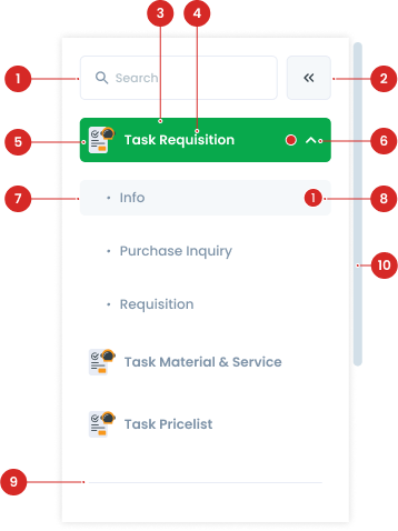
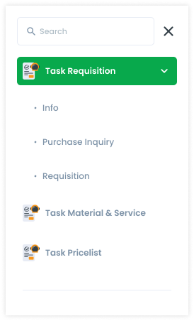
Interactive elements for actions like collapsing or expanding the menu.
The container for all menu items.
The text describing each menu item.
An icon representing the menu item.
A visual indicator used to expand or collapse sections within the menu.
Nested menu items that expand or collapse under a parent menu item.
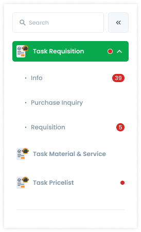
Displaying the number of outstanding tasks.
Separates groups of menu items for better visual organization.
Appears when the content exceeds the side menu's height.
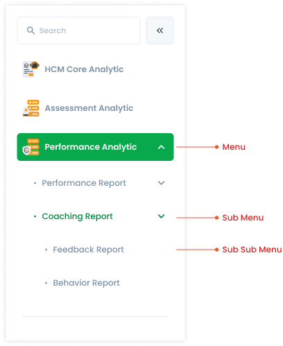
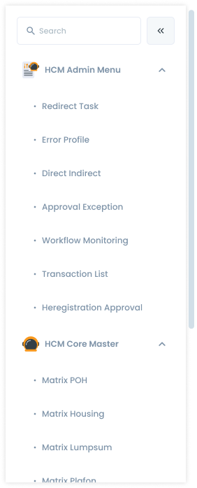
Side Menu Variant
| VARIANT | USAGE RECOMMENDATION |
|---|---|
Menu |
|
Sub Menu |
|
Sub Sub Menu |
|
Side Menu Expand/Collapse
There are 2 types of side menus, the first is expand (default) which displays the title text and a small hint on the menu, and a hint with numbers on the sub menu. The second is collapse which only brings up an icon and small hint which is located at the top right of the icon. Side menu can change from expand to collapse or collapse to expand by pressing the arrow icon.

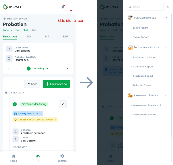
Side Menu PWA
When using the side menu in a Progressive Web App (PWA), there are specific behaviors to note:
- Icon Display - When transitioning from a desktop to a mobile view, a side menu icon appears at the top right of the screen.
- Icon Interaction - Clicking the side menu icon will cause the side menu to slide out from the right side of the screen.
- Background Dimming - As the side menu appears, the background (the content of the page that is covered by the side menu) will dim. This dimming effect helps focus the user's attention on the side menu and indicates that the underlying content is not currently interactive.
Usage example
Side Menu State
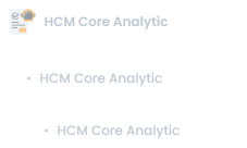
Micro interaction refers to a small, specific interaction that a user has with a product or system. Hover, active, and disable are three examples of micro interactions that are commonly used in BSpace. They are important because they help users understand how to interact with a system and provide feedback on their actions, making the overall user experience more intuitive and satisfying.
Usage
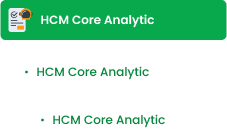
The Side Menu is a navigation component typically used in web or mobile applications to provide structured access to various sections of the application.
Key Considerations
- Use for navigation when the application has multiple hierarchical levels.
- Position on the left side of the screen.
- Ensure it is responsive and adaptable to different screen sizes.
Accessibility
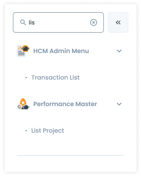
Search
Search interaction occurs when a user enters text into a search field. As the user types, the system may display suggestions or auto-complete the query to help the user find what they are looking for. This search bar only displays what is on the page/side menu. For example, a user is on the Transaction page and then searches for a function from Analytics, so the search returns no results.
Hint
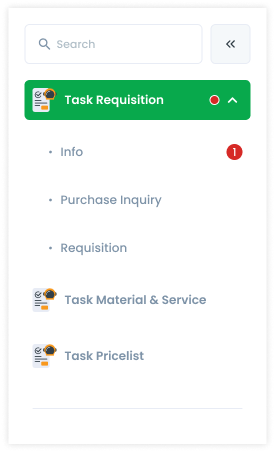
Hint has function as a notification that there is an action that needs to be performed in that function. Or to find out how many to-do lists are currently outstanding, so that the user can immediately find out the number of to-do lists that must be completed. The hint on the menu is just a red dot, while the hint on the sub menu has a number for the number of actions that must be performed.
- For menu items, hints are displayed as dots with no numbers.
- Sub menu items can have numerical hints up to 2 digits. If the number exceeds 99, it is displayed as "99+."
- Sub sub menu items do not have hints.
Scrollbar
If the side menu exceeds the length of the page, a scrollbar appears outside the side menu. This scrollbar can be by click or scroll from the mouse. At the very bottom of the menu list, there is a divider which functions to indicate that it is the end of the side menu. The menu has an icon (the icon follows the cluster service), while the submenu doesn't (only the dot icon). Then the order in the side menu follows the order in the Cluster Service. The order of the submenus is based on the business process. If there is no sequence of business processes, then it is based on the user's usage intensity.
Content
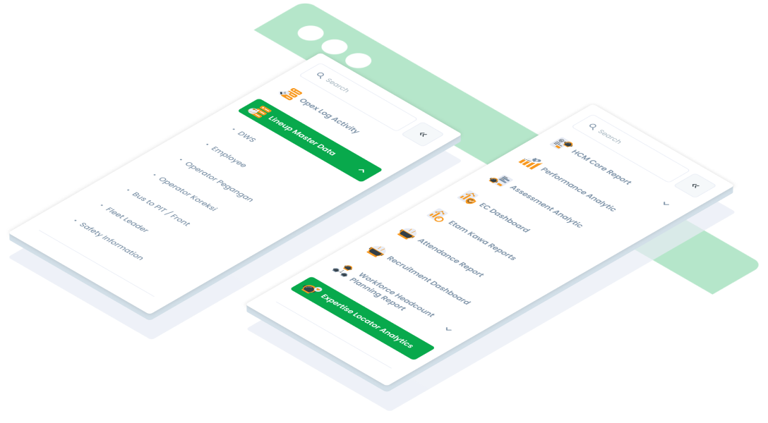
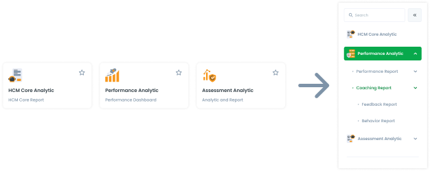
Side Menu and Cluster Service
The side menu is different for each function and service, for example opening the Analytics page in HR Service, so the side menu that opens is only the features in HR with the Analytic function.
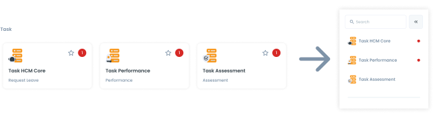
If you want to move to the Task function, you must return to the Cluster Service page first, then select a card in the Task function.
Each side menu has a Search Bar which is located above the element. This search bar only displays what is on the page/side menu. For example, a user is on the Transaction page and then searches for a function from Analytics, so the search returns no results.