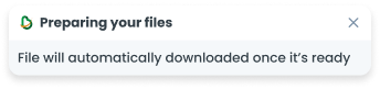
ComponentsToastThe Toast component is a non-intrusive notification element that briefly appears to provide users with important messages, alerts, or feedback.
Guidelines
Anatomy
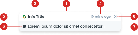
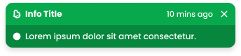
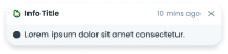
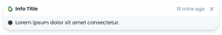
Label to indicate the title of toast.
Use colored logo in default variant, and white logo in success & error variant. You can use it or not, depends on the usage.
To close the toast.
(Optional) Displays icons that provide additional visual context to the user.
Contains a description of the information.
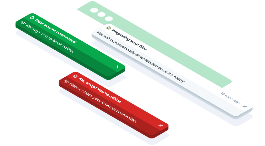
Toast Variant
Primary
Secondary-light
Secondary-white
| VARIANT | USAGE RECOMMENDATION |
|---|---|
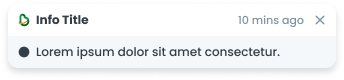
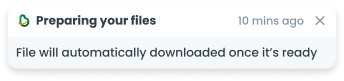
Default | Utilize the Default Toast variation for general notifications, informative messages, or neutral feedback. Example use cases:
|
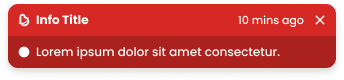
Error | Apply the Error Toast variation to alert users about errors, issues, or critical failures that require immediate attention. Example use cases:
|
Success | Implement the Success Toast variation to confirm successful actions, completion of tasks, or positive outcomes. Example use cases:
|
Variant on Size
S (328px x 64px)
Utilize the Size S option for compact notifications with concise content or limited space availability.
M (504px x 64px)
Apply the Size M option for standard-sized notifications with moderate content length and visibility.

L (1032px x 64px)
Implement the Size L option for wide notifications with extensive content or enhanced visibility.
Usage
Usage Recommendation:
- Provide a contextual message based on a user's action in the same view the action took place.
- The message should be a concise full sentence that ends with a period.
Accessibility
Timestamp
Has Timestamp
If a toast notification needs to be dismissed, include a timestamp indicating how long the toast has been displayed.

No Timestamp
If the toast is set to automatically close after a specific time, there is no need to include the timestamp.
Content
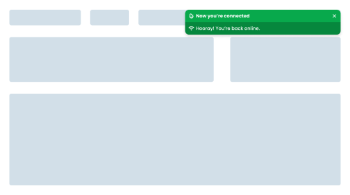
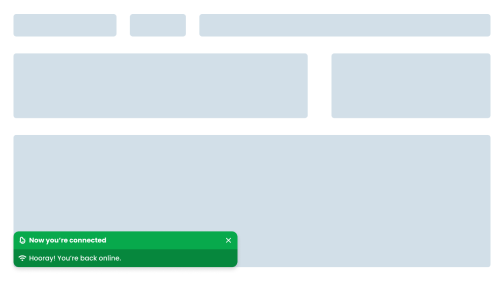
Consistent Positioning
Place toasts in a consistent position throughout the app, it must be at the top right of the screen.
Do's
Don't
Provide Manual Dismiss Option
Add a close button so users can close the toast or dismiss the toast before the timer ends.
Do's
Don't
Web
Resources You can use these components by accessing the provided resource files.
Usage
The package is already installed in the repository's shell. To use the component, you only need to add the following code:
<BToast />
Attributes
If there is a question mark ? in the Data Type, it means that the properties are optional.
| Properties | Data Type | Description | Default Value |
|---|---|---|---|
| title | String | Toast title | Title |
| message | String | Toast message | Message |
| variant | String? | Variant used for change toast color | default |
| size | String? | Size used for change toast width | md |
| items | ToastItems[] | Items for multiple Toast | none |
| time | string? | Time description in the top right corner | 10 mins ago |
| show | Boolean? | If true, a toast will be shown | true |
| autoHide | Boolean? | Toast will automaticly close | true |
| delay | Number? | Toast will closing after delay | 5000 |
Variants
The <BToast /> component supports the following variants:
| Variant | Description |
|---|---|
| default | Utilize the Default Toast variation for general notifications, informative messages, or neutral feedback. |
| success | Implement the Success Toast variation to confirm successful actions, completion of tasks, or positive outcomes. |
| error | Apply the Error Toast variation to alert users about errors, issues, or critical failures that require immediate attention. |
Size
The <BToast /> component supports the following sizes:
| Size | Description |
|---|---|
| sm | BToast width use 328px. Utilize the Size S option for compact notifications with concise content or limited space availability. |
| md | BToast width use 504px. Apply the Size M option for standard-sized notifications with moderate content length and visibility. |
| lg | BToast width use 1032px. Implement the Size L option for wide notifications with extensive content or enhanced visibility. |
Toast Items
The <BToast /> items must be filled, with this data:
| Properties | Data Type | Description | Default Value |
|---|---|---|---|
| title | String | Toast title | Title |
| message | String | Toast message | Message |
| variant | String? | Variant used for change toast color | default |