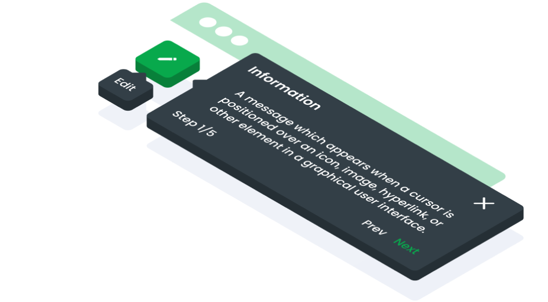
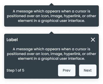
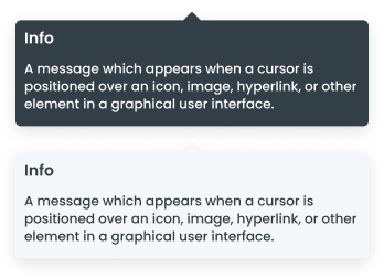
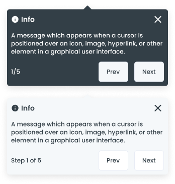
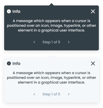
Anatomy
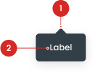
The text or information displayed within the tooltip container.
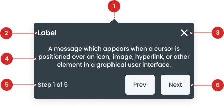
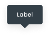
Title of the information.
To close the tooltip (used for tooltips on the onboarding page).
The text or information displayed within the tooltip container.
Display the number of steps available.
Buttons for navigation inside the tooltip.
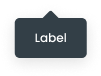
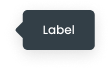
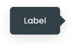
Size on Tooltip

| VARIANT | USAGE RECOMMENDATION |
|---|---|
Small | Small tooltips have a compact size and are typically used to present brief and concise information. Example Usage:
|
Medium | Medium tooltips have a moderate size and are suitable for presenting information of moderate complexity, such as short descriptions or usage instructions. Example Usage:
|
Large | Large tooltips have a bigger size and are used to present more detailed or comprehensive information. Example Usage:
|
Variant on Tooltip
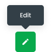
Icon Only Button
Buttons can have icons instead of text, or on either side of the text:
Example of usage:
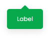
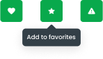
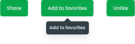
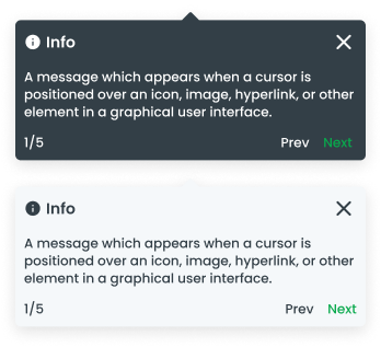
Color
The color of a tooltip can be customized, providing designers with the flexibility to align the tooltip's appearance with the overall visual theme of the UI. This feature allows for consistent branding and aesthetic coherence throughout the user interface.
Color Usage:
- Black: Used to convey important information or messages that require special attention from the user, especially against a light background.
- Green: Green in tooltips is commonly used to provide positive feedback or confirmation to the user.
- White: Used to display clear and neutral information or messages that require attention from the user, particularly against a dark background.
Usage
Usage Recommendation:
- Tooltips are used to provide additional explanations for specific content that would otherwise clutter the UI if permanently displayed. With tooltips, additional information can be provided contextually without sacrificing the clarity of the interface
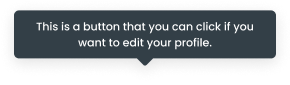
- Provide a brief description of the function of icon-only buttons. This helps users understand the purpose of the button without having to click on it, enhancing the overall user experience.
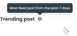
- Used to add context to a given screen. For example, tooltips can be used to explain the function of icons or other UI elements that may not be immediately clear to users (offer hints or additional guidance to users).
When Not to Use:
- Tooltips are used to provide additional explanations for specific content that would otherwise clutter the UI if permanently displayed. With tooltips, additional information can be provided contextually without sacrificing the clarity of the interface'
- Provide a brief description of the function of icon-only buttons. This helps users understand the purpose of the button without having to click on it, enhancing the overall user experience.
- Used to add context to a given screen. For example, tooltips can be used to explain the function of icons or other UI elements that may not be immediately clear to users (offer hints or additional guidance to users).
Don't use tooltips:
- For critical information that the user must read.
- For lengthy text or detailed instructions.
Accessibility
Behavior
Tooltips become redundant when UI elements already incorporate clear and descriptive label text, as the labels alone suffice to convey the function or purpose of the elements.
The tooltip should appear when the trigger element receives focus and should be dismissible when focus is moved away.
Content
Large Tooltip Type
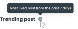
A large tooltip type is used when additional space is required to display more detailed information. This type of tooltip can accommodate longer text or multiple pieces of information, but should still remain concise and avoid overwhelming the user.
Writing Tips
- Be Concise: Keep the tooltip content brief and to the point.
- Be Clear: Use simple and clear language to ensure understanding.
- Avoid Redundancy: Provide information that is not already obvious from the UI.

- You can use these components by accessing the provided resource files.
- Preview animations are examples and may not suit Mobile Widgets. Press 'View Code' to access the Widgetbook Playground and see the Flutter widget displaying all created components and interactive.
Usage
Import this line to your file:
import 'package:buma_design_system/buma_design_system.dart';
Attributes of all variants
If there is a question mark ? in the Data Type, it means that the properties are optional, this is namedConstructor from UITooltip
UITooltip
A custom tooltip with different variants. The purpose of a tooltip is to provide additional context, explanation, or description about the element or component to the user, this widget has 3 variant size : small, medium and large
| Properties | Data Type | Description |
|---|---|---|
| message | String? | Displays text message to tooltip |
| child | Widget? | Displays child to trigger tooltip |
| color | UITooltipColor | Displays different of tooltip color |
UITooltipNavigation.showNavigation
Show navigation tooltip (coach mark) to guide users through the application. This tooltip variant is useful for highlighting specific elements or features within the app, providing step-by-step instructions or additional information to enhance user experience and onboarding.
| Properties | Data Type | Description |
|---|---|---|
| context | BuildContext | A handle to the location of a widget in the widget tree |
| position | UITooltipNavPosition? | Handle position arrow and content of tooltip navigation |
| color | UITooltipNavColor? | The color of tooltip navigation |
| targets | List<UITargetFocus> | A class that handles the target focus |
| opacityShadow | double? | Displays opacity shadow for tooltip |
| buttonType | UITooltipNavButtonType? | The type of button in tooltip navigation |
UITragetFocus
This class targets focus on the coach mark tooltip and provides a flow for users to navigate through the coach mark steps (next or prev).
| Properties | Data Type | Description |
|---|---|---|
| identify | String | The identify of the target focus |
| keyTarget | List<GlobalKey> | The key of multiple target to show higlight widget |
| enableTargetTab | bool | The enable target tab |
| tooltipKey | GlobalKey? | The key to identify focus tooltip |
| title | String? | The title of the tooltip content |
| description | String? | The decription of the tooltip content |
| hasClose | bool? | Enable user to close the tooltip and end the coach mark tutorial |
| buttonNext | UITooltipButtonHandler? | Displays next with custom callback and label |
| buttonPrev | UITooltipButtonHandler? | Displays previous with custom callback and label |
| step | String? | The step of the target focus |
| position | UITooltipNavPosition? | The position of the target focus |
Previews & Code
You can call the components with Class.namedConstructor() with different variants.