
Anatomy

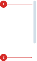
Label to indicate the action.
Variant on Style


| VARIANT | USAGE RECOMMENDATION |
|---|---|
Horizontal |
|
Vertical |
|
Usage
Scroll bars come into play when the content within a container is larger than the visible area, giving users a means to navigate through the overflow content by scrolling to reveal hidden portions.
Usage Recommendation:
- Navigate through content that exceeds the visible area of a UI element, such as a window, panel, or container. This is common in applications where users need to view large amounts of data, such as long documents, lists, or tables.
- Providing an alternative method for users to navigate content, particularly for individuals using assistive technologies or devices with limited input capabilities.
Accessibility
Touch/Drag Support
Ensure that the scroll bar is operable via touch gestures on mobile devices and and can be dragged with the cursor.


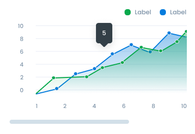
Navigate Data in Charts
Scroll bars in charts are used to enable users to navigate extensive data easily, perform zoom and panning to magnify details or view different time ranges, and provide an intuitive way to control the chart's display according to the user's analytical needs.
- Ensure the tooltip text is concise and descriptive, providing clear guidance on the button’s purpose.
- Use universally recognizable icons to minimize ambiguity and support intuitive user interactions.
- Test the button’s accessibility to confirm that tooltips are properly announced by screen readers and that interactions are smooth.
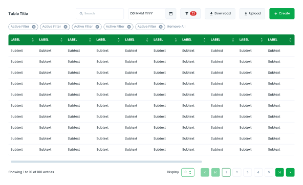
Navigate Data in Tables
Scroll bars in tables are essential for managing large datasets efficiently. They enable users to navigate through extensive data easily, zoom in to magnify details, pan to view different sections, and control the display according to their analytical requirements.
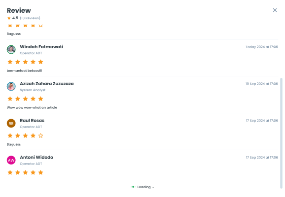
Navigate Data in Pop-ups
Scroll bars in pop-ups help users navigate long content or lists and zoom in on specific details, making it easier to explore information within the limited space of a pop-up window.
Behavior
- Users can interact with the scroll bar by dragging the thumb or using arrow buttons to scroll vertically or horizontally. The choice between horizontal and vertical scroll bars depends on the orientation of the data being displayed and the available space in the user interface (UI) design.
- Ensure that scroll bars are visible and easy to find. They should have enough contrast against the background to be easily distinguishable.
- Make scroll bars responsive to user interactions by providing visual feedback when scrolling occurs.
- Maintain consistency in scroll bar design across the interface. Use the same scroll bar style and behavior throughout the application or website to provide a familiar and cohesive experience for users.
Content
Provide Visual Cues
Provide visual cues or instructions if scrolling is required to access additional content.
- You can use these components by accessing the provided resource files.
- Preview animations are examples and may not suit Mobile Widgets. Press 'View Code' to access the Widgetbook Playground and see the Flutter widget displaying all created components and interactive.
Usage
Import this line to your file:
import 'package:buma_design_system/buma_design_system.dart';
Attributes
If there is a question mark ? in the Data Type.
| Properties | Data Type | Description |
|---|---|---|
| child | Widget | The widget that will be wrapped by the scrollbar |
| controller | ScrollController | The ScrollController for the scrollbar, If no controller is provided, a new ScrollController will be created |
Scrollbar Vertical
final myScrollController = ScrollController();

UIScrollbar(
  controller: myScrollController,
  child: MyScrollableWidget(
    controller: myScrollController,
  ),
)
Scrollbar Horizontal
final myScrollController = ScrollController();

UIScrollbar(
  controller: myScrollController,
  child: MyScrollableWidget(
    controller: myScrollController,
  ),
)