Golden Rule Data Visualization
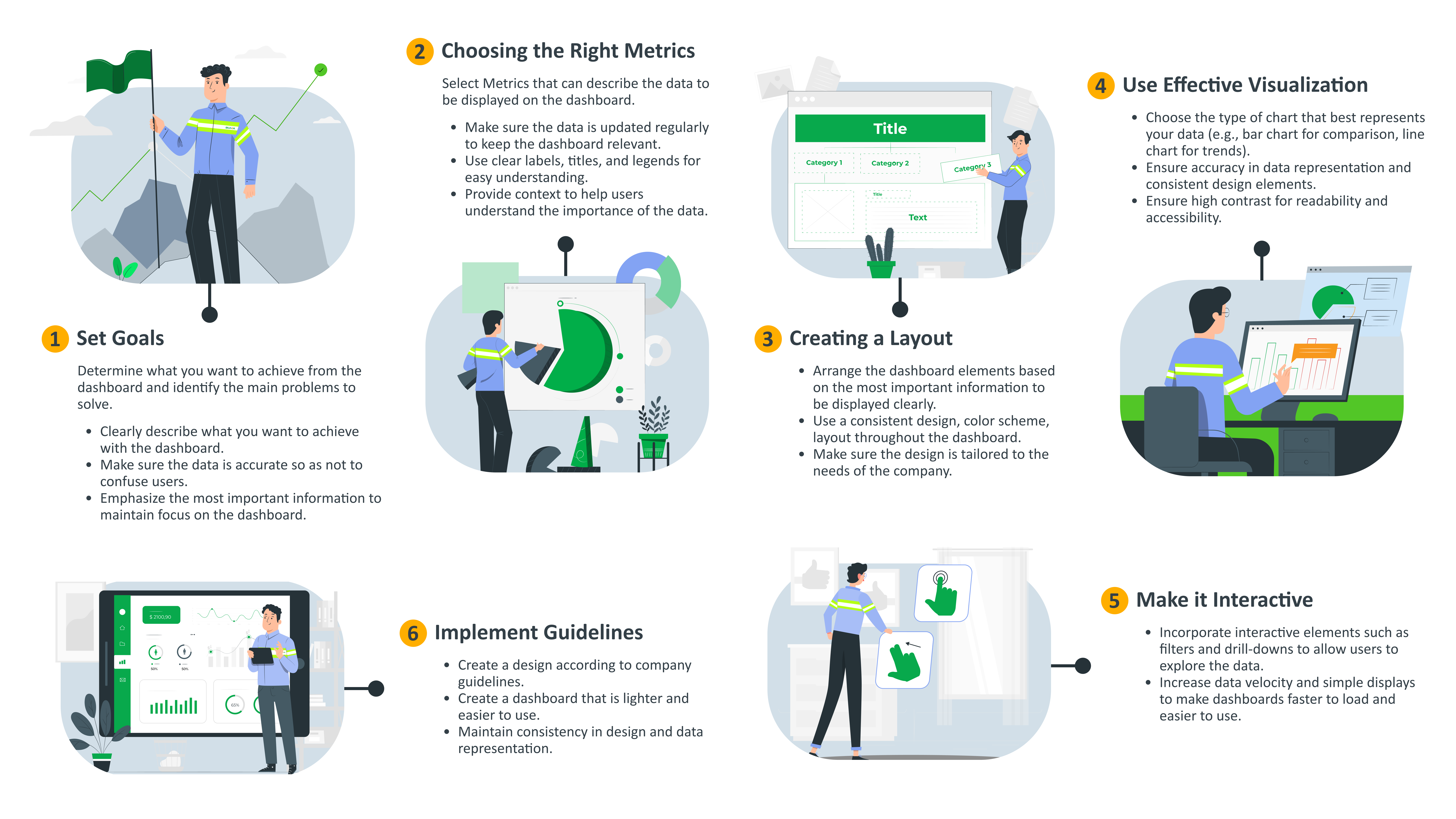
The Golden Rule of Data Visualization is to make data clear, simple, and easy to understand. Focus on showing insights, not just data. Such as, choosing the right chart type, using minimal clutter, and highlighting key points. The goal is to help users grasp the message quickly.
Design Patterns for Power BI Templates
Action
- Allows users to click on data elements to view more details.
- Features to filter and sort data based on various parameters.
- Highlights data elements when hovered over and displays tooltips with additional information.
Navigation
- Navigation menu at the top for global access to the main part of the dashboard.
- Bottom menu for quick navigation between different dashboard sections to dashboard details.
Layout
- Uses a grid layout to place elements in an organised pattern, ensuring visual balance and readability.
- Reorganises elements based on screen size to ensure readability and interactivity on any device.
- Each main dashboard page is required to include a summary score of key data. Additionally, it is recommended that each page contains 3 to 5, but no more than 7 analysis points. Including more than 7 analysis points may confuse users, while too few points may not effectively convey the required insights.
- Create a compact layout and minimise white space. This approach ensures that the dashboard is efficient and effective in presenting data.
Power BI Layout Consistency
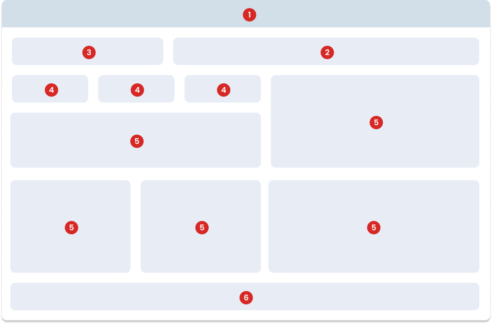
The following dashboard template marked in grey shows the position of each element: Header, Title, Filter, Chart and Footer. The layout for the Score Card and Chart can be customised as needed, the position of the header, title, filter and footer are fixed. The next slide provides a detailed explanation of these layouts.
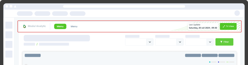
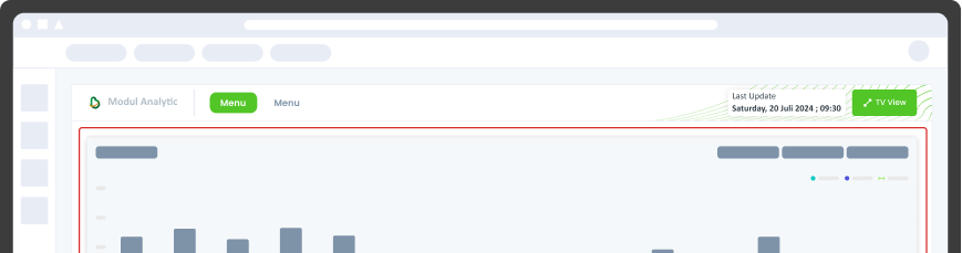
The top of the dashboard includes the Bspace Analytics logo and page navigation. The header also displays the Power BI embed layout area and the cluster feature. Additionally, there are navigation buttons to access other pages within the dashboard. The header component in this Power BI template serves as the main area for navigation and title display. This component is very important for building the overall structure and branding of reports and dashboards. Here are the guidelines for designing the header component.
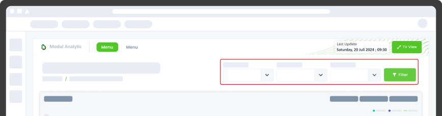
This area is used to filter the data content and is positioned to the right of the title. To maintain good visibility, it is recommended that the number of filters does not overlap with the title.
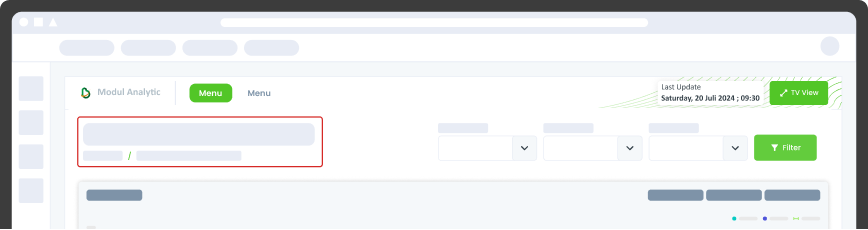
This area displays the dashboard title in the top left corner. This title provides important information for the user and includes a breadcrumb for navigation within Bspace.
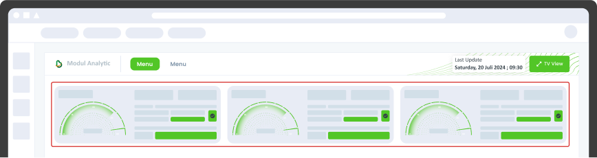
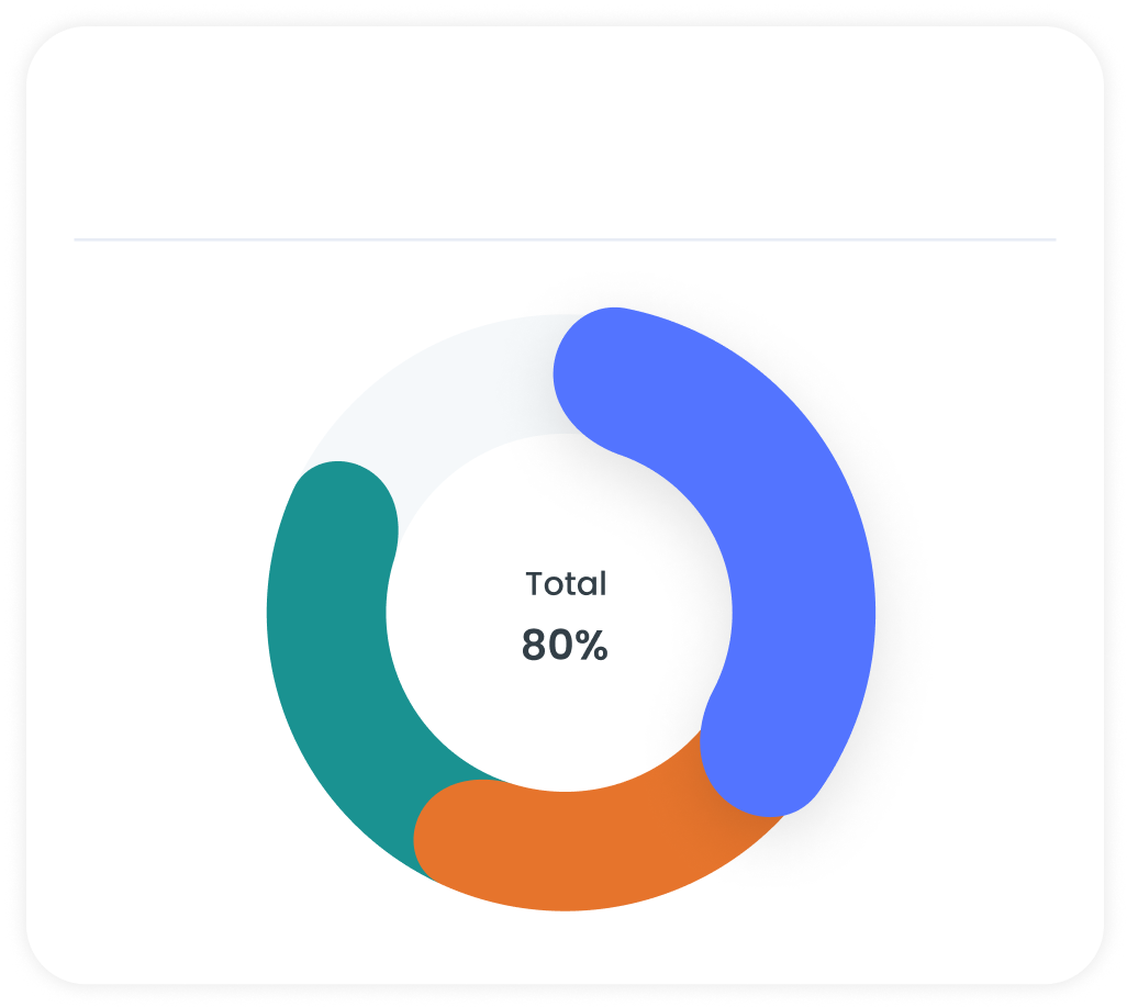
This area is devoted to the Scorecard, which is recommended to be placed below the title. In special cases, Scorecards can be organised vertically, but ensure clear visibility and avoid overlapping with other content.
This is the main content section of the dashboard. The layout should be customised as needed, but should still follow the best practice of chart structure.
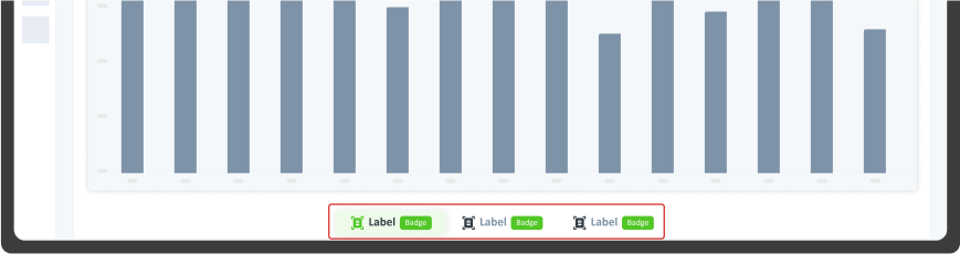
This is the lower part of the dashboard that consists of navigation buttons to connect to various sub-features or other sections within the dashboard. The footer includes navigation buttons that connect to different features or sections within the dashboard. These buttons help users to easily move between different parts of the dashboard without having to scroll up or search through menus.
Balance and Consistency Layout
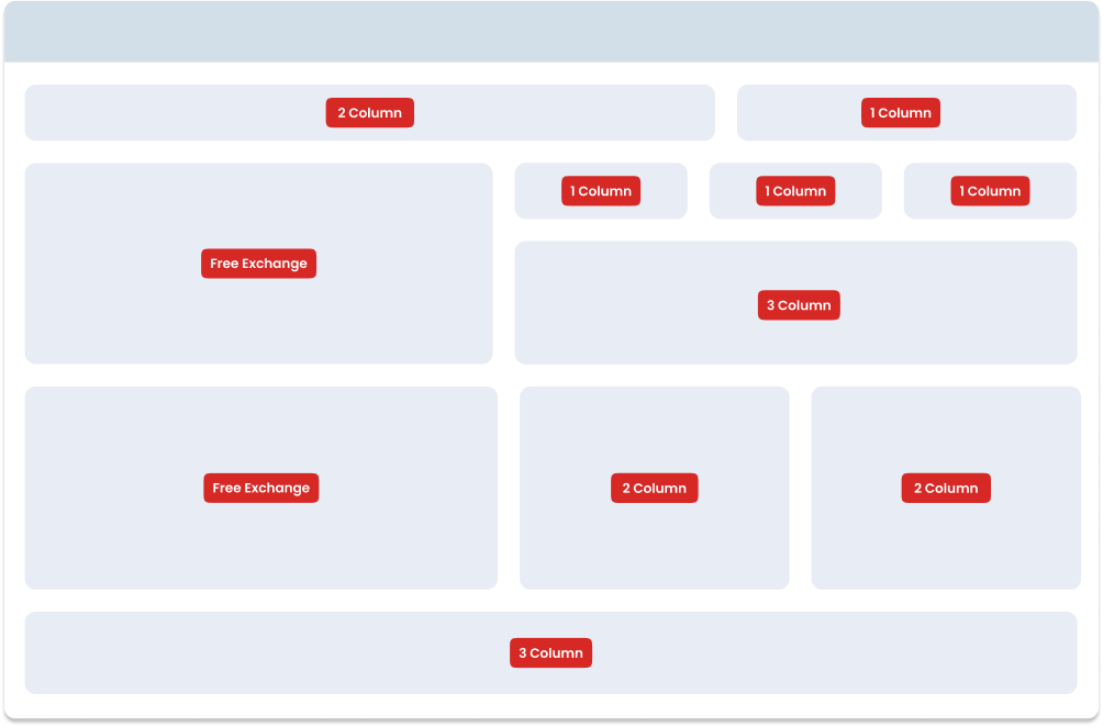
Organise containers in a clear and logical structure. Group related charts together to make the dashboard intuitive and easy to navigate.
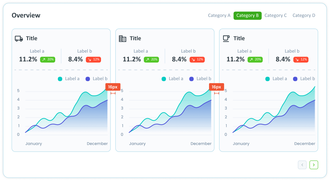
The dashboard page displays graphics of different sizes. In a one-column layout, the containers cover the entire width of the card. In a two-column layout, the containers each cover half the width of the card, with a 16px space between them. In a three-column layout, the containers each cover one-third of the card width, with 16px spacing between each column.
Chart Structure
Make sure all containers are aligned with each other. Horizontal and vertical alignment must be maintained to give the dashboard a clean and professional look.
Maintain consistent spacing between containers. For example, if you use a 16px spacing between columns, make sure this spacing is consistent throughout the dashboard.
Containers should be distributed proportionally. In a multi-column layout, each container should utilise an equal part of the width to maintain symmetry. For example, in a two-column layout, each container should utilise half of the available width, and in a three-column layout, each container should utilise one-third of the available width.
Dos and Don’ts
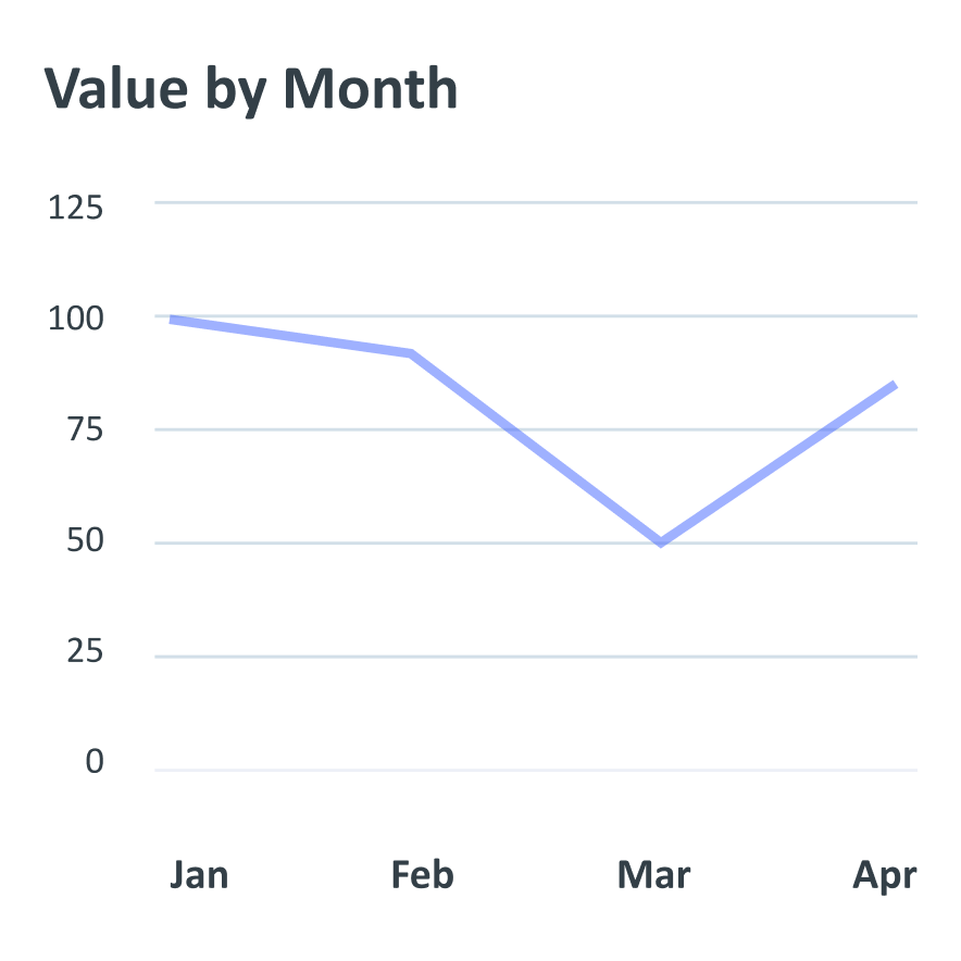
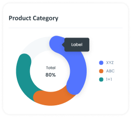
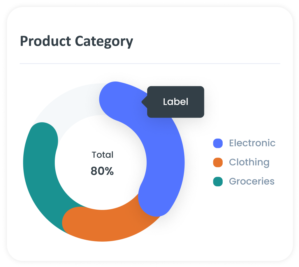
1. Use Clear Labels and Legends
Make sure all axes, data points, and legends are clearly labelled for easy understanding. Don't fail to provide explanations on key points, trends, or anomalies that keep the audience guessing.

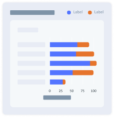
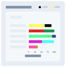
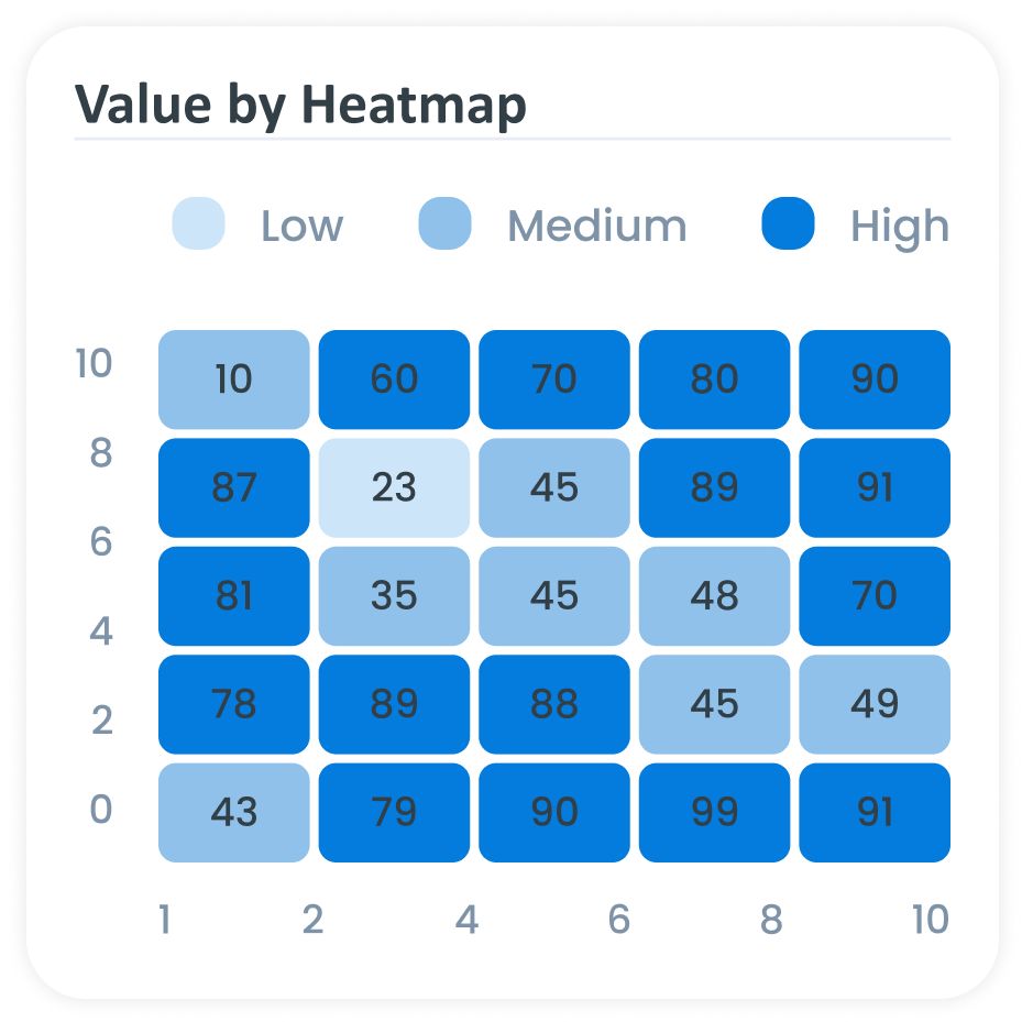
2. Use a Consistent Colour Scheme
Use a consistent colour palette throughout the visualisation to create a neat and professional look. Avoid using too many colours that can be distracting and confusing.
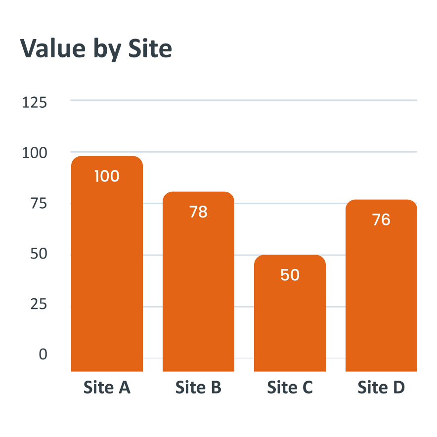
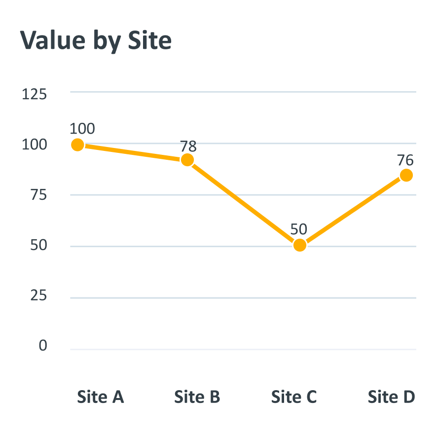
3. Choose the Right Type of Graphics
Choose the type of graph that best fits the data (e.g., bar graph for comparisons, line graph for trends). Don't mix too many types of graphics that may confuse and reduce the clarity of the message.
4. Maintain a Clear Hierarchy
Use visual elements like size, color, contrast, and positioning to guide the viewer's eye from the most important details to the less important ones. Use highlights to make key points stand out in focal areas, like the top or center, to make them easier to see.
5. Provide Context
Add a clear title, legend, a short subheading or a brief description. This will help viewers understand the purpose of the data and the insights it provides.
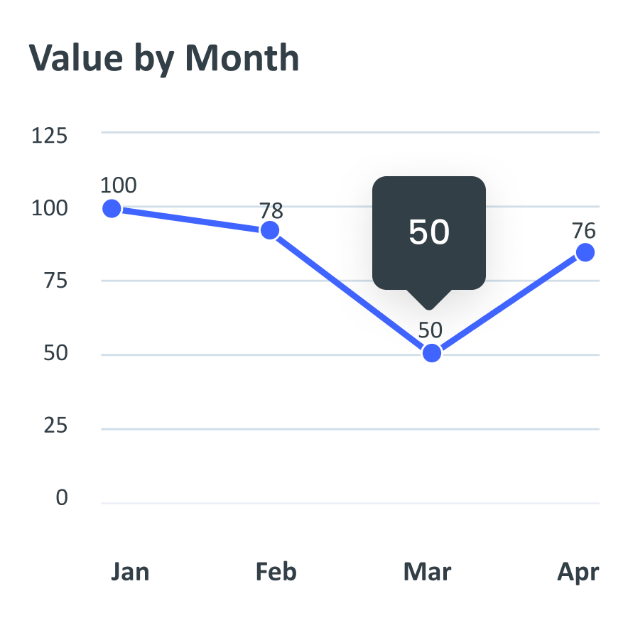
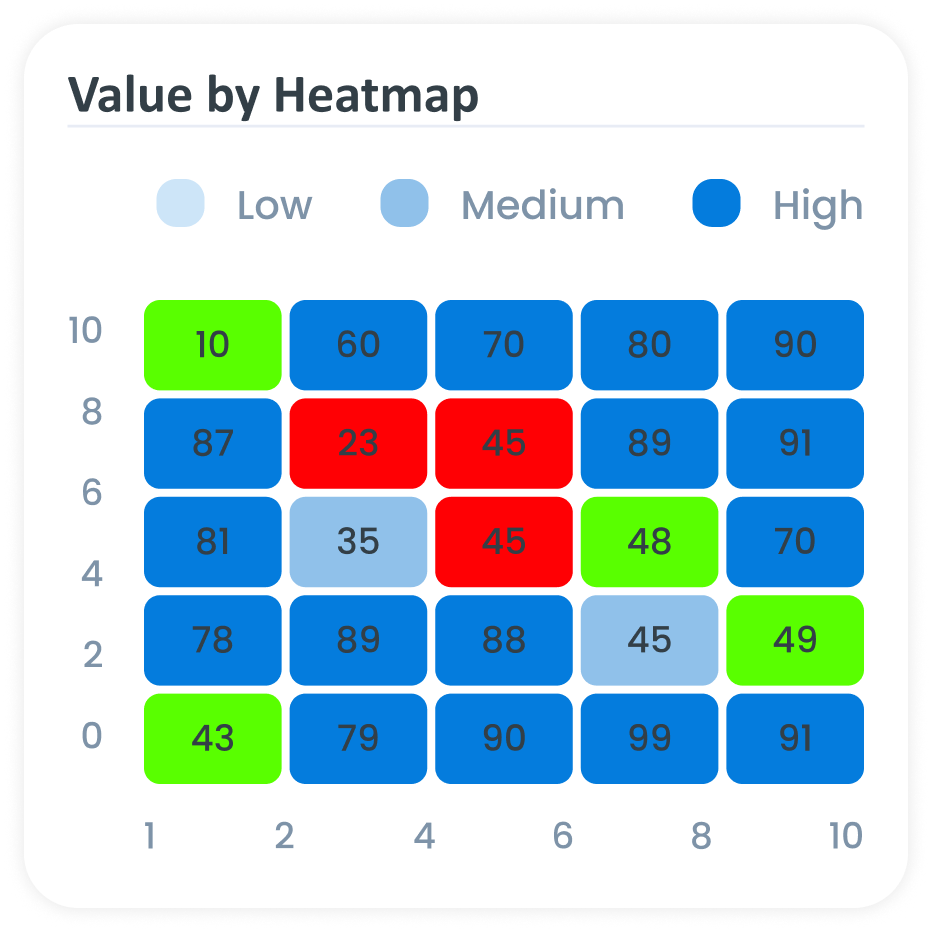
6. Highlight Key Data
Use contrasting colors or annotations to emphasize important points or trends.