Pie Chart
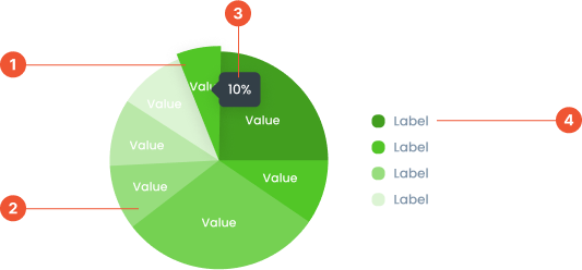
Anatomy
Pie Chart Hover is an interactive enhancement to a pie chart. When a user hovers their cursor over a slice, additional information is displayed.Pie Chart is a circular chart divided into slices, where each slice represents a proportion of a whole. It is used to visualize data as percentages or parts of a total, making it ideal for displaying simple comparisons.
A small box that pops up when you hover over a data point, showing more details about it.
A visual elements that serve as a guide to explain the meaning of various data or elements displayed in a graph
Guidelines for Pie Chart
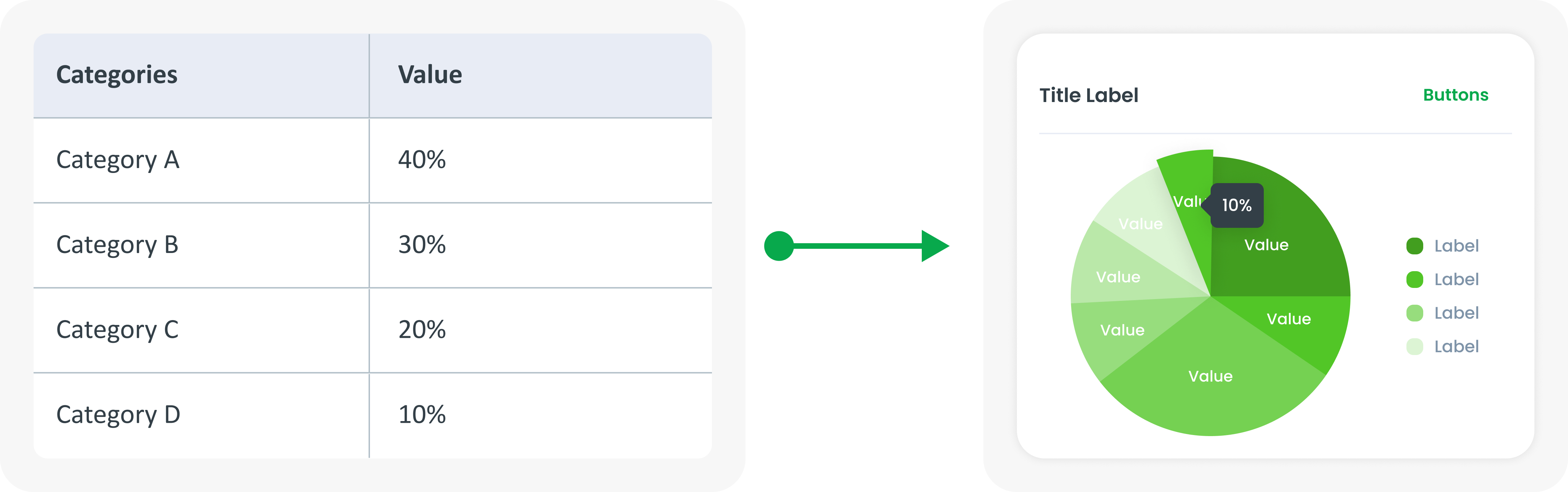
- Displays up to 6-8 data points. If there are more, combine small segments into the "Other" category.
- The value is displayed in the middle of the label or tooltip
- Labels and sub-labels in the center of the graph are optional. They can be used to provide a summary or highlight key metrics, but should be included according to the context and design requirements
Example of Source Data
When to Use Pie Chart?
- Similar to a donut chart, used to show parts of a whole.
- Effective for simple comparisons of multiple categories.
- Good for data sets with a small number of categories.