ComponentsWizzardThe Wizard component is a user interface (UI) element that divides complex processes into sequential, manageable steps.
Guidelines
Web
Mobile
Resources
- You can use these components by accessing the provided resource files.
- Preview animations are examples and may not suit Mobile Widgets. Press 'View Code' to access the Widgetbook Playground and see the Flutter widget displaying all created components and interactive.
Usage
Import this line to your file:
import 'package:buma_design_system/buma_design_system.dart';
Attributes of all variants
If there is a question mark ? in the Data Type, it means that the properties are optional, this is namedConstructor from UIWizzard.
UIWizzardNumber
The wizzard to displays sequential steps in a process.
With each step labeled with a corresponding number. Users navigate through the steps in numerical order, completing tasks or providing information as they progress. Place this wizard on the top of the screen.
| Properties | Data Type | Description |
|---|---|---|
| currentIndex | int | Displays current index of numbers |
| listDropDown | List<T>? | Displays list of dropdown menus |
| onTapDropDown | void Function(T itemDropDown)? | Callback when user tap dropdown wizzard |
| onTapNextPage | void Function()? | Callback when user tap next number |
| onTapPreviousPage | void Function()? | Callback when user tap previous number |
| numbers | List<UIWizzardNumberItem>? | Collection numbers of Wizzard |
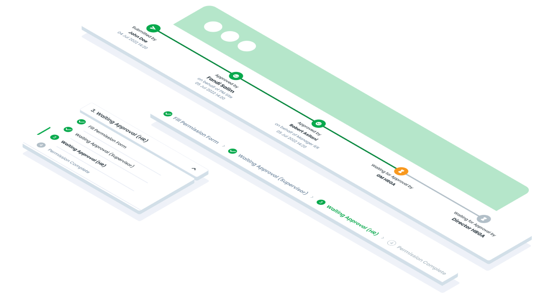
UIWizzardTracking
The wizzard to track user progress and completion status, withing a multi-step process or workflow.
It provides visual feedback on which steps have been completed and which are in progress.
| Properties | Data Type | Description |
|---|---|---|
| items | List<UIWizzardTrackItem> | A list of items to be tracked in the wizard. Each item is an instance of UIWizzardTrackItem |
| isDashedTrack | bool | A flag indicating whether the track should be dashed. If true, the track will be displayed with dashed lines |