Usage
Import this line to your file:
import 'package:buma_design_system/buma_design_system.dart';
Attributes of all variants
If there is a question mark ? in the Data Type, it means that the properties are optional, this is namedConstructor from UICardMenu etc.
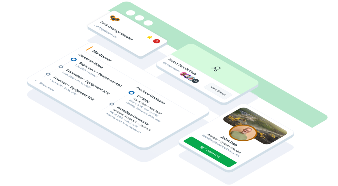
UICardMenu.base
- Suitable for displaying content with a mix of visual and textual details
- Allows users to interact with the content and, potentially, mark it as a favorite
| Properties | Data Type | Description | Default Value |
|---|
| icon | Widget? | Displays icon to the content card, the icon has maxWidth & maxHeight to adjust the size of the UI | null |
| title | String? | Displays title to the content card | null |
| subTitle | String? | Displays subtitle to the content card | null |
| enabled | bool | Make the card interactive | true |
| isFavorite | bool | Mark if the card is a favorite | false |
| valueHint | int? | Displays hint value | null |
| onTapFavorite | VoidCallback? | Callback when user tap favorite icon | null |
| onTap | VoidCallback? | Callback when user tap all content card | null |
UICardMenu.fullbox
- Best for content that needs more visual emphasis or additional detail
- Suitable for showcasing highlights, previewing content, or emphasizing specific elements
| Properties | Data Type | Description | Default Value |
|---|
| banner | Widget? | Displays banner to top of the content card, the banner has static minHeight & maxHeight, to adjust the size of the UI | null |
| icon | Widget? | Displays icon to the content card, the icon has maxWidth & maxHeight to adjust the size of the UI | null |
| title | String? | Displays title to the content card | null |
| subTitle | String? | Displays subtitle to the content card | null |
| enabled | bool | Make the card interactive | true |
| isFavorite | bool | Mark if the card is a favorite | false |
| valueHint | int? | Displays hint value | null |
| onTapFavorite | VoidCallback? | Callback when user tap favorite icon | null |
| onTap | VoidCallback? | Callback when user tap all content card | null |
UICardMenu.small
- Useful for lists or areas where space is limited but interactivity is needed
- Suitable for displaying concise content or options while retaining a clean look
| Properties | Data Type | Description | Default Value |
|---|
| icon | Widget? | Displays icon to the content card, the icon has maxWidth & maxHeight to adjust the size of the UI | null |
| title | String? | Displays title to the content card | null |
| subTitle | String? | Displays subtitle to the content card | null |
| enabled | bool | Make the card interactive | true |
| isFavorite | bool | Mark if the card is a favorite | false |
| valueHint | int? | Displays hint value | null |
| onTapFavorite | VoidCallback? | Callback when user tap favorite icon | null |
| onTap | VoidCallback? | Callback when user tap all content card | null |
UICardMenu.tiny
- Best for very compact spaces, where only minimal information needs to be displayed
- Suitable for displaying concise content or options while retaining a clean look
| Properties | Data Type | Description | Default Value |
|---|
| icon | Widget? | Displays icon to the content card, the icon has maxWidth & maxHeight to adjust the size of the UI | null |
| title | String? | Displays title to the content card | null |
| subTitle | String? | Displays subtitle to the content card | null |
| enabled | bool | Make the card interactive | true |
| isFavorite | bool | Mark if the card is a favorite | false |
| valueHint | int? | Displays hint value | null |
| onTapFavorite | VoidCallback? | Callback when user tap favorite icon | null |
| onTap | VoidCallback? | Callback when user tap all content card | null |
UICardSection
- Useful for grouping related content, such as a list of items, tasks, or categories
- Can support expandable or collapsible functionality for better space management
| Properties | Data Type | Description |
|---|
| title | String? | Displays text title label |
| secondaryButton | UICardSecondaryButton? | Displays secondary button in the right of header content |
| child | Widget? | Displays child content |
UICardProfile
- Best for displaying user information concisely while allowing users to expand for more details
- Useful for user management screens, team overviews, or customer profiles
| Properties | Data Type | Description |
|---|
| avatar | UIAvatarItem? | Displays avatar at the card profile |
| email | String? | Displays email user profile |
| additionalInfo | String? | Displays additional info user profile like, departmen or job position |
| cover | Widget? | Displays cover at top of UICardProfile |
| primaryButton | UICardButton? | Displays primary button at the card profile |
| size | UICardProfileSize | Diplays different size of card profile |
UICardAccordion
- Great for showing/hiding additional details
- Ideal for menus, FAQs, or multi-step processes
| Properties | Data Type | Description |
|---|
| title | Strin? | Displays text title label |
| titleType | UILabelType? | Displays different type size of title |
| borderColor | Color? | Displays border color card |
| child | Widget? | Displays content expanded |
| withColoredHeader | bool | Displays UIColors.primary500 into header when expanded |
| onChange | void Function(bool isExpanded)? | Callback function when the card is expanded or collapsed |
UICardValue
- Highlights important data or values at a glance
- On this card the content has a list of key values
- And has 2 additional optional buttons below it
| Properties | Data Type | Description |
|---|
| icon | IconData? | Displays icon at the left of the content |
| title | String? | Displays title at the top of the content |
| badgeLabel | String? | Displays badge with text label |
| values | List<UICardItem>? | Displays list of items |
| leftButton | UICardButton? | Displays left button |
| rightButton | UICardButton? | Displays right button |
UICardSummary
- Suitable for overviews of data or progress
- On this card the content has a list of key values
- And has 2 additional optional buttons below it
| Properties | Data Type | Description |
|---|
| title | String? | Displays title at the top of content |
| label | String? | Displays label in the content |
| desc | String? | Displays description info in the content |
| additionalInfo | String? | Displays additional info in the content |
| icon | Widget? | Displays icon in the center of content |
| color | UICardSummaryColor | Displays different constant color of content |
| type | UICardSummaryType | Displays different type of summary card |
| items | List<UICardItem>? | Displays list of items UICardSummaryType.soft |
| onTap | VoidCallback? | Callback when user tap card of UICardSummaryType.solid |
UICardNavigation
- Ideal for navigation menus or toolbars
- Helps users quickly switch between different app sections
| Properties | Data Type | Description |
|---|
| menus | List<UICardNavigationMenu>? | Displays all menu of card navigation item title, icon, label, and desc |
| onTap | ValueChanged<int>? | Give callback index int when user pressed |
Previews & Code
You can call the components with Class.namedConstructor() with different variants
Card Base
UICardMenu.base(
icon: Image.asset(),
title: 'Label',
subTitle: 'Label',
enabled: true,
isFavorite: _isFavorite,
valueHint: 1,
onTapFavorite: (){
},
onTap: (){
}
)
Card Fullbox
UICardMenu.fullbox(
banner: Image.asset(),
title: 'Label',
subTitle: 'Label',
enabled: true,
isFavorite: _isFavorite,
valueHint: 1,
onTapFavorite: (){
},
onTap: (){
}
)
Card Small
UICardMenu.base(
icon: Image.asset(),
title: 'Label',
subTitle: 'Label',
enabled: true,
isFavorite: _isFavorite,
valueHint: 1,
onTapFavorite: (){
},
onTap: (){
}
)
Card Tiny
UICardMenu.tiny(
icon: Image.asset(),
title: 'Label',
subTitle: 'Label',
enabled: true,
onTap: () {
}
)
Card Section
UICardSection(
title: 'Label',
secondaryButton: UICardSecondaryButton(
label: 'Label',
onTap: () {
},
),
child: Widget()
)
Card Profile
UICardProfile.large(
  email: 'example@mail.com',
  additionalInfo: 'Function',
  cover: Widget(),
  avatar: UIAvatarItem(name: 'Name'),
  primaryButton: UICardButton(
    label: 'Label'
  ),
)
Card Accordion
 UICardAccordion.colored(
  title : 'Title Label',
  type: UILabelType.body,
  child: Widget()
)
Card Value
UICardValue(
icon: Icons.flight,
title: 'Title Card',
values: List.generate(
10,
(index) => UICardItem(
label: 'Label',
value: 'Example index',
),
),
badgeLabel: 'Badge Label',
leftButton: UICardButton(
label: 'Label',
onTap: (){
}
),
rightButton: UICardButton(
label: 'Label',
onTap: (){
},
),
)
Card Summary
UICardSummary.solid(
title: 'Title',
label: 'Label',
desc: 'Example Description',
additionalInfo: 'Information',
icon: Icons.flight,
color: UICardSummaryColor.green,
onTap: (){
}
)
Card Navigation
UICardNavigation(
menus: [
UICardNavigationMenu(
title: 'Title',
icon: Icons.flight,
label: 'Label',
desc: 'Description',
),
],
onTap: (int index) {
}
)