Watterfall Chart
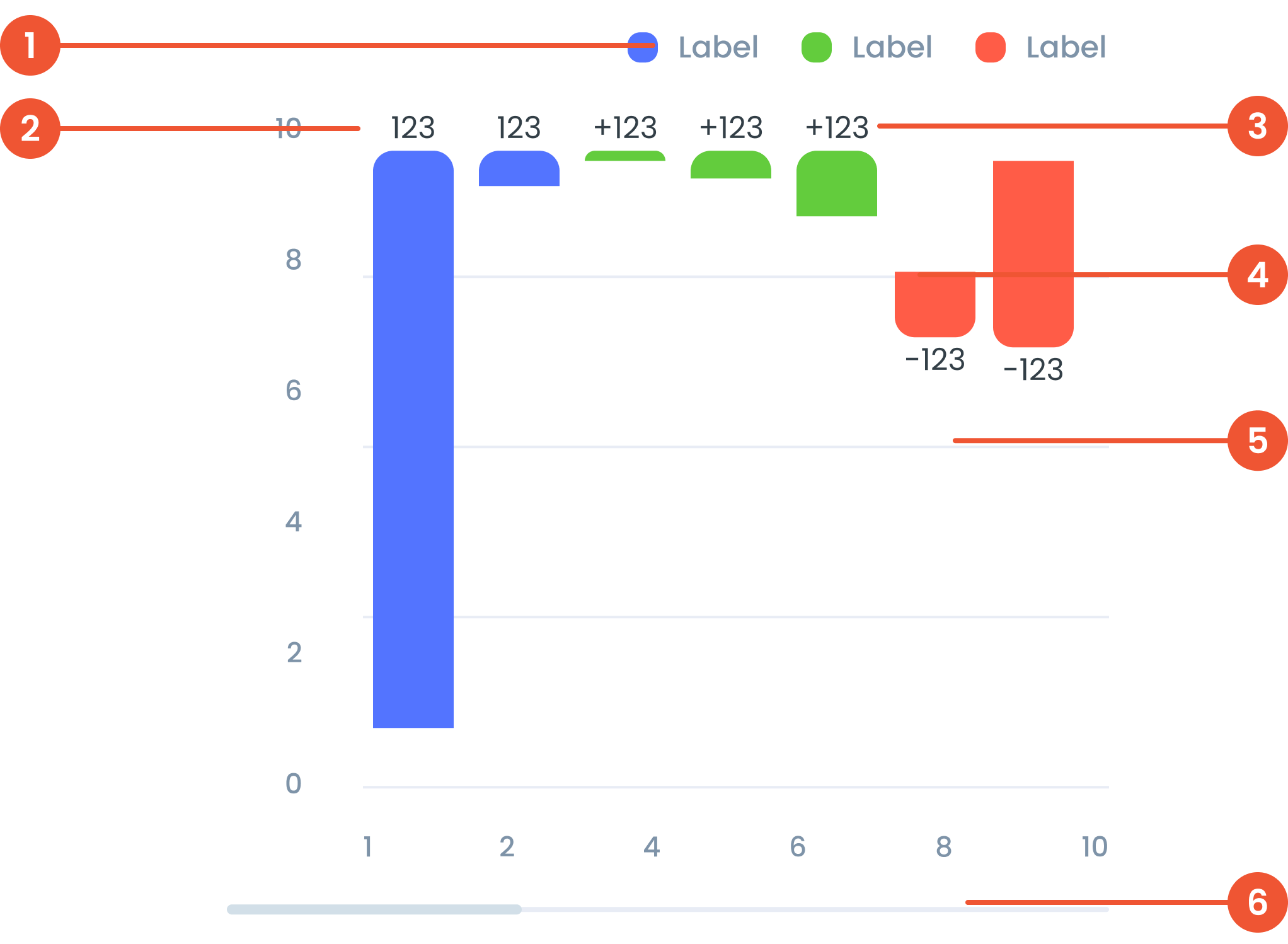
Anatomy
A visual elements that serve as a guide to explain the meaning of various data or elements displayed in a graph
The label on the vertical (up-down) side of the chart, showing what the numbers represent.
Labels in a waterfall chart provide descriptive information to identify or explain each step in the sequence.
The chart in a waterfall visualization is the graphical representation of the data, comprising vertical bars and connecting lines.
Faint lines across the chart that help you match data points to the values on the axes.
A bar that lets you move around the chart when there’s too much data to fit on the screen.
Guidelines for Waterfall Chart
- Start and End Point: Mark the start and end values with different colors.
- Change Step: Use different colors for positive and negative changes to clearly differentiate between increases and decreases.
- Cumulative Totals: Display cumulative totals at each step to show each segment's contribution to the final value.
- Vertical: Suitable for displaying up to 15-20 data points to keep it clear.
- Horizontal: Can be used for the same range, but make sure the labels are clear and don't overlap.
- Positive Change: Usually uses green or another color that indicates positive change.
- Negative Change: Usually use red or other colors that indicate negative changes.
- Neutral/Total: Use neutral colors such as gray for the start, end, and total bars.
- Label: Use a short label to identify each bar. Place labels inside or outside the bar depending on space and readability.
- Tooltip: Provide detailed information when the cursor is over to display precise values and percentages.
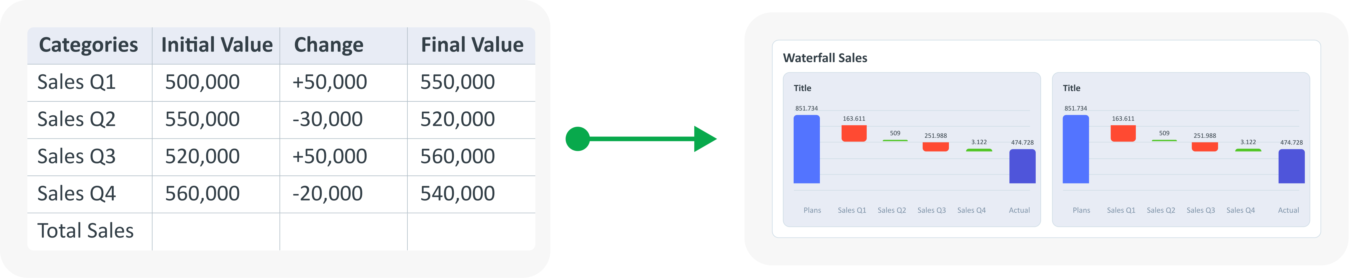
Example of Source Data
When to Use Waterfall Chart?
- Track cumulative changes in value over time or across categories.
- Ideal for visualizing the impact of positive value and consecutive negative.
- Indicates the contribution of individual elements to the total.