 Design
 Vue
Vue Flutter
Anatomy
The initials of the username (e.g., ‘JS’ for ‘John Smith’) are used if an image is not available.
Variant Avatar
Avatars have various variations to fulfil different interface needs:
Usage
Initials Name
Avatars support the display of abbreviations as user identification, especially when profile pictures are not available. This aims to ensure identities remain recognisable in all circumstances.
When the user does not have a profile picture, an Initial will appear.
Profile Picture
Images, such as user profile pictures or company logos, can be displayed using avatar. When images are used, Initials are not displayed.
When the user already has a profile picture, an image of the profile picture will appear.
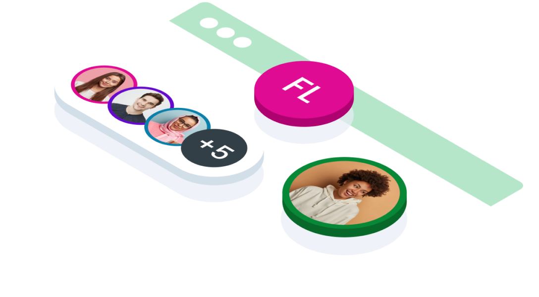
Avatar Group
Avatar Group is used to group together multiple Avatars. It can be used to show that multiple users are viewing the same page, or it can be used to list project members. The maximum number of items that an Avatar Group should display is three. Overflow items are grouped into a single Avatar that shows the overflow count. On hover, the name of each hidden item appears in a tooltip. When you click the overflow item, a list of overflowing avatars and names appears.
When you see a + symbol on the avatar group, it indicates that there are new avatars added to that group. The number of additions can vary, meaning there could be more than one avatar added but not exceeding a certain predefined limit. This reflects the avatar group's ability to continuously expand with various additions as needed. In the example above, the use of +5 indicates the addition of 5 avatars to the existing avatar group.
Avatar with Name
Horizontal
- Displaying user profiles in applications or websites, where the avatar represents the user's identity and the text provides additional information such as their name, role, or status.
- Within comment sections using avatars with sided text helps in attributing comments to specific users and distinguishing them from others.
- In contact lists or address books, associating avatars with contact names or initials makes it easier to identify contacts at a glance.
Vertical
- In card-based user interfaces, using avatars with bottomed text within cards can help identify users or content while preserving a consistent card design across the interface.
- Displaying detailed user information, such as job titles, locations, or statuses, below the avatar, bottomed text can effectively present this additional context without overcrowding the visual space.
- Consider using bottomed text if it makes the information next to avatars easier to read and understand, especially for users who might find other layouts confusing.
Avatar Condition
No Image and Initials
This variant indicates that the avatar component is lacking an associated image. Possible explanations include:
- the user has not uploaded a profile picture
- there are technical issues in image retrieval or display
- or it might be a design choice or user preference not to have a profile picture.
Error
This variant signals that there's a problem preventing the proper display or management of the avatar. Potential causes include:
- failure in loading the profile picture
- internet connection issues
Change image
This variant when the user will change the image of an avatar. Guidelines size for icon edit in avatar
| Avatar | Icon |
|---|---|
| 120px | 24px |
| 96px | 24px |
| 64px | 24px |
| 48px | 16px |
| 32px | 16px |
| 24px | 16px |
Loading
The loading state provides visual feedback to the user that the avatar image is in the process of being fetched or updated. This ensures users are aware that their action is being processed and prevents confusion.
Variant on Size
| SIZE | USAGE RECOMMENDATION |
|---|---|
Small (24px & 32px) |
|
Medium (48px & 64px) |
|
Large (96px & 120px) |
|
When a display shape is applied to the avatar component, it adjusts its size based on the defined display sizes, making it versatile for both mobile and web use. For mobile apps, developers can set specific avatar sizes for different screen sizes to ensure they look good and fit well within the layout. Similarly, in web applications, avatars can be adjusted to maintain consistency and readability across various devices and screen sizes.
Accessibility
The accessibility aspect ensures that the avatar can be used by all users, including those using assistive devices.
Avatar size is automatically adjusted based on screen size to ensure readability.In avatar groups, the names of additional members can be accessed via a tooltip.
Initials are displayed using fonts and colours that ensure high contrast, especially at small sizes.
Placeholders provide a visual indication that the image is loading to prevent user confusion.
Content
Abbreviation/Initials
Used when a profile picture is not available. Format The initials of the user's name are displayed inside the avatar circle.
Example:
Full name ‘John Doe’ → Abbreviation: ‘JD.’ Single name ‘Elon’ → Abbreviation: ‘E.’Rules:
Abbreviation text is capitalised. Text and background colours are chosen to ensure legibility.Avatar with Profile Picture
The user's profile picture is displayed in a circle container. The image should be automatically resized (cropped) to fit the container.
- You can use these components by accessing the provided resource files.
- Preview animations are examples and may not suit Mobile Widgets. Press 'View Code' to access the Widgetbook Playground and see the Flutter widget displaying all created components and interactive.
Usage
Import this line to your file:
import 'package:buma_design_system/buma_design_system.dart';
Attributes
If there is a question mark ? in the Data Type, it means that the properties are optional
| Properties | Data Type | Description | Default Value |
|---|---|---|---|
| avatar | UIAvatarItem? | Displays label single item of avatar | null |
| avatars | List<UIAvatarItem>? | Displays label groups of avatar | [] |
| avatarSize | UIAvatarSize? | Describe size of avatar | UIAvatarSize.size48 |
| isLoading | bool? | Make shimmer effect to waiting avatar data. | false |
UIAvatarItem
Model of avatar.
| Properties | Data Type | Description | Default Value |
|---|---|---|---|
| name | String | String to display multiple names | null |
| imageUrl | String? | String for displaying image asset or url. | null |
| color | Color? | Color for displaying background avatar and border of avatar. | UIColors.backgroundDark |
Previews & Code
You can call the components with Class.namedConstructor() with different variants.
Single Avatar
Use the UIAvatar component to display an abbreviation inside a circular avatar while the image is loading or if the image URL fails to load, and replace it with the image once it's successfully loaded.
 const UIAvatar(
   avatar:
     UIAvatarItem(
       name: 'First Last',
       color: Color(0xFFDF0B92), // color example
       image: '{url_person}'
     ),
   size: UIAvatarSize.size48,
 )
Multiple Avatar
Use the UIAvatar.multiple component to display multiple avatars from an unlimited list, showing the first 4 items as circular avatars and the last item displaying the remaining count (e.g., "+5" for additional items).
const UIAvatar.multiple(
   avatars: [
     UIAvatarItem(
       name: 'Person 1',
       color: UIColors.primary600,
       image: '{url}'
     ),
     /// Add more avatars
   ],
   size: UIAvatarSize.size48,
 )