 Design
 Vue
Vue Flutter
Anatomy
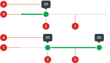
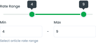
The handle that can be dragged to select a value.
A progress indicator showing the selected value.
Displays the value while the thumb is being moved.
Slider area
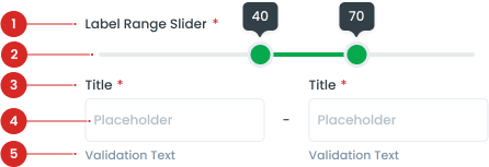
The field title is the label placed above the field, commonly used examples are min and max.
The area where the user types their input.
Validation text appears below the input field, offering feedback to the user about the accuracy or completeness of their input.
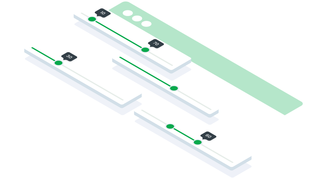
Slider Variant


Usage
Usage Recommendation:
- Use when selecting a single value or range of number values.
- Use sliders when there is a need to show a selection of a single value or range of values.
- Use when needing to expose a variety of options or to limit the number of options quickly.
Accessibility
Screen Reader Support
The slider should have a label describing its function.
Content
Provide a clear and informative label.

When a user’s mouse cursor is hovering over the thumb of the slider component. Use a tooltip on hover to show the selected values.
Usage
The package is already installed in the repository's shell. To use the component, you only need to add the following code:
<BSlider />
Attributes
If there is a question mark ? in the Data Type, it means that the properties are optional.
| Properties | Data Type | Description | Default Value |
|---|---|---|---|
| min? | number | Lowest input value | 0 |
| max? | number | Highest input value | 10 |
| minRange? | number | Minimum input range | 1 |
| step? | number | Size of each movement (an increment or jump between values) | 1 |
| minimum? | number | Minimum input value. This prop is two-way binding, use v-model:minimum | 0 |
| maximum? | number | Maximum input value. This prop is two-way binding, use v-model:maximum | 0 |
| range? | boolean | Enable range mode | false |
| id? | string | ID for the input | none |
| disabled? | boolean | Disable the input if true | false |
| tooltip? | boolean | Show tooltip if true | true |
| modelValue | number | Single input value. This prop is two-way binding, use v-model for reactivity | 0 |
| error? | boolean | Mark the input as having an error if true | false |
- You can use these components by accessing the provided resource files.
- Preview animations are examples and may not suit Mobile Widgets. Press 'View Code' to access the Widgetbook Playground and see the Flutter widget displaying all created components and interactive.
Usage
Import this line to your file:
import 'package:buma_design_system/buma_design_system.dart';
Attributes of all variants
If there is a question mark ? in the Data Type, it means that the properties are optional, this is namedConstructor from UISlider.
UISlider
A Custom Slider is a versatile and customizable slider component that allows users to select a value or range of values by dragging a handle along a track. It is designed to be highly flexible and can be easily integrated into various mobile applications to enhance user experience.
| Properties | Data Type | Description | Default Value |
|---|---|---|---|
| min | double | The minimum value the user can select | 0 |
| max | double | The number of discreate divisions | 100 |
| onChanged | ValueChanged<double> | Called when the user is selecting a new value for the slider by dragging | null |
UIRangeSlider
A Custom Range Slider is a versatile and customizable slider component that allows users to select a range of values by dragging two handles along a track. It is designed to be highly flexible and can be easily integrated into various mobile applications to enhance user experience.
| Properties | Data Type | Description | Default Value |
|---|---|---|---|
| min | double | The minimum value the user can select | 0 |
| max | double | The number of discreate divisions | 100 |
| rangeValue | RangeValues? | Displays current value of range | null |
| onChanged | ValueChanged<double> | Called when the user is selecting a new value for the slider by dragging | null |
| onChangeEnd | ValueChanged<RangeValues>? | Callback function that is called when the user ends a change to the slider's range values | null |