Buma UI - DocumentationBuma UI - Documentation
Get Started
Foundations
Components
Resources
Patterns
Data Visualization
Back to BSpace
Get Started
Foundations
Components
Resources
Patterns
Data Visualization
  • stacksFoundations
    • 💡 Overview
    • Color
    • Principle
    • Typography
  • brickComponents
    • 💡 Overview
    • Accordion
    • Alert
    • Avatar
    • Badge
    • Bottom Sheet
    • Bread Crumb
    • Button
    • Button Link
    • Button Navigation
    • Calendar
    • Card
    • Chat
    • Checkbox
    • Chips
    • Choice Tile
    • Comment
    • Date Picker
    • Divider
    • Download
    • Drawer
    • Dropdown
    • Empty State
    • Floating Button
    • Form Input
    • Header
    • Hint
    • Icon
    • List Choice
    • Loading
    • Modal
    • Navigation Bar
    • Notification
    • Pagination
    • Progress Bar
    • Radio Button
    • Search
    • Scrolling Bar
    • Segmented Switch
    • Side Menu
    • Side Tab
    • Slider
    • Switch
    • Tab
    • Table
    • Text Area
    • Text Input
    • Time Picker
    • Title
    • Toast
    • Tooltip
    • Wizzard
  • splitscreenPattern
    • 💡 Overview
    • Filter
      upcoming
    • Form
      upcoming
    • Notification
    • PWA
      upcoming
    • table
      upcoming
    • Upload Download
      upcoming
  • insert_chartData Visualization
    • 💡 Overview
    • Tiering
    • Pattern
    • Chart and Graph
      • Chart Selection Guide
      • Map Selector
      • Donut Chart
      • Donut Progress Bar Chart
      • Spider Chart
      • Line Chart
      • Chart Area
      • Speedometer
      • Heat Map
      • Scatter Plot
      • Pie Chart
      • Bar Chart
      • Waterfall Chart
      • Sunburst Chart
      • Tree Decomposition Chart
      • Scorecards
      • Table
      • Micro Visualization
    • Typography
    • Color Palette
  • data_objectTokens
    upcoming
  • inventory_2Resources
    • 💡 Overview
    • Mobile
      new
      • 💡 Introduction
      • Installation
      • General
        • Important Rules
        • Naming Convention
        • Clean Architecture
    • Web
      upcoming

Table

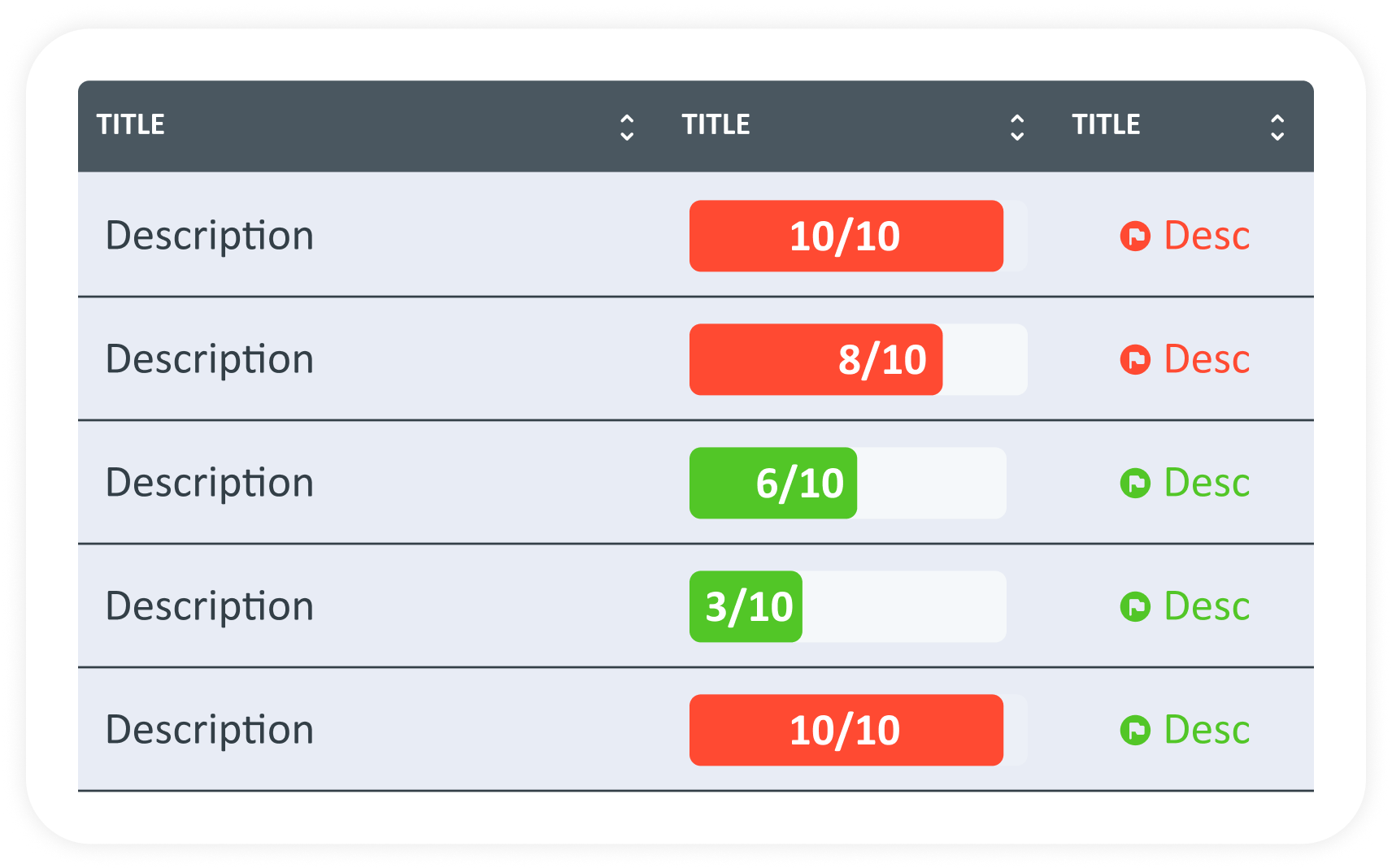
Guidelines for Table

    • Column Header: Make sure column headers are clear and descriptive. Use the tooltip for additional explanation if needed.
    • Row and Column Limit: Avoid data stacking by limiting the number of columns and rows.
    • Maximum Characters: Keep labels short, ideally under 15 characters for headers and under 30 characters for cells data.
    • Tooltip: Use tooltips for additional information or explanations that don't fit in cell.
    • Placement: micro visualizations and icons should be placed in cells or columns where they add value.
    • Tooltip: Use tooltips for additional information or explanations that don't fit in cell.
    • Alignment: Align micro visualizations and icons with appropriate data to ensure clear data and avoid overlapping with text or other data.
    • Colors: use consistent colors according to guidelines throughout the table to maintain visual coherence.
    • Maximum Digits: 6 (example: 123456)
    • Use abbreviations for large nominal amounts. (example: 1M for 1,000,000)
When to Use Table?
  • Presents numeric data​
  • Presents detailed and easy to find information
  • Comparing many variables with various categories
  • Organizing data that requires vertical and horizontal reading
arrow_back
Previous Scorecards
Next Micro Visualization
arrow_forward