 Design
 Vue
Vue Flutter
Anatomy
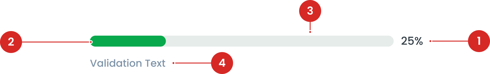
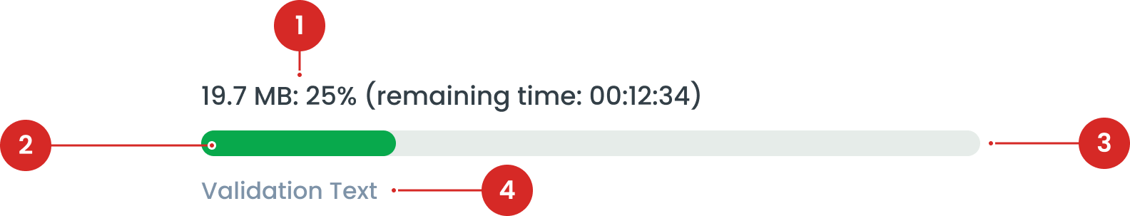
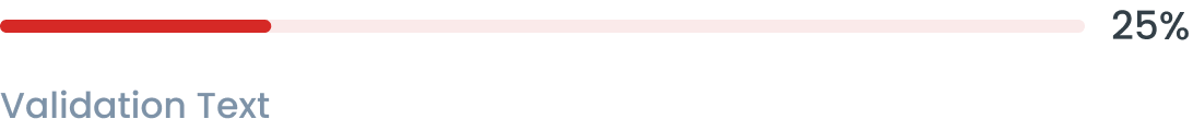
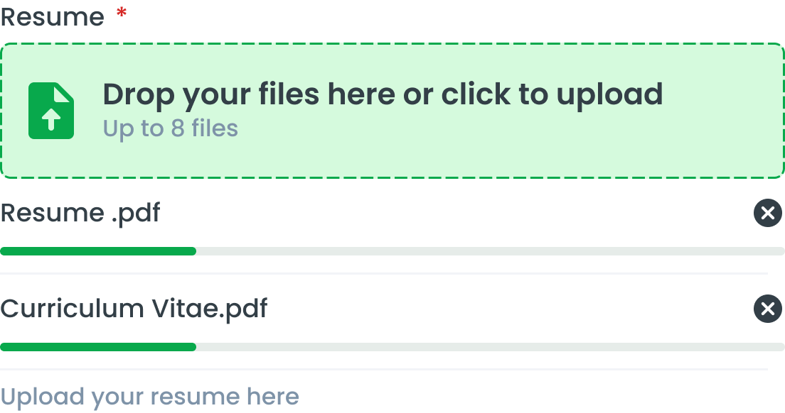
The filled portion within the track that visually represents the progress. The length of the indicator corresponds to the percentage of the task completed.
The container that holds the progress indicator. It provides the visual boundary for the progress bar.
Additional text that may provide feedback or validation messages related to the progress.

Progress Bar State


| VARIANT | USAGE RECOMMENDATION |
|---|---|
Success | Refers to the main status or progress that you want to highlight or emphasize to the user |
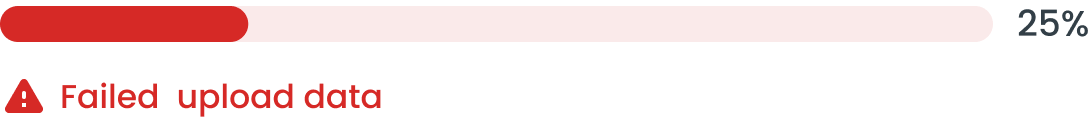
Error | Notifying users about the problem and providing instructions or steps to fix it. |
Info | Provide information to users |
Secondary | Indicates a status or situation that does not dominate, but is still important for users to know |
Progress Bar State
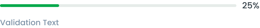
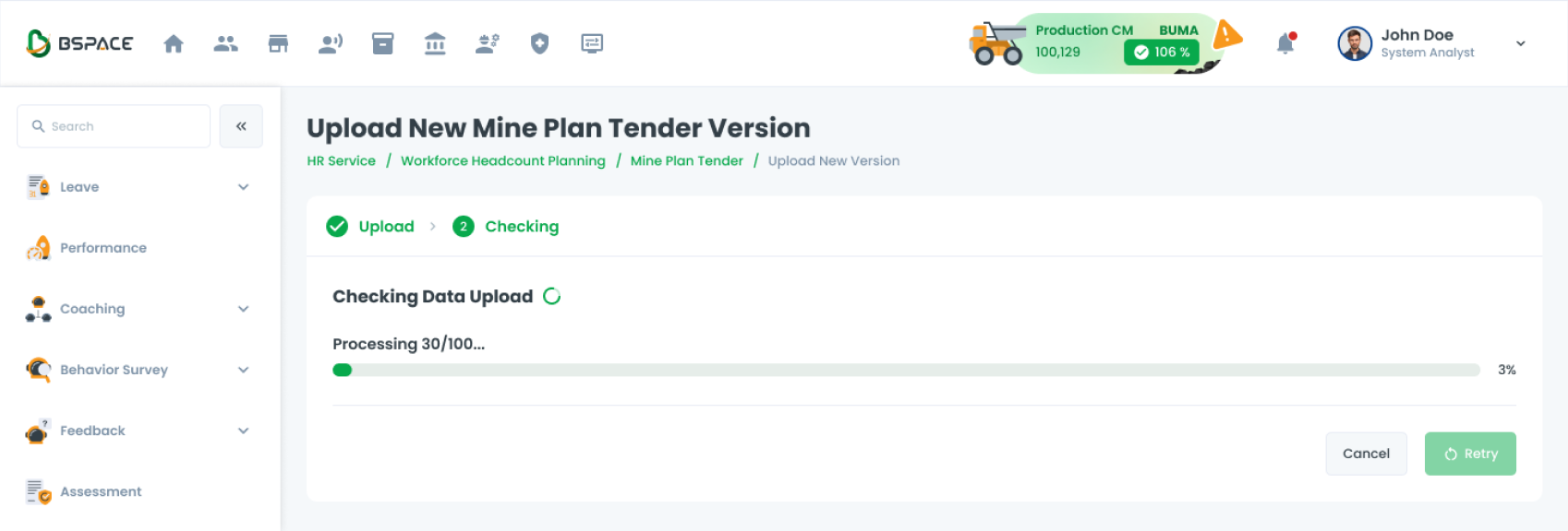
Without Information Text (Top Text)
Leverage non-long label variations to display concise progress information

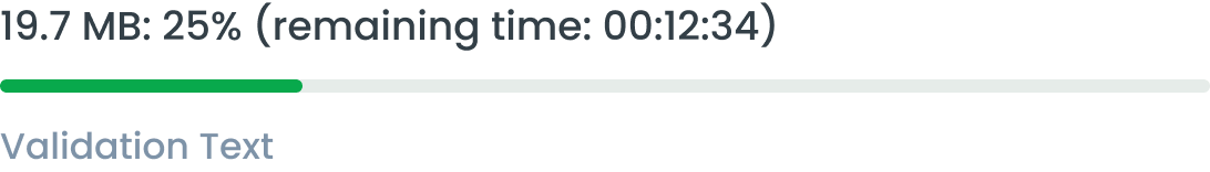
With Information Text (Top Text)
Take advantage of long label variations to display detailed progress information. Example use case:
- Remaining Time is useful for users to understand how much longer the process will take
- Size is useful for indicating how large a file the user must download
- Percentages give users an understanding of how far the process has progressed
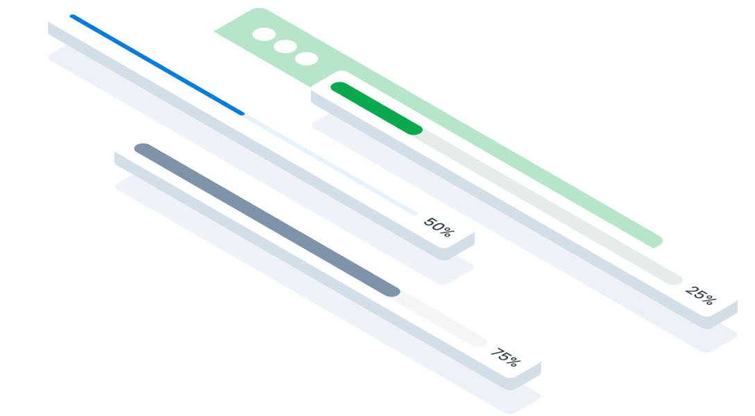
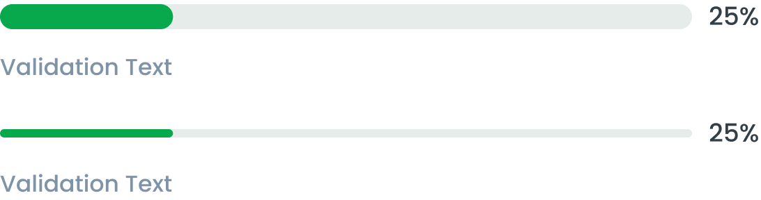
Thick & Thin Bar
A thicker progress bar provides a more prominent visual cue, making it easier to notice and follow the progress. It’s often used in applications where visibility is key or on larger screens.
A thinner progress bar is more subtle and less obtrusive, often used in minimalist designs or when space is limited, like in mobile apps or small components.
Usage
Usage Recommendation:
- Track how far the process has progressed and the estimated time remaining to complete it
- Providing a more interactive and informative experience to users
- By using a progress bar, users can easily see whether a process is in progress, how fast it is moving, and how long the process is likely to take to complete.
- Unlike the Loading component, the Progress Bar provides information about the progress of a specific process, whereas loading does not.
Accessibility
Error Handling
If an error occurs, the progress bar should stop and display an error message. The color of the indicator can change to reflect the error state.
Content
Example Use Case
Usage
The package is already installed in the repository's shell. To use the component, you only need to add the following code:
<BProgressBar />
Attributes
If there is a question mark ? in the Data Type, it means that the properties are optional.
| Properties | Data Type | Description | Default Value |
|---|---|---|---|
| modelValue | number | Value in bytes | none |
| size? | number | Max value in bytes | none |
| small? | boolean | Progress bar type | false |
| title? | string | Custom title text | none |
| validation | string | Max value in bytes | none |
| progress? | number | Override progress percentage without input max value | none |
| variant? | string | Progress bar variants | primary |
| infoClass? | string | Inject class to progress info | none |
| mainClass? | string | Inject class to progress main | none |
| shadowClass? | string | Inject class to progress shadow | none |
| fillClass? | string | Inject class to progress fill | none |
| percentageClass? | string | Inject class to progress percentage | none |
Variants
The <BProgressBar /> component supports the following variants:
| Variant | Description |
|---|---|
| primary | Refers to the main status or progress that you want to highlight or emphasize to the user |
| secondary | Indicates a status or situation that does not dominate, but is still important for users to know |
| danger | Notifying users about the problem and providing instructions or steps to fix it. |
| info | Provide information to users |
- You can use these components by accessing the provided resource files.
- Preview animations are examples and may not suit Mobile Widgets. Press 'View Code' to access the Widgetbook Playground and see the Flutter widget displaying all created components and interactive.
Usage
Import this line to your file:
import 'package:buma_design_system/buma_design_system.dart';
Attributes of all variants
If there is a question mark ? in the Data Type, it means that the properties are optional, this is namedConstructor from UIProgressBar.
UIProgressbar & UIProgressbar.looping
Displays a progressbar with percentage
| Properties | Data Type | Description | Default Value |
|---|---|---|---|
| value | double | Displays mutable value of progressbar and percentage label | 0 |
| size | UIProgressbarSize | A constant size to make different height of progressbar | UIProgressbarSize.small |
UIProgressbar.detail
Displays a progressbar with looping value.
| Properties | Data Type | Description | Default Value |
|---|---|---|---|
| value | double | Displays mutable value of progressbar and percentage label | 0 |
| size | UIProgressbarSize | A constant size to make different height of progressbar | UIProgressbarSize.small |
| detailLabel | UIProgressbarDetailLabel? | Displays specific progress label above of progressbar | null |
UIProgressbar
 UIProgressbar(
   value: _progress,
   size: UIProgressbarSize.large
 )
UIProgressbar.detail
 UIProgressbar.detail(
   value: _progress,
   size: UIProgressbarSize.large
   detail: UIProgressbarDetailLabel(
     sizeFile: 24,
     remainingTime: Duration(seconds: 80)
   )
 )