Buma UI - DocumentationBuma UI - Documentation
Get Started
Foundations
Components
Resources
Patterns
Data Visualization
Back to BSpace
Get Started
Foundations
Components
Resources
Patterns
Data Visualization
  • stacksFoundations
    • πŸ’‘ Overview
    • Color
    • Principle
    • Typography
  • brickComponents
    • πŸ’‘ Overview
    • Accordion
    • Alert
    • Avatar
    • Badge
    • Bottom Sheet
    • Bread Crumb
    • Button
    • Button Link
    • Button Navigation
    • Calendar
    • Card
    • Chat
    • Checkbox
    • Chips
    • Choice Tile
    • Comment
    • Date Picker
    • Divider
    • Download
    • Drawer
    • Dropdown
    • Empty State
    • Floating Button
    • Form Input
    • Header
    • Hint
    • Icon
    • List Choice
    • Loading
    • Modal
    • Navigation Bar
    • Notification
    • Pagination
    • Progress Bar
    • Radio Button
    • Search
    • Scrolling Bar
    • Segmented Switch
    • Side Menu
    • Side Tab
    • Slider
    • Switch
    • Tab
    • Table
    • Text Area
    • Text Input
    • Time Picker
    • Title
    • Toast
    • Tooltip
    • Wizzard
  • splitscreenPattern
    • πŸ’‘ Overview
    • Filter
      upcoming
    • Form
      upcoming
    • Notification
    • PWA
      upcoming
    • table
      upcoming
    • Upload Download
      upcoming
  • insert_chartData Visualization
    • πŸ’‘ Overview
    • Tiering
    • Pattern
    • Chart and Graph
      • Chart Selection Guide
      • Map Selector
      • Donut Chart
      • Donut Progress Bar Chart
      • Spider Chart
      • Line Chart
      • Chart Area
      • Speedometer
      • Heat Map
      • Scatter Plot
      • Pie Chart
      • Bar Chart
      • Waterfall Chart
      • Sunburst Chart
      • Tree Decomposition Chart
      • Scorecards
      • Table
      • Micro Visualization
    • Typography
    • Color Palette
  • data_objectTokens
    upcoming
  • inventory_2Resources
    • πŸ’‘ Overview
    • Mobile
      new
      • πŸ’‘ Introduction
      • Installation
      • General
        • Important Rules
        • Naming Convention
        • Clean Architecture
    • Web
      upcoming
ComponentsSide TabSide tabs are used to group different but related content, allowing users to navigate views without leaving the page.
Guidelines
Design
v2.5.0
Updated
Vue
v2.0.0
Updated
Flutter
v2.0.0
Updated

Anatomy

A container that holds all the buttons and organizes them into a cohesive navigation structure.
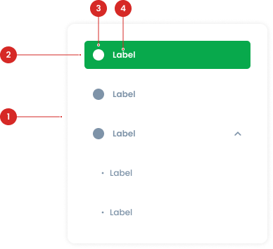
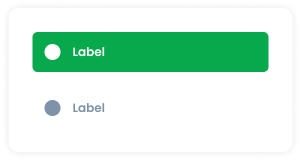
Interactive elements representing individual tabs within the side tab.
Optional graphical representation that enhances recognition of the button's purpose.
Textual description of the button's purpose
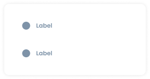
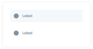
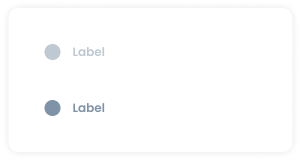
Side Tab State
Default
The default state represents a non-interacted, available tab. The tile tab has no background fill. It remains visually simple, indicating that the tab is ready to be interacted with but is not currently selected
Hover
The hover state provides a visual cue when a user’s cursor is over a tile tab. The background of the tile tab changes to background-light
Active
The active state indicates the currently selected tab. When active, the background of the tile tab (not the entire side tab) changes to green.
Disable
The disable state indicates that a tile tab is not available for interaction. The tile tab has no background fill, similar to the default state. However, it is distinguished by having 50% opacity, which visually communicates that the tab is disabled.


Usage

Usage Recommendation:

  • Use side tab to group related information into different categories, helping to reduce cognitive load.
  • Navigating between major sections of an website.
  • Help users navigate between different content sections within the same page, without the need to load a new page.
  • Help users understand the structure of the information and easily access different sections.
  • Typically used on the info page of the module.


Accessibility

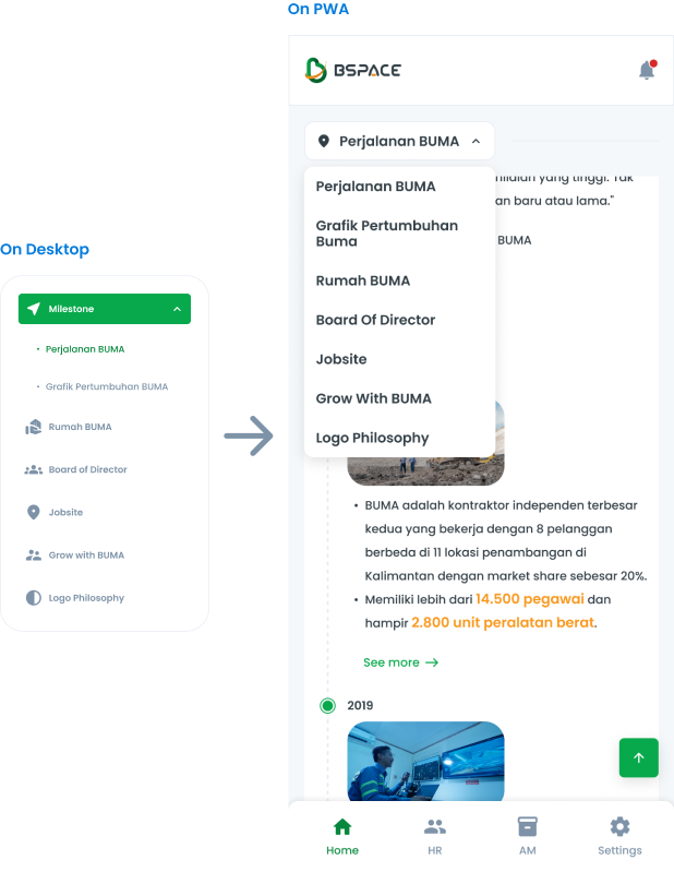
Side Tab Terms of Switching to PWA

The side tab component can be switched to a Progressive Web App (PWA) format. This ensures that the navigation functionality remains consistent and user-friendly across both desktop and mobile platforms.


Content

Pattern

We provide a pattern that can be used to create information pages, ensuring consistency across all features.
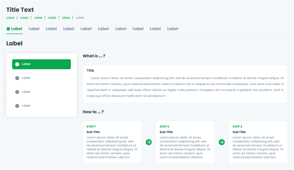
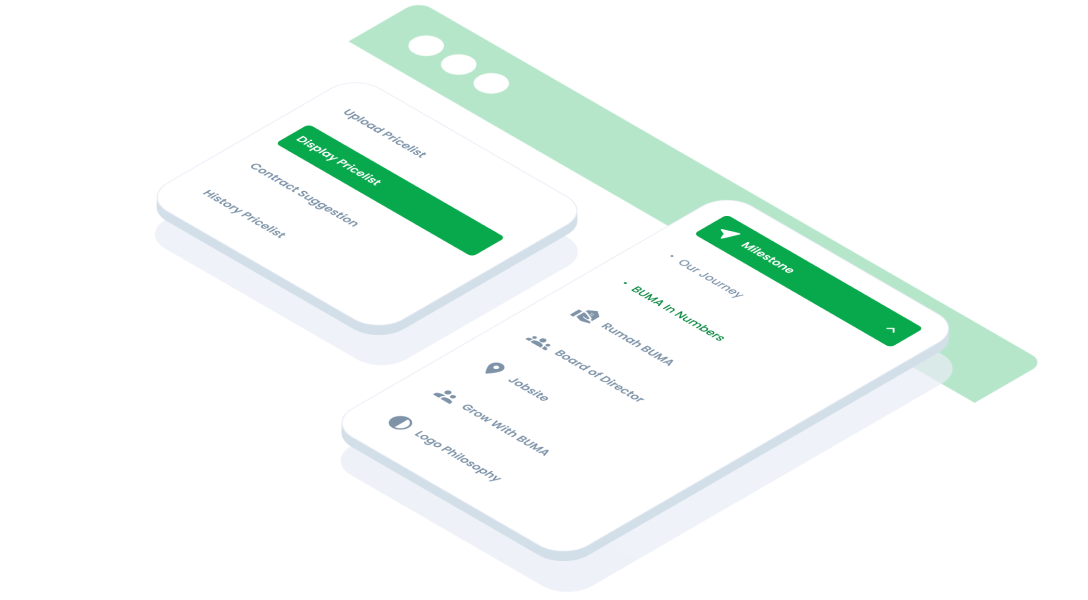
Use case

This is an example of using side tabs on an information page.

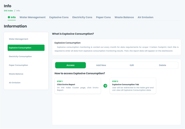
Additionally, this is an example of using side tabs for other purposes.

Web
Resources You can use these components by accessing the provided resource files.

Usage

The package is already installed in the repository's shell. To use the component, you only need to add the following code:

<BTab :items="ItemTypes" vertical switch/>

Attributes

If there is a question mark ? in the Data Type, it means that the properties are optional.

NameData TypeDescriptionDefault Value
itemsItemTypes[]Array of tab items.none
verticalbooleanEnables vertical tabsFalse
switchbooleanChanges tabs to switch type.False
smallbooleanSets the tab to small size.false
itemFullBlockbooleantab item occupies the full block space.False
itemClassstringCustom class to style the itemnone
linkClassstringCustom class to style the linknone
idstringID for the tab.none
iconstringIcon for the tab.none
hintnumberHint number displayed on the tab.none
dropdownOptionDropdownOption[]Dropdown options for the tab.none

ItemTypes

The <BTab /> items must be defined using the following structure. If there is a question mark ? in the Data Type, it means that the properties are optional:

VariantData TypeDescriptionDefault Value
idstringUnique identifier for the tab.none
textstringText displayed on the tab.none
icon?string Icon for the tabnone
hint?numberHint number displayednone
disabled?booleanDisables the tab if set tofalse
arrow_back
Previous Side Menu
Next Slider
arrow_forward