ComponentsAlertThe Alert component is designed to promptly inform users about significant changes or conditions within the interface.
Guidelines
Web
Resources You can use these components by accessing the provided resource files.
Usage
The package is already installed in the repository's shell. To use the component, you only need to add the following code:
<BAlert />
Attributes
If there is a question mark ? in the Data Type, it means that the properties are optional.
| Properties | Data Type | Description | Default Value |
|---|---|---|---|
| variant | String? | variant used for change alert color | success |
| title | String | Alert Title | Alert Title |
| message | String? | Alert variant | Lorem ipsum dolor sit amet, consectetur adipiscing |
| icon | String? | Add surfix icon | none |
| reverse | Boolean? | Alert variant style will be reversed | none |
| buttonLink | Boolean? | If true, a button link will be shown | none |
| buttonVariant | String? | variant used for change chips color | none |
| buttonLabel | String? | variant used for change chips color | none |
Variants
The <BAlert /> component supports the following variants:
| Variant | Description |
|---|---|
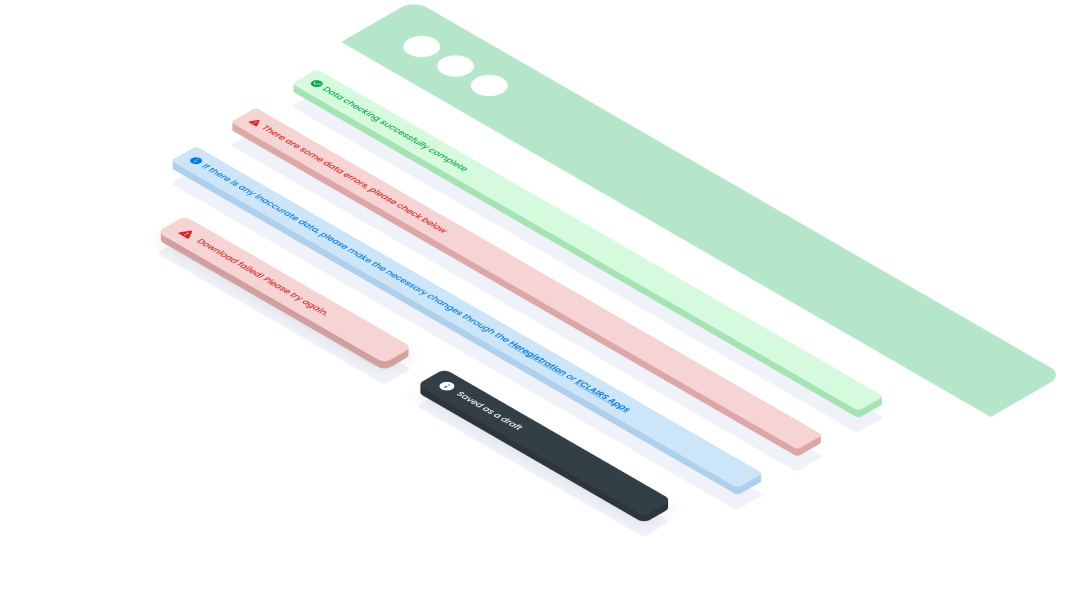
success | Used to convey success states. For example, you might show a success message that tells the user that changes were saved or something was completed. |
error | Used to signal errors, the alert function comes into play once a user has initiated an action, subsequently encountering either internal or external issues. |
warning | Used to prevent errors from occurring. |
neutral | Used to convey general information that isn’t critical. For example, you might show an alert that asks for user feedback. |
info | Used to display information that needs user’s attention and may require further steps. |
Mobile
Resources
- You can use these components by accessing the provided resource files.
- Preview animations are examples and may not suit Mobile Widgets. Press 'View Code' to access the Widgetbook Playground and see the Flutter widget displaying all created components and interactive.
Usage
Import this line to your file:
import 'package:buma_design_system/buma_design_system.dart';
Attributes
If there is a question mark ? in the Data Type, it means that the properties are optional
| Properties | Data Type | Description | Default Value |
|---|---|---|---|
| title | String | Display label of title | none |
| description | String? | Display optional describe of contents | none |
| type | UIAlertType? | Describe what UIAlertType you want | UIAlertType.success |
| reverseColor | bool? | Makes the colors inverted with reverseColor | false |
UIAlertType
Creating enumeration type of UIAlert
| Properties | Description |
|---|---|
| Used to convey success states | |
| Used to signal errors, the alert function comes into play once a user has initiated an action, subsequently encountering either internal or external issues | |
| Used to prevent errors from occurring | |
| Used to convey general information that isn’t critical | |
| Used to display information that needs user’s attention and may require further steps |
Variants
You can call the components with Class.namedConstructor() with different variants.
Alert Success
Used to convey success states. For example, you might show a success message that tells the user that changes were saved or something was completed.
UIAlert.showAlert(
        context,
        'Text Alert',
        type: UIAlertType.success,
    );
Alert Error
Used to signal errors, the alert function comes into play once a user has initiated an action, subsequently encountering either internal or external issues.
UIAlert.showAlert(
        context,
        'Text Alert',
        type: UIAlertType.error,
    );
Alert Warning
Used to prevent errors from occurring.
UIAlert.showAlert(
        context,
        'Text Alert',
        type: UIAlertType.warning,
    );
Alert Neutral
Used to convey general information that isn’t critical. For example, you might show an alert that asks for user feedback.
UIAlert.showAlert(
        context,
        'Text Alert',
        type: UIAlertType.neutral,
    );
Alert Info
Used to display information that needs user’s attention and may require further steps.
UIAlert.showAlert(
        context,
        'Text Alert',
        type: UIAlertType.info,
    );
Alert Color Reverse
Alert offers a reverse color option, presenting an alternative bold visual style. This is particularly used for floating and non-fixed alerts.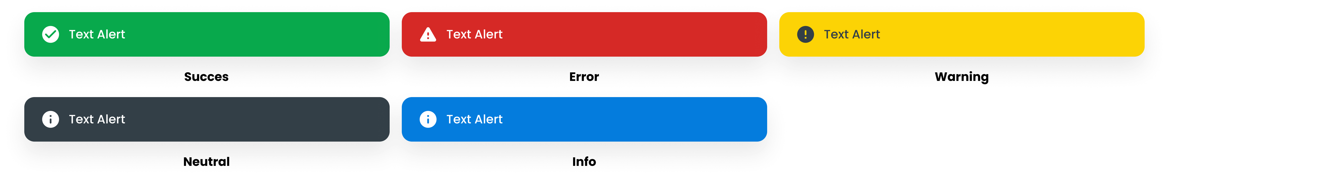
UIAlert.showAlert(
        context,
        'Text Alert',
        type: { alert_type },
    );
Alert With Description
- The Description Text variant offers an extended area for presenting descriptive text, allowing for the inclusion of additional context or details relevant to the alert message.
- By providing supplementary information alongside the primary alert message, users can gain a deeper understanding of the situation or action required, improving overall clarity and comprehension.
- Description text can include explanations, instructions, or further details about the alert, helping users make informed decisions or take appropriate actions in response to the message.
- This variant can accommodate a wide range of use cases, from simple informational alerts to more complex notifications requiring detailed explanations or guidance. Maximum line is 3. If it exceeds it will become truncate.
UIAlert.showAlert(
        context,
        'Text Alert',
        type: UIAlertType.neutral,
        reverseColor: true,
        description: 'Lorem ipsum dolor sit amet, consectetur adipiscing',
    );