Chart Area
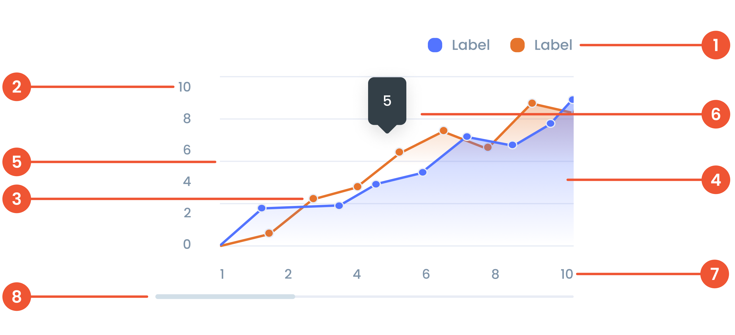
Anatomy
Text on a chart refers to any written information or labels included in a chart to provide context, describe data, or improve the readability and understanding of the visualization.
The label on the vertical (up-down) side of the chart, showing what the numbers represent.
A small dot marking a specific data point on the chart, making it easier to see exact values.
Area Chart is a type of data visualization that combines elements of a line chart and a filled area beneath the line. It is used to show trends over time or across categories, emphasizing the magnitude of values.
Faint lines across the chart that help you match data points to the values on the axes.
A small box that pops up when you hover over a data point, showing more details about it.
The label on the horizontal (left-right) side of the chart, showing time, categories, or other data types.
A bar that lets you move around the chart when there’s too much data to fit on the screen.
Guidelines for Area Charts
- The maximum number of line series is 5 series.
- The Maximum number of Characters is 30 Characters per tooltip
- The minimum number of data points on X-Axis is 10 data points, and the maximum number of data points on Y-Axis is 10 data points.
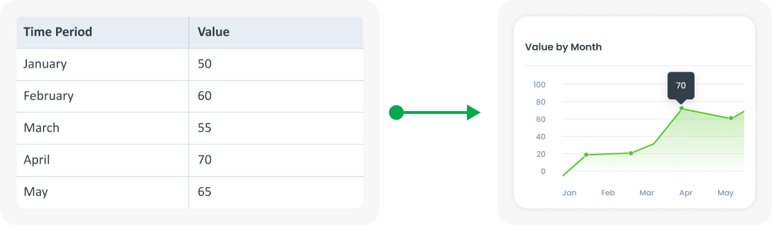
Example of Source Data
When to Use a Area Chart?
- Shows changes over time.
- Shows a continuous dataset.
- Identifying trends, patterns and fluctuations.