Buma UI - DocumentationBuma UI - Documentation
Get Started
Foundations
Components
Resources
Patterns
Data Visualization
Back to BSpace
Get Started
Foundations
Components
Resources
Patterns
Data Visualization
  • stacksFoundations
    • 💡 Overview
    • Color
    • Principle
    • Typography
  • brickComponents
    • 💡 Overview
    • Accordion
    • Alert
    • Avatar
    • Badge
    • Bottom Sheet
    • Bread Crumb
    • Button
    • Button Link
    • Button Navigation
    • Calendar
    • Card
    • Chat
    • Checkbox
    • Chips
    • Choice Tile
    • Comment
    • Date Picker
    • Divider
    • Download
    • Drawer
    • Dropdown
    • Empty State
    • Floating Button
    • Form Input
    • Header
    • Hint
    • Icon
    • List Choice
    • Loading
    • Modal
    • Navigation Bar
    • Notification
    • Pagination
    • Progress Bar
    • Radio Button
    • Search
    • Scrolling Bar
    • Segmented Switch
    • Side Menu
    • Side Tab
    • Slider
    • Switch
    • Tab
    • Table
    • Text Area
    • Text Input
    • Time Picker
    • Title
    • Toast
    • Tooltip
    • Wizzard
  • splitscreenPattern
    • 💡 Overview
    • Filter
      upcoming
    • Form
      upcoming
    • Notification
    • PWA
      upcoming
    • table
      upcoming
    • Upload Download
      upcoming
  • insert_chartData Visualization
    • 💡 Overview
    • Tiering
    • Pattern
    • Chart and Graph
      • Chart Selection Guide
      • Map Selector
      • Donut Chart
      • Donut Progress Bar Chart
      • Spider Chart
      • Line Chart
      • Chart Area
      • Speedometer
      • Heat Map
      • Scatter Plot
      • Pie Chart
      • Bar Chart
      • Waterfall Chart
      • Sunburst Chart
      • Tree Decomposition Chart
      • Scorecards
      • Table
      • Micro Visualization
    • Typography
    • Color Palette
  • data_objectTokens
    upcoming
  • inventory_2Resources
    • 💡 Overview
    • Mobile
      new
      • 💡 Introduction
      • Installation
      • General
        • Important Rules
        • Naming Convention
        • Clean Architecture
    • Web
      upcoming
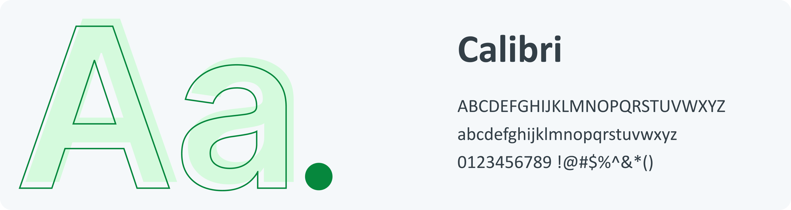
Overview Our typography uses the Calibri font. Power BI is a modern digital tool that requires a typographical interface that is easy to read for effective data presentation. Calibri has simple, balanced letterforms that make it easy to read. This makes complex data easy to understand at a glance. It works well with Power BI, which makes it easy to read and professional-looking on all dashboards.
Guidelines Typography is our font system. Each font reflects the right sentiment to support our users at every stage of their journey. Typography Guidelines :

  • Make a big difference when you want to create contrast between two elements, such as a header and body of text.
  • Use a similar font when creating for the same brand.
  • Make sure your header is twice as large as the body of the text.
  • The typeface and background colors must have the proper level of contrast.
  • To create a strong contrast, pair fonts with different weights.
  • When designing, make an attempt to keep with the same icon and font to maintain consistency.

  • Above all, make sure you consider all the elements of typography when designing.
    Type
    Heading
    Aa
    ultra / h1Bold 43px/44pxOversized screen titles. Use in moderation
    Aa
    large / h2SemiBold 35px/40pxEmpty states and feature introductions. Top level headers
    Aa
    medium / h3Bold 30px/34pxMain titles, use only once per page
    Aa
    small / h4Medium 25px/26pxHeadings that identify key functionality
    Sub Heading
    Aa
    large / h5Bold 20px/22pxSub-section and field group headings
    Aa
    medium / h6Bold 17px/20pxDeep headings and for highlighting important pieces of information
    Aa
    capital / h7Bold 14px/16pxHeading up a group of list items
    Aa
    small / h8Bold 14px/16pxLow level headings
    Body
    Aa
    bodyRegular 14px/16pxText Body
    Aa
    boldBold 14px/16pxUse to emphasize text.
    Aa
    italicsRegular Italics 14px/16pxHeadings that identify key functionality
    Aa
    linkBold 15px/18pxLink
    Aa
    paragraphRegular 14px/24pxParagraph
    Aa
    smallRegular 12px/12pxHelp text under form fields, and as supporting text
    Aa
    xtra smallRegular 10px/10pxMobile version for minor details, it is not recommended for conveying crucial or primary information
    Next Color Palette
    arrow_forward