Scatter Plot
Anatomy
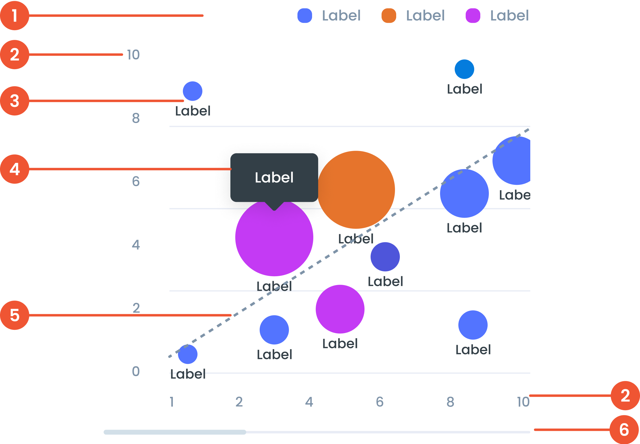
Text on a chart refers to any written information or labels included in a chart to provide context, describe data, or improve the readability and understanding of the visualization.
The label in a scatter plot provides descriptive information about the axes, data points, or categories being analyzed.
The bubble is an optional enhancement for scatter plots where data points are represented as circles with varying sizes. The size of the bubble adds a third dimension to the chart, often used to visualize an additional variable.
A small box that pops up when you hover over a data point, showing more details about it.
Linear regression is a statistical technique added to scatter plots to display the line of best fit. This line represents the overall trend or relationship between the two variables.
A bar that lets you move around the chart when there’s too much data to fit on the screen.
Guidelines for Scatter Plot
- We can use the "Main Data Color" palette to categorize colors, but they are not related.
- For the conditional case, we can use the "Semantic Color" palette or the "Diverging Color" palette.
- Cumulative Totals: Display cumulative totals at each step to show each segment's contribution to the final value.
- Linear regression can be used to analyze the relationship between two continuous variables, predict the value of one variable based on the value of another variable, or identify trends and patterns in data.
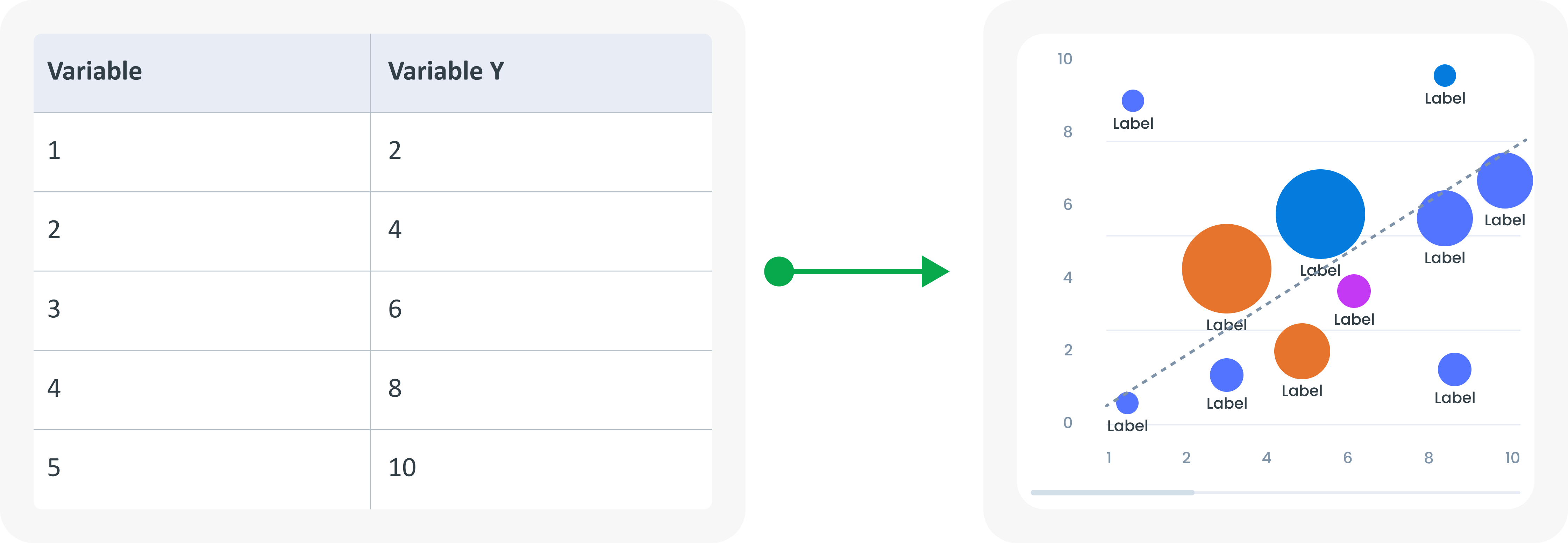
Example of Source Data
When to Use a Scatter Plot?
- Use to display the relationship between two variables.
- Identify correlations and outliers.
- Shows the distribution of data points.