ResourcesIntroductionThis is a small introduction page for users such as what is Design System

Consistent, Visual and Reduce
"A design system is a set of standards to manage design at scale by reducing redundancy while creating a shared language and visual consistency across different pages and channels." What is BUMA-UI?
BUMA-UI is a UI framework for the BUMA ecosystem, featuring a design system with specific tokens, reusable components, and modular architecture. It ensures consistent and scalable UI development across projects.This version includes predefined typography, color schemes, spacing guidelines, and reusable components like buttons, cards, and modals, all aligned with BUMA's branding.
BUMA-UI improves theming support and developer experience, streamlining UI implementation and maintaining consistency across applications.
What's inside BUMA-UI?
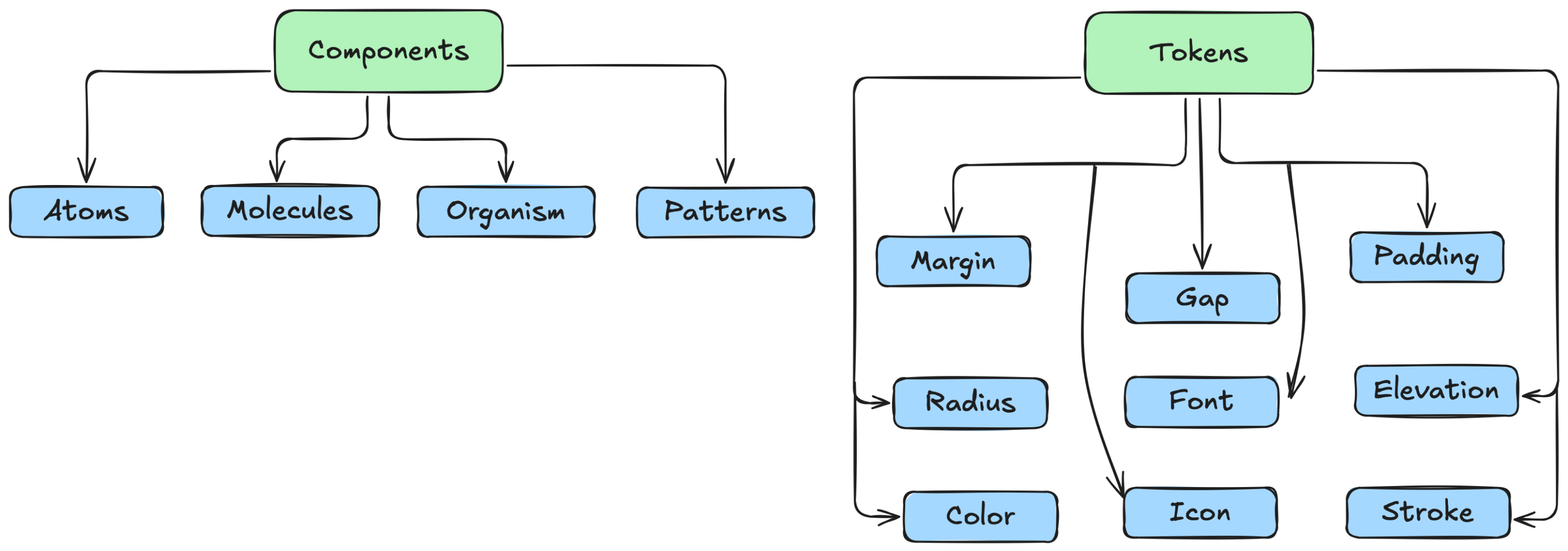
Components
In Flutter, components refer to reusable UI elements, also known as widgets, that build the app's interface. Widgets are the building blocks of Flutter applications and can be either stateless (immutable) or stateful (can change over time).
| Name | Description |
|---|---|
| Atoms | Basic building blocks of the design system, such as buttons, inputs, and labels. |
| Molecules | Combinations of atoms that form more complex UI elements, like input groups or form fields. |
| Organisms | Groups of molecules joined together to form a distinct section of an interface, such as a navigation bar. |
| Patterns | Reusable combinations of components that solve specific design problems, like a login form or a product card. |
Token (Design Token)
A design token in Flutter refers to a standardized, reusable value that defines UI properties such as colors, typography, spacing, shadows, and border radius. These tokens help maintain design consistency and allow for easy theme customization across an app.
| Name | Description |
|---|---|
| Margin | The space outside a widget, creating separation between elements. |
| Gap | The space between elements in a layout, often used in rows, columns, or grids. |
| Padding | The space inside a widget, pushing its content inward. |
| Radius | The roundness of a widget's corners, controlling border curvature. |
| Font | The typography settings, including size, weight, and style. |
| Elevation | The shadow effect that gives a sense of depth to a widget. |
| Color | The visual hue applied to text, backgrounds, and elements. |
| Icon | A symbolic representation or glyph used to visually communicate actions. |
| Stroke | The thickness or outline applied to borders, icons, or vector elements. |
Have issue or problem?
If you have any problems or requests regarding the use of BUMA-UI V2, you can contact one of the team members listed below (Microsoft Teams).
 Muhammad
RizqinovniariUI/UX Lead
Muhammad
RizqinovniariUI/UX Lead Rama
Muhammad S.UI Engineer
Rama
Muhammad S.UI Engineer Apriawan
Dwi PutraMobile Developer
Apriawan
Dwi PutraMobile Developer