 Design
 Vue
Vue Flutter
Anatomy
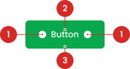
Label to indicate the action.
Containers that contain labels and icons that are also useful as click area identifier.
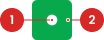
Containers that contain labels and icons that are also useful as click area identifier.
- Circle as an instance of the swap component
- The use of the icon on the button will be taken from the Material Design Icon that has been provided
Variant on Style
To distinguish between UI activities of varying relevance, you can change the color of the primary button according to the specified state, using the colors that have been prepared in the color styles. utilize the following variations:
| VARIANT | USAGE RECOMMENDATION |
|---|---|
Primary |
|
Secondary-light |
|
Secondary-white |
|
outline |
|
Variant on Size
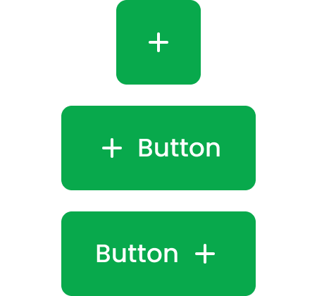
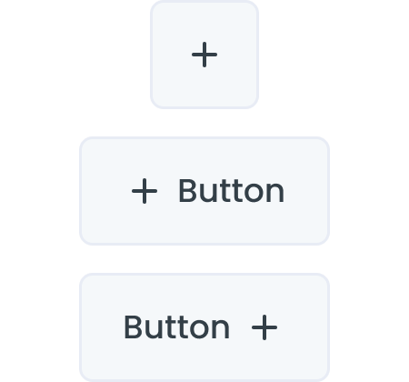
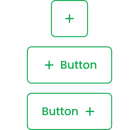
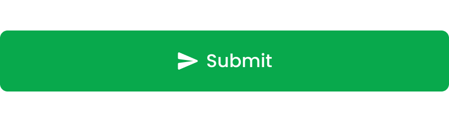
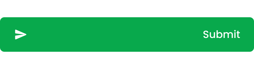
Buttons can have icons instead of text, or on either side of the text:
The following size variants are available for Button instances whose size needs to be different from the default. Default/Normal button size can be customized, Size variants should only be used in special cases.


Variant on Type
Button with Icons
Buttons can have icons instead of text, or on either side of the text:
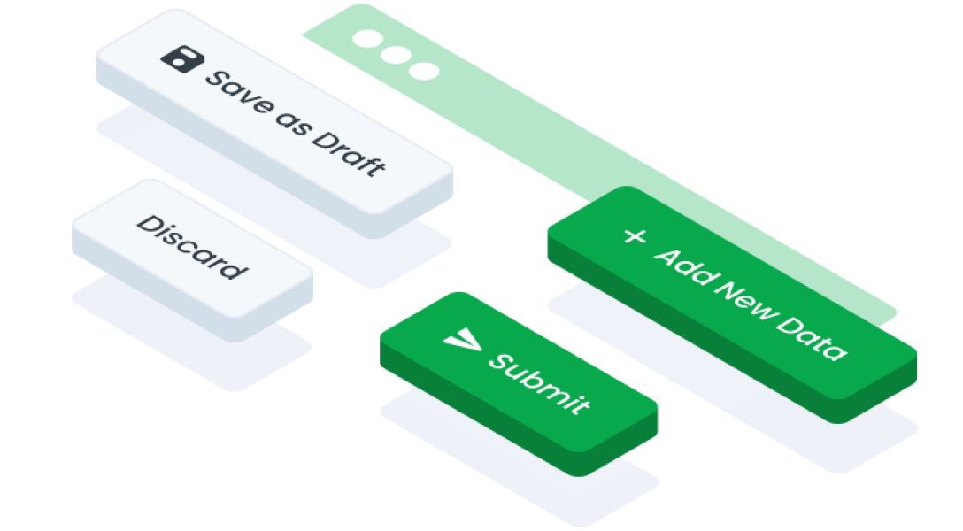
Condition All Primary Button with Different Colors
The primary button can change its color according to its needs, usually used for action buttons, or others, here's an example of a primary button with a different color.

We use hierarchical levels in using the primary button when the condition is that there are several of the same primary buttons
Button State
Usage
Usage Recommendation:
- Use icons sparingly. Most actions are difficult to represent reliably with icons, and the benefit of icons plus text should be weighed against the visual clutter this creates.
- Icon-only buttons should be primarily used for common recurring actions with highly standardized, universally understood icons, such as, a cross for close, and for actions that are repeated, such as in lists and tables.
Accessibility
The position and alignment of elements like text and icons are crucial. Typically, text is center-aligned for readability, while icons are placed alongside text with a focus on visual balance and icon clarity. It's also important to consider the button's alignment within larger containers like toolbars or headers to ensure proportional and non-overlapping layout with other elements.
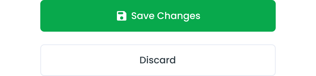
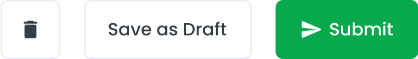
When multiple buttons are required in some cases, it's designate one button as the Primary Button while the others are styled as Secondary Button(s). The primary button typically stands out visually and represents the main or most important action associated with the user interface element, such as submitting a form or confirmation.


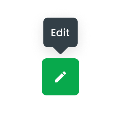
Button Icon Only with Tooltips
Tooltip is The Icon Button with Tooltip is a compact and intuitive user interface element designed to offer a clean and efficient way to execute actions without cluttering the interface. By integrating an icon with a tooltip, this component balances minimalistic design with functional clarity, enhancing both aesthetics and user experience in your application.
- Ensure the tooltip text is concise and descriptive, providing clear guidance on the button’s purpose.
- Use universally recognizable icons to minimize ambiguity and support intuitive user interactions.
- Test the button’s accessibility to confirm that tooltips are properly announced by screen readers and that interactions are smooth.
Horizontal & Vertical
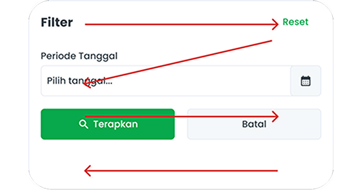
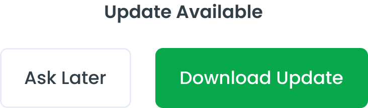
The horizontal arrangement of buttons gives the impression that both options carry equal weight, making it easier for users to compare and choose between the two options.

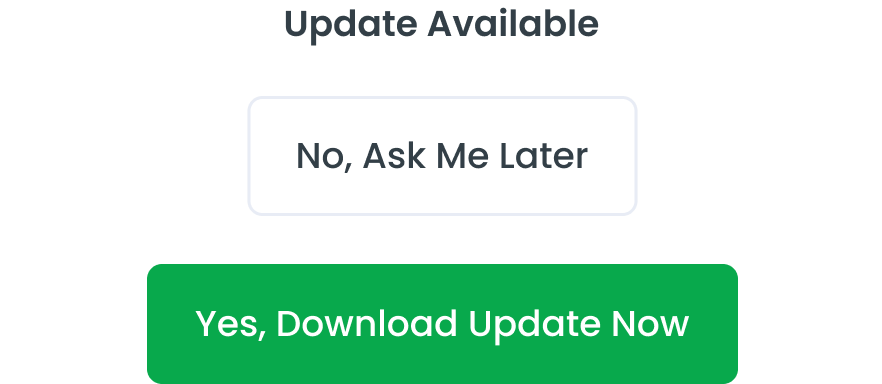
Vertical buttons are an excellent choice if your objective is to ensure that users pay close attention to each action independently. By presenting buttons in a vertical orientation, you encourage users to spend more time fixating on each button individually, fostering a more deliberate decision-making process. When space on the screen is limited or there's concern about the length of button labels, stacking buttons vertically can be a solution. This helps maintain clarity in the interface, users can more easily understand and interact with the application interface without encountering obstacles.
Behavior
When designing three buttons on the same page, it's essential to create a clear visual distinction between them while ensuring they're logically grouped and placed near relevant content. Prioritize the buttons based on their importance or frequency of use, using different visual cues to differentiate primary, secondary, and tertiary actions.
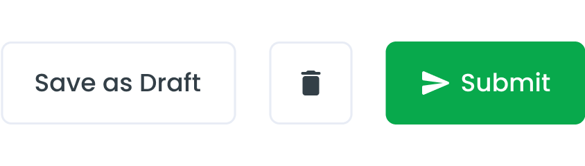
In smaller windows, it's beneficial to place the primary action button at the bottom right corner. This placement ensures that the most important action is easily accessible and prominent, as users tend to scan content from left to right and top to bottom.
Content
To take action, button labels must be clear and meaningful to the user. When the user presses the button, they should understand what it will do.
Use action verbs
Use clear verbs like save, edit, download, etc. this will give the user an exact idea of what will happen after pressing the button


Explain what will happen next
Use precise language that when users read the button label, they should know what they should expect on the next screen.


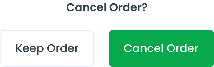
Dont confuse the user
When user performs actions like delete or cancel the service or order, if not placed labels correctly it will confuse the user.

Avoid too many words
Keep it short, do not write a sentance in the button labels
Usage
The package is already installed in the repository's shell. To use the component, you only need to add the following code:
<BButton />
Attributes
If there is a question mark ? in the Data Type, it means that the properties are optional.
| Properties | Data Type | Description | Default Value |
|---|---|---|---|
| label | string | label for button label | Button |
| variant | string | variant used for change button color | primary |
| condition? | string ? | this props only can use with variant primary | approve |
| outline? | string ? | Make button outline style | false |
| disabled | boolean | disabled button | false |
| small? | boolean | this props make button size small | false |
| block? | boolean | this props make button width 100% | false |
| pill? | boolean | this props make rounded button | false |
Variants
The <BButton /> component supports the following variants:
| Variant | Description |
|---|---|
| primary | Button using primary style for primary action |
| secondary | Button using Secondary style for Secondary action |
| tertiary | Button using Tertiary style (without background and outline) |
<BButton variant="primary" />
Condition
The conditions can only be applied when the variant is set to 'primary'. The <BBButton /> component supports the following variants:
| Condition | Description |
|---|---|
| approve | Button use green color, indicating an approval action. |
| reject | Button use red color, indicating a rejection |
| revise | Button use orange color, indicating a need for revision |
| outstanding | Button user blue color, indicating an outstanding or notable status |
<BButton variant="primary" condition="approve"/>
- You can use these components by accessing the provided resource files.
- Preview animations are examples and may not suit Mobile Widgets. Press 'View Code' to access the Widgetbook Playground and see the Flutter widget displaying all created components and interactive.
Usage
Import this line to your file:
import 'package:buma_design_system/buma_design_system.dart';
Attributes
If there is a question mark ? in the Data Type, it means that the properties are optional.
| Properties | Data Type | Description |
|---|---|---|
| label | String | The text label displayed on the button. |
| enabled | bool? | Indicates whether the button is enabled or disabled. |
| leftIcon | IconData? | The icon displayed on the left side of the button. |
| rightIcon | IconData? | The icon displayed on the right side of the button. |
| expandWidth | bool? | Determines if the button should expand to fill its container's width. |
| color | Color? | The background color of the button. |
| loader | UIButtonLoader? | The loader displayed on the button when an action is in progress. |
| icon | IconData? | The icon displayed on the button. |
| iconSize | double? | The size of the icon displayed on the button. |
| onPressed | void Function()? | The callback function that is called when the button is pressed. |
Variants
You can call the components with Class.namedConstructor() with different variants.
Primary
Secondary
Textline
Outline
Icon Only
Icon
You can add icon at the left of the UIButton or use centered icon with the UIButton.iconOnly without label, this icon is taken from the default IconData of flutter material.
Left Icon
UIButton.primary(
    label: 'Label',
    leftIcon: Icons.fiber_manual_record,
    onPressed: () {
        // Do something here
    },
)
Right Icon
UIButton.primary(
    label: 'Label',
    rightIcon: Icons.fiber_manual_record,
    onPressed: () {
        // Do something here
    },
)
Expanded Width
UIButton.primary(
    label: 'Label',
    expandWidth: true,
    onPressed: () {
        // Do something here
    },
)
Custom Color
Here custom color is optional when there is a case of different button colors, you can use any variant, but it is recommended to use UIButton.primary.
UIButton.primary(
    label: 'Label',
    color: Colors.green,
    onPressed: (){
        // Do something here
    }
)
Icon Size
When you are using variant UIButton.iconOnly you will have 3 additional properties, icon, variant, and iconSize.
UIButton.iconOnly(
    variant: UIButtonVariant.primary,
    icon: Icons.fiber_manual_record,
    iconSize: 24,
    onPressed: (){
        // Do something
    }
)