Buma UI - DocumentationBuma UI - Documentation
Get Started
Foundations
Components
Resources
Patterns
Data Visualization
Back to BSpace
Get Started
Foundations
Components
Resources
Patterns
Data Visualization
  • stacksFoundations
    • 💡 Overview
    • Color
    • Principle
    • Typography
  • brickComponents
    • 💡 Overview
    • Accordion
    • Alert
    • Avatar
    • Badge
    • Bottom Sheet
    • Bread Crumb
    • Button
    • Button Link
    • Button Navigation
    • Calendar
    • Card
    • Chat
    • Checkbox
    • Chips
    • Choice Tile
    • Comment
    • Date Picker
    • Divider
    • Download
    • Drawer
    • Dropdown
    • Empty State
    • Floating Button
    • Form Input
    • Header
    • Hint
    • Icon
    • List Choice
    • Loading
    • Modal
    • Navigation Bar
    • Notification
    • Pagination
    • Progress Bar
    • Radio Button
    • Search
    • Scrolling Bar
    • Segmented Switch
    • Side Menu
    • Side Tab
    • Slider
    • Switch
    • Tab
    • Table
    • Text Area
    • Text Input
    • Time Picker
    • Title
    • Toast
    • Tooltip
    • Wizzard
  • splitscreenPattern
    • 💡 Overview
    • Filter
      upcoming
    • Form
      upcoming
    • Notification
    • PWA
      upcoming
    • table
      upcoming
    • Upload Download
      upcoming
  • insert_chartData Visualization
    • 💡 Overview
    • Tiering
    • Pattern
    • Chart and Graph
      • Chart Selection Guide
      • Map Selector
      • Donut Chart
      • Donut Progress Bar Chart
      • Spider Chart
      • Line Chart
      • Chart Area
      • Speedometer
      • Heat Map
      • Scatter Plot
      • Pie Chart
      • Bar Chart
      • Waterfall Chart
      • Sunburst Chart
      • Tree Decomposition Chart
      • Scorecards
      • Table
      • Micro Visualization
    • Typography
    • Color Palette
  • data_objectTokens
    upcoming
  • inventory_2Resources
    • 💡 Overview
    • Mobile
      new
      • 💡 Introduction
      • Installation
      • General
        • Important Rules
        • Naming Convention
        • Clean Architecture
    • Web
      upcoming

Donut Chart


Anatomy
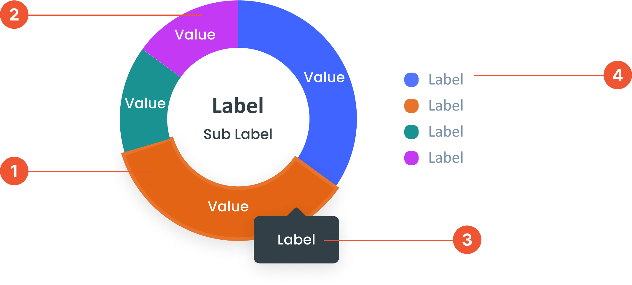
 The numbers or categories shown on the chart. They represent the data being measured.
 A circular chart similar to a pie chart but with a hole in the center.
 A small box that pops up when you hover over a data point, showing more details about it.
 A visual elements that serve as a guide to explain the meaning of various data or elements displayed in a graph
Guidelines for Donut Chart
  • Can display 6 to 8 data points. If there are more, they can be categorized as "Other".
  • Maximum Digits: Label value should not exceed 4 digits & Decimal Digits: Display 1 decimal place without making the graph look messy.
  • Center Labels: The labels and sub-labels in the center of the donut chart are optional. Can be used to provide a summary or key information.
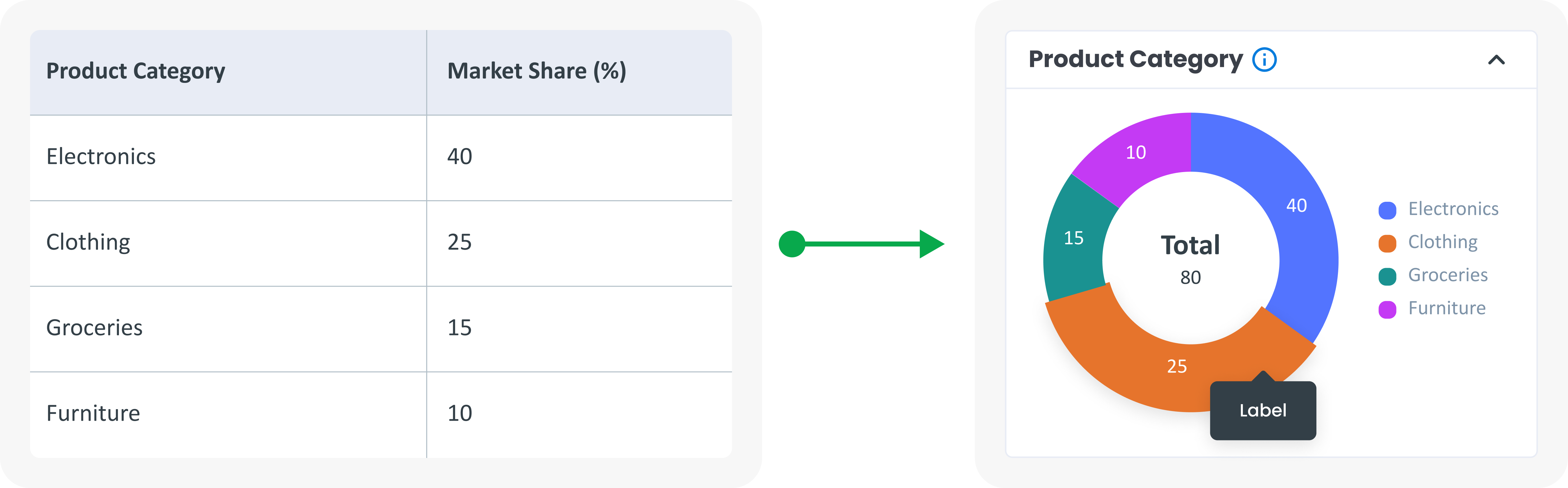
Example of Source Data

When to Use Donut Chart?
  • Donut charts are suitable for showing the composition of a category, comparing the size of a segment of data as a whole, and showing the contribution of each part to the total data.
  • Show how each segment contributes to the overall total.
  • Emphasise certain segments, the space in the middle can be used to display additional information or show certain labels.
  • Comparing categories, When you want to compare. multiple categories, especially when one or more segments are much larger or more small.
arrow_back
Previous Map Selector
Next Donut Progress Bar Chart
arrow_forward