foundationsTypographyTypography is fundamental in presenting the hierarchy, information, and context of a page
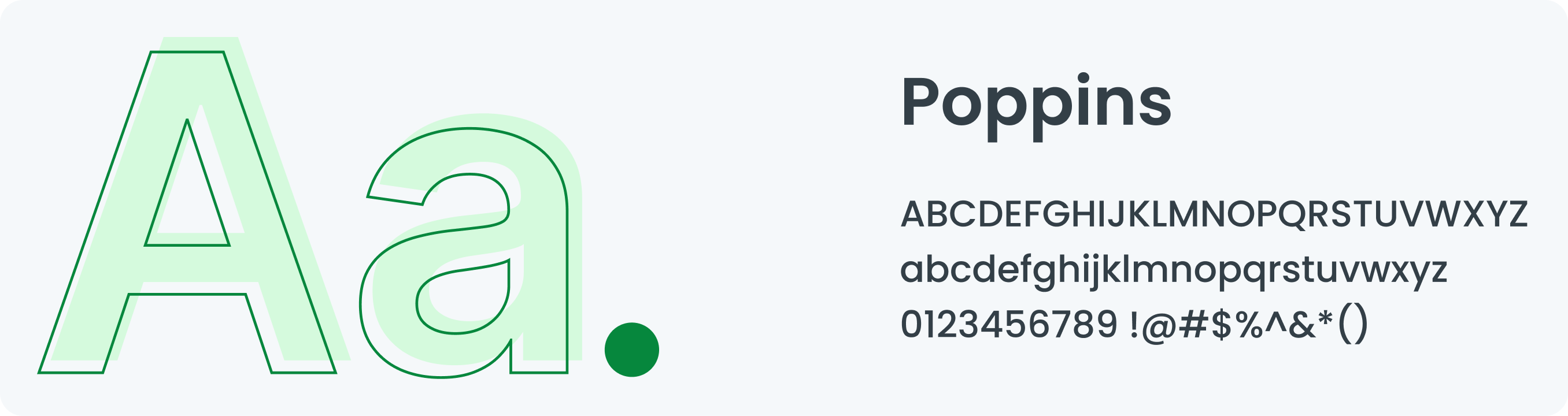
Overview Our typography uses the Poppins font. In present times, any kind of digital medium requires some kind of typographical interface for the user to interact with. Type could account for almost 85-90% of any given screen. Poppins is one of the new comers to this long tradition. With support for the Devanagari and Latin writing systems, it is an internationalist take on the genre.
Guidelines Typography is our font system. Each font reflects the right sentiment to support our users at every stage of their journey. Typography Guidelines :
Make a big difference when you want to create contrast between two elements, such as a header and body of text. Use a similar font when creating for the same brand. Make sure your header is twice as large as the body of the text. The typeface and background colors must have the proper level of contrast. To create a strong contrast, pair fonts with different weights. When designing, make an attempt to keep with the same icon and font to maintain consistency.
Above all, make sure you consider all the elements of typography when designing.
Above all, make sure you consider all the elements of typography when designing.
Type
Headingfont.heading.h1font.heading.h2font.heading.h3font.heading.h4
Aa
ultra / h1Bold 35px/40pxOversized screen titles. Use in moderation
Aa
large / h2SemiBold 29px/32pxEmpty states and feature introductions. Top level headers
Aa
medium / h3Bold 24px/28pxMain titles, use only once per page
Aa
small / h4Medium 20px/24pxHeadings that identify key functionality
Sub Headingfont.subheading.h5font.subheading.h6font.subheading.h7.capitalfont.subheading.h7
Aa
large / h5Bold 16px/20pxSub-section and field group headings
Aa
medium / h6SemiBold 14px/16pxDeep headings and for highlighting important pieces of information
Aa
capital / h7Bold 12px/16pxHeading up a group of list items
Aa
small / h7Bold 12px/16pxLow level headings
Bodyfont.bodyfont.body.boldfont.body.italicfont.body.underlinefont.body.paragraphfont.body.smallfont.body.extrasmall
Aa
bodyMedium 12px/16pxText Body
Aa
boldBold 12px/16pxUse to emphasize text.
Aa
italicsMedium Italics 12px/16pxHeadings that identify key functionality
Aa
linkSemiBold 12px/16pxLink
Aa
paragraphMedium 12px/24pxParagraph
Aa
smallMedium 11px/16pxHelp text under form fields, and as supporting text
Aa
xtra smallMedium 8px/12pxMobile version for minor details, it is not recommended for conveying crucial or primary information