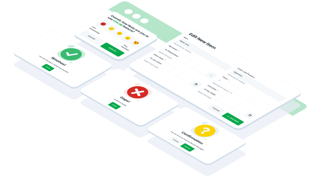
ComponentsModalModal UI refers to a concept in UI design where a window or dialog box appears above the main content of a page or screen, typically to display additional information, gather input from the user, or request confirmation before proceeding with a specific action
Guidelines
Web
Oops Sorry! This Page Is Under Maintenance
We are improving this page, and will be back soon! You can explore other page.
Mobile
Resources
- You can use these components by accessing the provided resource files.
- Preview animations are examples and may not suit Mobile Widgets. Press 'View Code' to access the Widgetbook Playground and see the Flutter widget displaying all created components and interactive.
Usage
Import this line to your file:
import 'package:buma_design_system/buma_design_system.dart';
Attributes of all variants
If there is a question mark ? in the Data Type, it means that the properties are optional, this is namedConstructor from UIModal
showModalMessage
A custom dialog modal for displaying content and information with text content only.
| Properties | Data Type | Description | Default Value |
|---|---|---|---|
| context | BuildContext | A handle to the location of a widget in the widget tree | required |
| state | UIModalState | A state to displaying different Image information content | UIModalState.success |
| typeButton | UIModalButtonType | A button type to displaying different axis of button | UIModalButtonType.vertical |
| primaryButton | UIModalButton? | A model to showing primary button with label and onPressed | null |
| secondaryButton | UIModalButton? | A model to showing secondary button with label and onPressed | null |
showModal
A custom dialog modal for displaying content and information with dynamic content widget.
| Properties | Data Type | Description | Default Value |
|---|---|---|---|
| title | Widget? | A widget to displaying custom title information | null |
| bodyText | String? | A text to display some description | null |
| contentHeader | Widget? | A custom widget to displaying content above title | null |
| contentModal | Widget? | A custom widget to displaying content center of modal | null |
| state | UIModalState | A state to displaying different Image information content | UIModalState.success |
| typeButton | UIModalButtonType | A button type to displaying different axis of button | UIModalButtonType.vertical |
| primaryButton | UIModalButton? | A model to showing primary button with label and onPressed | null |
| secondaryButton | UIModalButton? | A model to showing secondary button with label and onPressed | null |
| checkbox | UIModalCheckbox? | Optional Checkbox with boolean callback | null |
| errorMessage | String? | A text to displays error message | null |
| hasClose | bool? | A button close to dismiss the dialog | false |
Previews & Code
You can call the components with Class.namedConstructor() with different variants.