 Design
 Vue
Vue Flutter
Anatomy
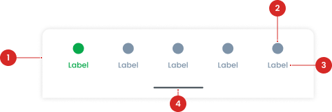
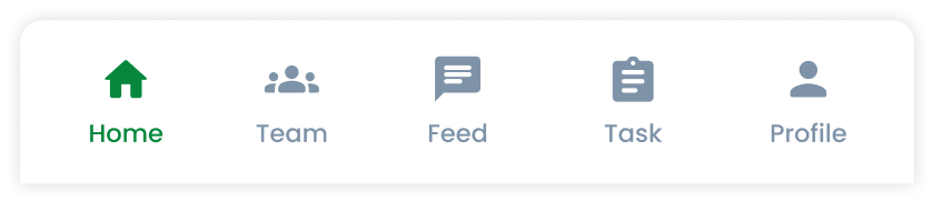
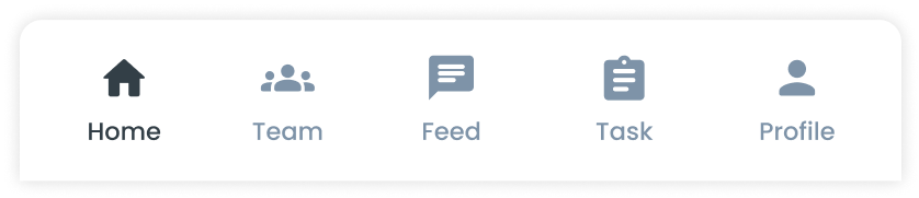
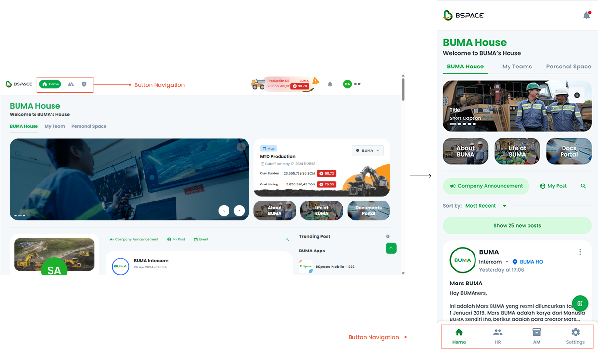
Icons within the navigation buttons that visually represent the associated section or action.
Text accompanying the icon (or standalone) that provides a clear description of each navigation option.
A gesture feature enabling users to reveal additional navigation options or access secondary actions.
- Circle as an instance of the swap component
- The use of the icon on the button will be taken from the Material Design Icon that has been provided
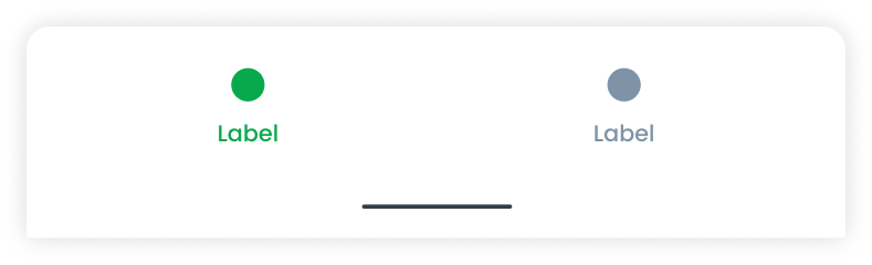
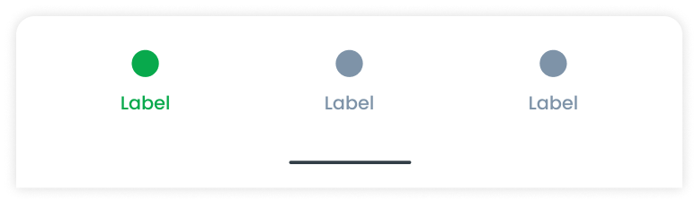
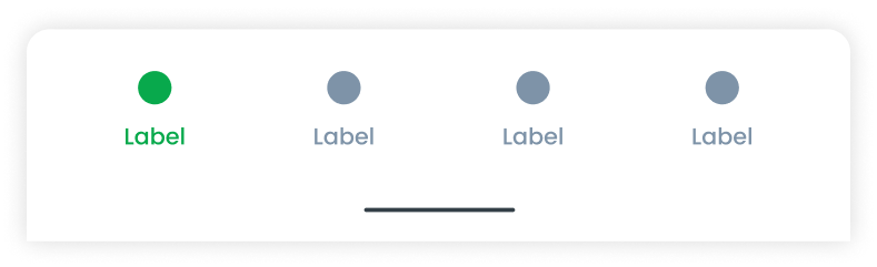
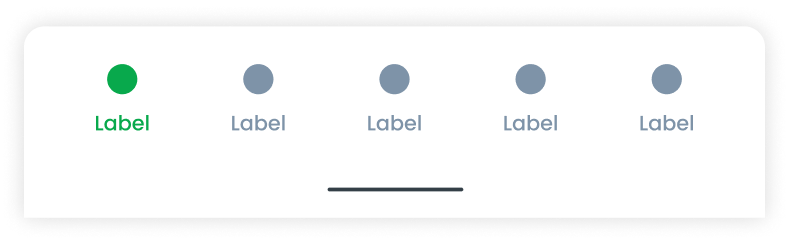
Variant on Button Navigation
Each variant of button navigation is tailored to fit different use cases based on the number of menu options required.
Usage
Usage Recommendation:
- Use button navigation to organize and provide quick access to primary sections or features of an application.
- Ideal for scenarios where users frequently switch between sections, such as mobile apps.
Accessibility
Use the green color (Primary500) for the active button to create a clear visual hierarchy, drawing users' attention to the currently selected page or section. Employ gray color (Icon/Text-lightdark) for inactive buttons to distinguish them from the active button and indicating non-selected pages or sections.
Content
Navigation Button Terms of Switching to PWA
The navigation button component can be switched to a Progressive Web App (PWA) format. This ensures that the navigation functionality remains consistent and user-friendly across both desktop and mobile platforms.
- You can use these components by accessing the provided resource files.
- Preview animations are examples and may not suit Mobile Widgets. Press 'View Code' to access the Widgetbook Playground and see the Flutter widget displaying all created components and interactive.
Usage
Import this line to your file:
import 'package:buma_design_system/buma_design_system.dart';
Attributes
If there is a question mark ? in the Data Type, it means that the properties are optional
| Properties | Data Type | Description |
|---|---|---|
| initialIndex | int | A current position for first initialization |
| items | List<BottomNavigationBarItem> | A collection for displaying all item |
| onTap | ValueChanged<int> | Signature for callbacks that report that an underlying value, when user pressed item |
Previews & Code
You can call the components with Class.namedConstructor() with different variants.
Primary Usage
- Use the primary color (Primary500) for the active button to create a clear visual hierarchy, drawing users' attention to the currently selected page or section.
- Employ secondary color (Icon/Text-lightdark) for inactive buttons to distinguish them from the active button and indicating non-selected pages or sections.
Scaffold(
    body: YourContent(),
    bottomNavigationBar: UIBottomNavbar(
   items: [
     BottomNavigationBarItem(
       icon: Icon(Icons.home),
       label: 'Home',
     ),
     BottomNavigationBarItem(
       icon: Icon(Icons.search),
       label: 'Search',
     ),
     BottomNavigationBarItem(
       icon: Icon(Icons.person),
       label: 'Profile',
     ),
   ],
   selectedIndex: 1,
   onTap: (index) {
     print('Selected index: $index');
   },
 )
)