 Design
 Vue
Vue Flutter
Anatomy
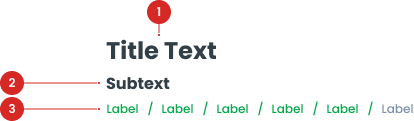
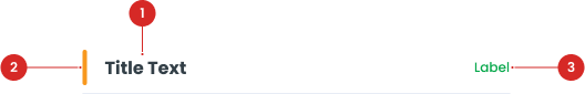
A smaller, descriptive text that provides additional context or information about the page.
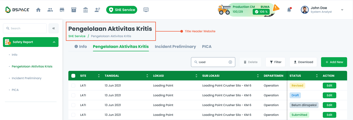
A navigational aid that helps users understand their location within the system and navigate back to previous sections.
A decorative element used to create visual separation between sections of content, enhancing the layout without implying any structural hierarchy.
An interactive element that can be optionally included with the Title component to provide actions related to the page title or context.
Title Variant
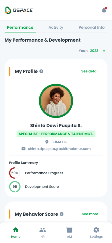
Header Title
Used as the main Title, which serves as the main header on each page.

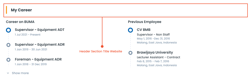
Header Section Title
Used within the Card, which provides titles for specific content within the Card component.

Usage
The Title component is a key element used for headers on each page. It ensures consistency in the presentation of page titles across the system.
Usage Recommendation:
- Providing clear and descriptive headings or labels for various sections, pages, or elements.
- Convey essential information and provide context to users.
- Enhancing navigation and comprehension throughout the interface.
Accessibility
This title component is designed to ensure consistency in typography and spacing across all pages, so that every title on different pages maintains a uniform and well-structured appearance. It is important not to change the text size or spacing, as doing so may disrupt the overall visual consistency and user experience across the site.
Content
Titles should clearly communicate the purpose or main content of the page.
Capitalization
It is essential to use title case for all titles, ensuring they maintain a formal and consistent appearance.


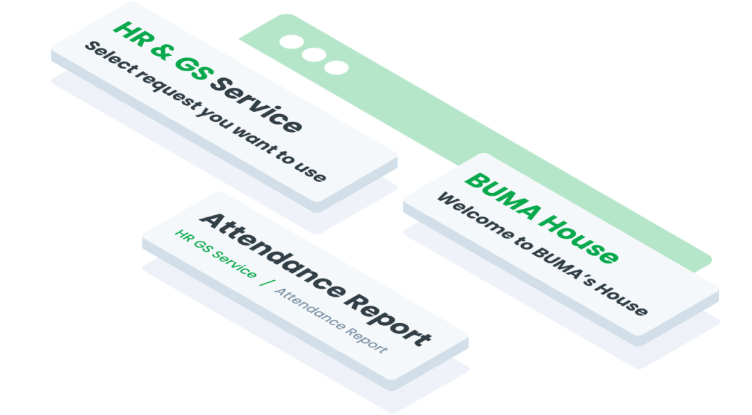
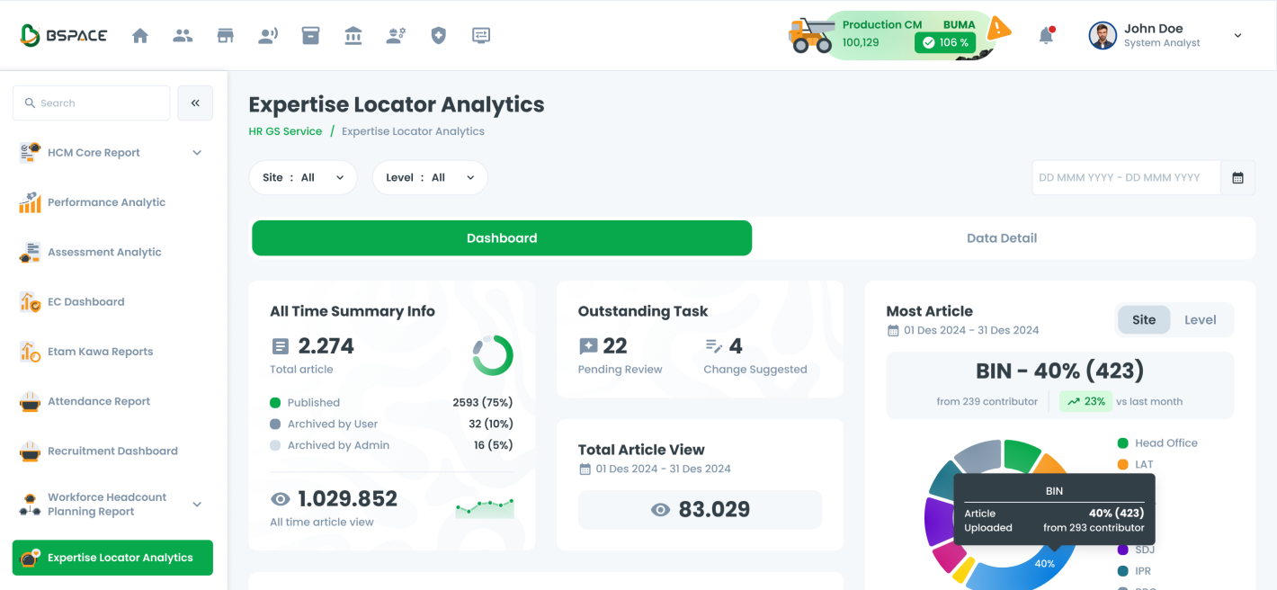
Usage on BSpace
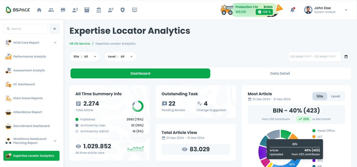
Header Title
The header title is used to display the main title of a page with additional subtitle and relevant button links.
The title component can be switched to a Progressive Web App (PWA) format. This ensures that the title remains consistent and user-friendly across both desktop and mobile platforms.
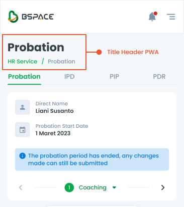
Header Section Title
No button is present near the title, suggesting that the section is either static or for informational purposes only, without options for immediate interaction or management by the user.
With button (typically labeled "Manage," "Edit," or similar) placed near the title. This button allows users to interact with or manage the section's content, providing options such as editing, adding, or deleting items. Also, the button can serve as a link to redirect users to another page for more detailed management or further actions related to the section.
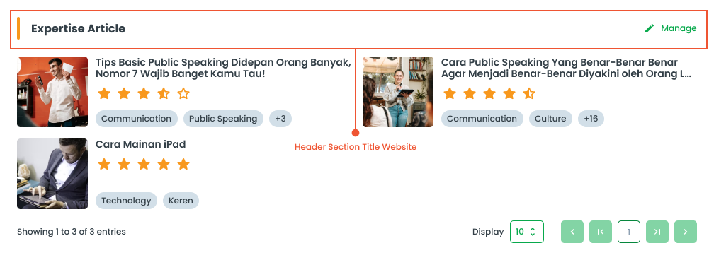
The title header section component can be switched to a Progressive Web App (PWA) format. This ensures that the title header section remains consistent and user-friendly across both desktop and mobile platforms.
Usage of BTitle
The package is already installed in the repository's shell. To use the component, you only need to add the following code:
<BTitle />
Attributes of BTitle
If there is a question mark ? in the Data Type, it means that the properties are optional.
| Properties | Data Type | Description | Default Value |
|---|---|---|---|
| title | string | Text for the title | Title Text |
| titleClass | string | Custom class to style the title | none |
| breadcrumbItems? | string | Breadcrumb text for hierarchical navigation | none |
Variants
The <BTitle /> component supports the following variants:
| Variant | Description |
|---|---|
| label | Label used for show target label |
| target | A target variant to link to a destination |
Usage of BTitleSection
The package is already installed in the repository's shell. To use the component, you only need to add the following code:
<BTitleSection />
Attributes of BTitleSection
If there is a question mark ? in the Data Type, it means that the properties are optional.
| Properties | Data Type | Description | Default Value |
|---|---|---|---|
| title | string | Text for the title | Title Text |
| titleClass | string | Custom class to style the title | none |
| hideButton? | boolean | Determines if the action button should be hidden | true |
| buttonVariant | string | Variant for the action button | secondary |
| buttonLabel | string | Label text for the action button | Action |
| buttonClass | string | Custom class for styling the action button | none |
Variants
The <BTitleSection /> component supports the following variants:
| Variant | Description |
|---|---|
| primary | Used for primary or important actions within an interaction. |
| secondary | Default style recommended for most actions. |