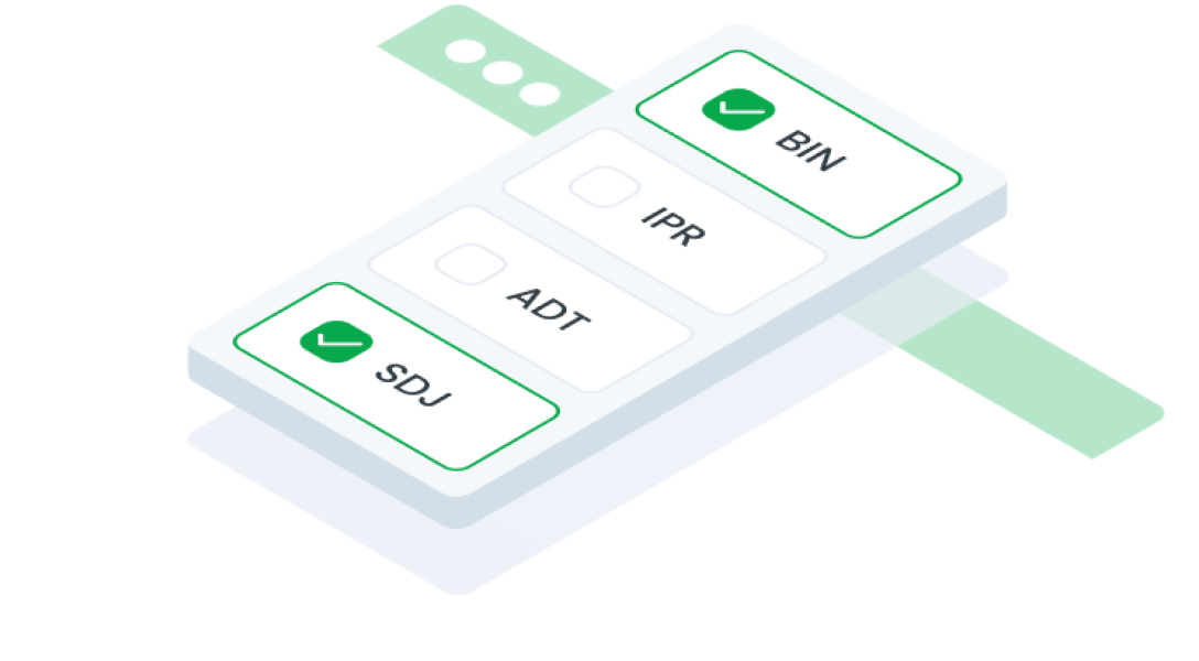
ComponentsCheckboxA checkbox button is a user interface element that allows users to select multiple options from a list. Each checkbox can be checked or unchecked independently of the others.
Guidelines
Web
Resources You can use these components by accessing the provided resource files.
Usage
The package is already installed in the repository's shell. To use the component, you only need to add the following code:
<BCheckbox />
Attributes
If there is a question mark ? in the Data Type, it means that the properties are optional.
| Properties | Data Type | Description | Default Value |
|---|---|---|---|
| label | string? | Label text | none |
| required | boolean | Marks the field as required | false |
| disabled | boolean | Disables the checkbox button | false |
| modelValue | string | The value of the selected checkbox | none |
| id | string? | Identifier for the checkbox button | uuid() |
| inputClass | string | Used for modify checkbox input | none |
| error | boolean | Indicates an error state | false |
| filled | boolean | Style variation for filled buttons | false |
| intermediate | string? | Validation text | false |
Mobile
Resources
- You can use these components by accessing the provided resource files.
- Preview animations are examples and may not suit Mobile Widgets. Press 'View Code' to access the Widgetbook Playground and see the Flutter widget displaying all created components and interactive.
Usage
Import this line to your file:
import 'package:buma_design_system/buma_design_system.dart';
Attributes
If there is a question mark ? in the Data Type, it means that the properties are optional.
| Properties | Data Type | Description |
|---|---|---|
| value | T? | Displays value of actions. |
| label | String? | Displays additional label right of different action widget. |
| isFilled | bool | Make action has container, background and bordered. |
| isError | bool | When user interface indicates that something has gone wrong or that user input is incorrect or invalid |
| tristate | bool | If true the checkbox's [value] can be true, false, or null. |
| onChanged | ValueChanged<T?>? | Callback when action has changed. |
Previews & Code
You can call the components with Class.namedConstructor() with different variants.
Checkbox
This checkbox variant includes a unique tristate value. In this implementation, a custom function manages a parent-child relationship: when a child checkbox is selected, the parent checkbox automatically updates to a "-" state, indicating a partial selection.