Usage
The package is already installed in the repository's shell. To use the component, you only need to add the following code:
<BEmptyState />
Attributes
If there is a question mark ? in the Data Type, it means that the properties are optional.
| Properties | Data Type | Description | Default Value |
|---|---|---|---|
| variant | string? | Specifies the variant for the component | none |
Variant
<BEmptyState /> has 3 variant
| Variant | Description |
|---|---|
| load-failed | Used to indicate a failed load state |
| no-data | Used when there is no data available |
| no-result | Used when there are no search results |
- You can use these components by accessing the provided resource files.
- Preview animations are examples and may not suit Mobile Widgets. Press 'View Code' to access the Widgetbook Playground and see the Flutter widget displaying all created components and interactive.
Usage
Import this line to your file:
import 'package:buma_design_system/buma_design_system.dart';
Attributes of all variants
If there is a question mark ? in the Data Type, it means that the properties are optional, this is namedConstructor from UIEmptyState
UIEmptyState
A widget for warn user when data is unavailable, Prevent confusion that would arise from and empty page or component, reassure users that they are doing the right thing and help the user figure out what they can do next.
| Properties | Data Type | Description | Default Value |
|---|---|---|---|
| message | String? | A text for empty state highlight information | null |
| type | UIEmptyStateType | A different type of empty state | UIEmptyStateType.noData |
UIEmptyStatePage
A widget for warn user when data is unavailable for full of page, Prevent confusion that would arise from and empty page or component, reassure users that they are doing the right thing and help the user figure out what they can do next.
| Properties | Data Type | Description | Default Value |
|---|---|---|---|
| title | String? | A text for empty state page highlight information | null |
| messange | String? | A subtitle under title to explain more information | null |
| systemMessange | String? | A important information to client devices with Error: prefix | null |
| type | UIEmptyStatePageType | A different type of empty state page | UIEmptyStatePageType.system400 |
| button | UIEmptyStateButton | A primary button for handle callback to continue the next action | `{different_type_default_button} |
Previews & Code
You can call the components with Class.namedConstructor() with different variants
Single No Data
  UIEmptyState(
    message: 'Message',
    type: UIEmptyStateType.nodata,
  )
Single No Result
  UIEmptyState(
    message: 'Message',
    type: UIEmptyStateType.noresult,
  )
Page System 400
  UIEmptyStatePage(
    title: 'Title',
    message: 'Message',
    systemMessage: '400 Exception',
    type: UIEmptyStatePageType.system400,
    button: UIEmptyStateButton(
      label: 'Label',
      onPressed: (){
        // Do something
      },
    ),
  )
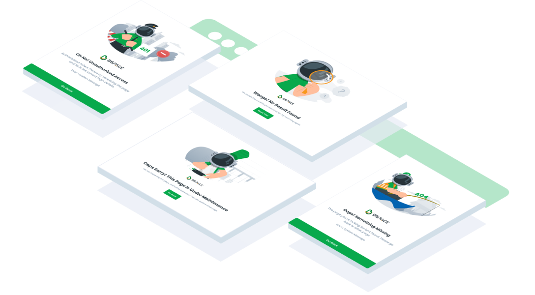
Page System 401
  UIEmptyStatePage(
    title: 'Title',
    message: 'Message',
    systemMessage: '401 Exception',
    type: UIEmptyStatePageType.system401,
    button: UIEmptyStateButton(
      label: 'Label',
      onPressed: (){
        // Do something
      },
    ),
  )
Page System 404
  UIEmptyStatePage(
    title: 'Title',
    message: 'Message',
    systemMessage: '404 Exception',
    type: UIEmptyStatePageType.system404,
    button: UIEmptyStateButton(
      label: 'Label',
      onPressed: (){
        // Do something
      },
    ),
  )
Page System 500
  UIEmptyStatePage(
    title: 'Title',
    message: 'Message',
    systemMessage: '500 Exception',
    type: UIEmptyStatePageType.system500,
    button: UIEmptyStateButton(
      label: 'Label',
      onPressed: (){
        // Do something
      },
    ),
  )
Page No Data
  UIEmptyStatePage(
    title: 'Title',
    message: 'Message',
    type: UIEmptyStatePageType.noData,
    button: UIEmptyStateButton(
      label: 'Label',
      onPressed: (){
        // Do something
      },
    ),
  )
Page Under Maintenaince
  UIEmptyStatePage(
    title: 'Title',
    message: 'Message',
    type: UIEmptyStatePageType.underMaintenaince,
    button: UIEmptyStateButton(
      label: 'Label',
      onPressed: (){
        // Do something
      },
    ),
  )
Page Update App
  UIEmptyStatePage(
    title: 'Title',
    message: 'Message',
    type: UIEmptyStatePageType.updateApp,
    button: UIEmptyStateButton(
      label: 'Label',
      onPressed: (){
        // Do something
      },
    ),
  )