Buma UI - DocumentationBuma UI - Documentation
Get Started
Foundations
Components
Resources
Patterns
Data Visualization
Back to BSpace
Get Started
Foundations
Components
Resources
Patterns
Data Visualization
  • stacksFoundations
    • 💡 Overview
    • Color
    • Principle
    • Typography
  • brickComponents
    • 💡 Overview
    • Accordion
    • Alert
    • Avatar
    • Badge
    • Bottom Sheet
    • Bread Crumb
    • Button
    • Button Link
    • Button Navigation
    • Calendar
    • Card
    • Chat
    • Checkbox
    • Chips
    • Choice Tile
    • Comment
    • Date Picker
    • Divider
    • Download
    • Drawer
    • Dropdown
    • Empty State
    • Floating Button
    • Form Input
    • Header
    • Hint
    • Icon
    • List Choice
    • Loading
    • Modal
    • Navigation Bar
    • Notification
    • Pagination
    • Progress Bar
    • Radio Button
    • Search
    • Scrolling Bar
    • Segmented Switch
    • Side Menu
    • Side Tab
    • Slider
    • Switch
    • Tab
    • Table
    • Text Area
    • Text Input
    • Time Picker
    • Title
    • Toast
    • Tooltip
    • Wizzard
  • splitscreenPattern
    • 💡 Overview
    • Filter
      upcoming
    • Form
      upcoming
    • Notification
    • PWA
      upcoming
    • table
      upcoming
    • Upload Download
      upcoming
  • insert_chartData Visualization
    • 💡 Overview
    • Tiering
    • Pattern
    • Chart and Graph
      • Chart Selection Guide
      • Map Selector
      • Donut Chart
      • Donut Progress Bar Chart
      • Spider Chart
      • Line Chart
      • Chart Area
      • Speedometer
      • Heat Map
      • Scatter Plot
      • Pie Chart
      • Bar Chart
      • Waterfall Chart
      • Sunburst Chart
      • Tree Decomposition Chart
      • Scorecards
      • Table
      • Micro Visualization
    • Typography
    • Color Palette
  • data_objectTokens
    upcoming
  • inventory_2Resources
    • 💡 Overview
    • Mobile
      new
      • 💡 Introduction
      • Installation
      • General
        • Important Rules
        • Naming Convention
        • Clean Architecture
    • Web
      upcoming
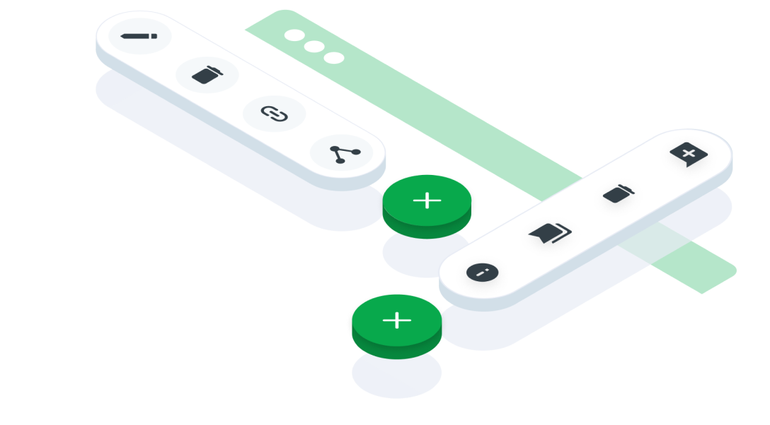
ComponentsFloating ButtonA floating button in interface design refers to an interactive element that floats above the main content of an application or website, typically providing quick access to essential functions or frequently used actions
Guidelines
Mobile
Resources
  • You can use these components by accessing the provided resource files.
  • Preview animations are examples and may not suit Mobile Widgets. Press 'View Code' to access the Widgetbook Playground and see the Flutter widget displaying all created components and interactive.

Usage

Import this line to your file:

import 'package:buma_design_system/buma_design_system.dart';

Attributes of all variants

If there is a question mark ? in the Data Type, it means that the properties are optional, this is namedConstructor from UIFloatingButton

UIFloatingButton & UIFloatingButton.horizontal
PropertiesData TypeDescriptionDefault Value
iconIconDataDisplays the icon in the center UIFloatingButtonnull
variantUIFloatingButtonVariant?Displays different floating buttons using certain variants``UIFloatingButtonVariant.vertical`
sizeUIFloatingButtonSizeA constant size to create different padding on contentUIFLoatingButtonSize.large
labelString?Displays labels to the right of iconnull
menusList<UIFloatingBUttonMenu>?A collection of menus that display several additional floating buttons[]
onPressedVoidCallback?A callback when the user presses a buttonnull

Previews & Code

You can call the components with Class.namedConstructor() with different variants

UIFloatingButton.vertical
   UIFloatingButton.vertical(
    icon: Icons.add,
    label: 'Add',
    menus: [
      UIFloatingButtonMenu(
        icon: Icons.flight,
        label: 'Menu 1',
        onPressed: (){
          // Do something on Menu 1
        }
      ),
      UIFloatingButtonMenu(
        icon: Icons.flight,
        label: 'Menu 2',
        onPressed: (){
          // Do something on Menu 2
        }
      )
    ]
  )
UIFloatingButton.horizontal
   UIFloatingButton.horizontal(
    icon: Icons.add,
    label: 'Add',
    menus: [
      UIFloatingButtonMenu(
        icon: Icons.flight,
        label: 'Menu 1',
        onPressed: (){
          // Do something on Menu 1
        }
      ),
      UIFloatingButtonMenu(
        icon: Icons.flight,
        label: 'Menu 2',
        onPressed: (){
          // Do something on Menu 2
        }
      )
    ]
  )
arrow_back
Previous Empty State
Next Form Input
arrow_forward