Donut Progress Bar Chart
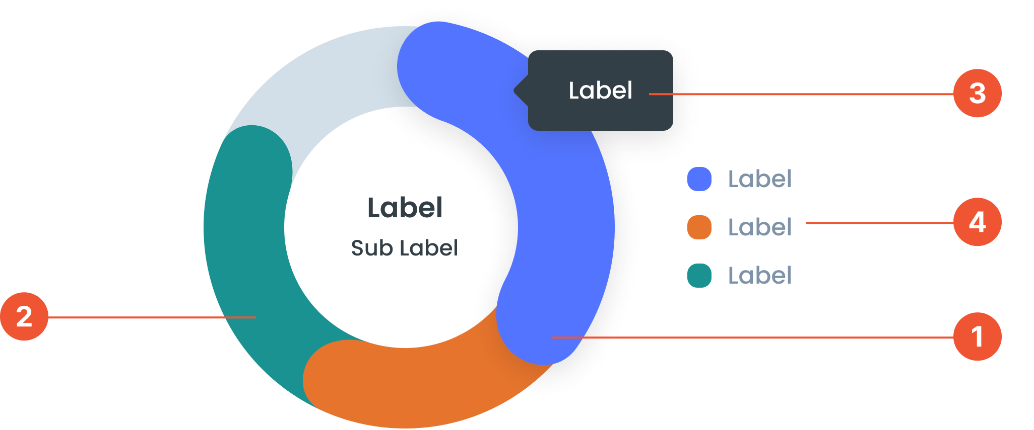
Anatomy
Refers to the interactive feature of a Donut Progress Bar Chart, which provides additional details when users hover over specific segments of the chart.
is a variation of a donut chart used to display progress toward a target or maximum value. It features a circular shape with a hollow center (resembling a donut) and colored segments representing the percentage of completion.
A small box that pops up when you hover over a data point, showing more details about it.
A visual elements that serve as a guide to explain the meaning of various data or elements displayed in a graph
Guidelines for Donut Progress Bar Charts
- Can display 6 to 8 data points. If there are more, they can be categorized as "Other".
- The value displayed can be in the Center Label or Tooltip
- Center Labels: The labels and sub-labels in the center of the donut chart are optional. Can be used to provide a summary or key information.
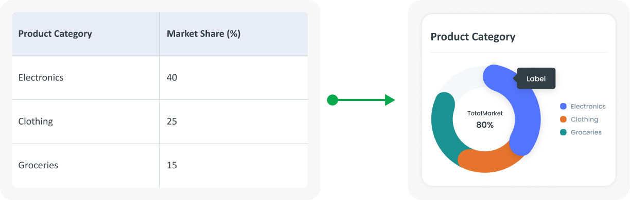
Example of Source Data
When to Use a Donut Progress Bar Chart?
- Visualize data against targets and measure progress.
- Quickly compare visually between categories.