 Design
 Vue
Vue Flutter
Anatomy
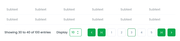
Desktop

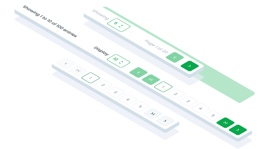
Allows users to specify the number of items displayed per page (e.g., 5, 10, 25, 50, 100 data).
Navigates to the next or previous page. Displays specific page numbers that the user can click to navigate directly to a specific page.
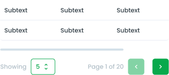
Mobile
Allows users to specify the number of items displayed per page (e.g., 5, 10, 25, 50, 100 data).
Navigates to the next or previous page.
Type of Display Pagination


Variant of Pagination
Primary (Default)
This variant is ideal for scenarios where pagination is a key part of the user's navigation flow, such as switching pages in a table or on a list view where data visibility is critical.

Secondary
This variant is intended for secondary or less prominent areas. It works well in contexts where the pagination is not the focal point, such as within a sidebar or a supporting section.

Size of Pagination
Large (Default)
Larger dimensions for buttons and spacing. Ideal for primary sections where pagination is frequently used and requires easy accessibility. For example, in a main table of a dashboard where users navigate through detailed records or datasets, the large size ensures better usability and visibility.

Small
Compact dimensions for buttons and spacing. Suitable for areas with limited space or less frequent use. For instance, inside cards, small panels, or compact sections, where pagination supports content navigation without taking up significant space or overshadowing other elements.

State of Pagination Button


Usage
The Pagination component is used to navigate through a list or dataset that spans multiple pages. It is particularly useful when displaying a large amount of data that cannot fit on a single screen.
Usage Recommendation:
- To allow users to concentrate on a limited number of items simultaneously.
- For displaying the entire range of pages available for user navigation.
- To enable users to swiftly and effortlessly navigate to any page within the list.
Accessibility
First and Last Page
Ensure the "Previous" and "Next" buttons are disabled when the user is on the first or last page, respectively.
Center Alignment of Active Page
Ensure the active page button is always centered within the pagination component, except when the user is on the first two or last two pages.


Content
Screen Readers
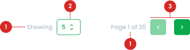
Provide clear announcements for actions, e.g., "Showing 30 to 40 of 100 entries" or "Page 3 of 20"
Usage
The package is already installed in the repository's shell. To use the component, you only need to add the following code:
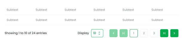
<BPagination :totalRows='120' v-model="current" :perPage="perPage" @update:perPage="updatePerpage"/>
Attributes
If there is a question mark ? in the Data Type, it means that the properties are optional.
| Name | Data Type | Description | Default Value |
|---|---|---|---|
| size | string | Defines the size of the pagination. | lg |
| perPage | number string | Number of items displayed per page. | 10 |
| totalRows* | number string | Total number of rows to paginate. | 120 |
| perPageLabel | string | Custom label for items per page. | Display' |
| minPerPage | number | Minimum items per page. | none |
| maxPerPage | number | Maximum items per page. | none |
| light | boolean | Enables light variant styling. | false |
Sizes
The <BPagination /> component supports the following Sizes:
| Size | Description |
|---|---|
| sm | Showing current page with perv and next button |
| md | Showing pagination step button |
| lg | Showing pagination step button with display setting |
- You can use these components by accessing the provided resource files.
- Preview animations are examples and may not suit Mobile Widgets. Press 'View Code' to access the Widgetbook Playground and see the Flutter widget displaying all created components and interactive.
Usage
Import this line to your file:
import 'package:buma_design_system/buma_design_system.dart';
Attributes
If there is a question mark ? in the Data Type.
| Properties | Data Type | Description | Default Value |
|---|---|---|---|
| initialPage | int? | Displays initial page of pagination | 1 |
| maxPage | int? | Displays maximum page of pagination | 1 |
| onPaginationChanged | UIPaginationCHanged? | Callback when pagination is changed | null |
Pagination Base
You can use UIPagination at the bottom of the screen page.