Line Chart
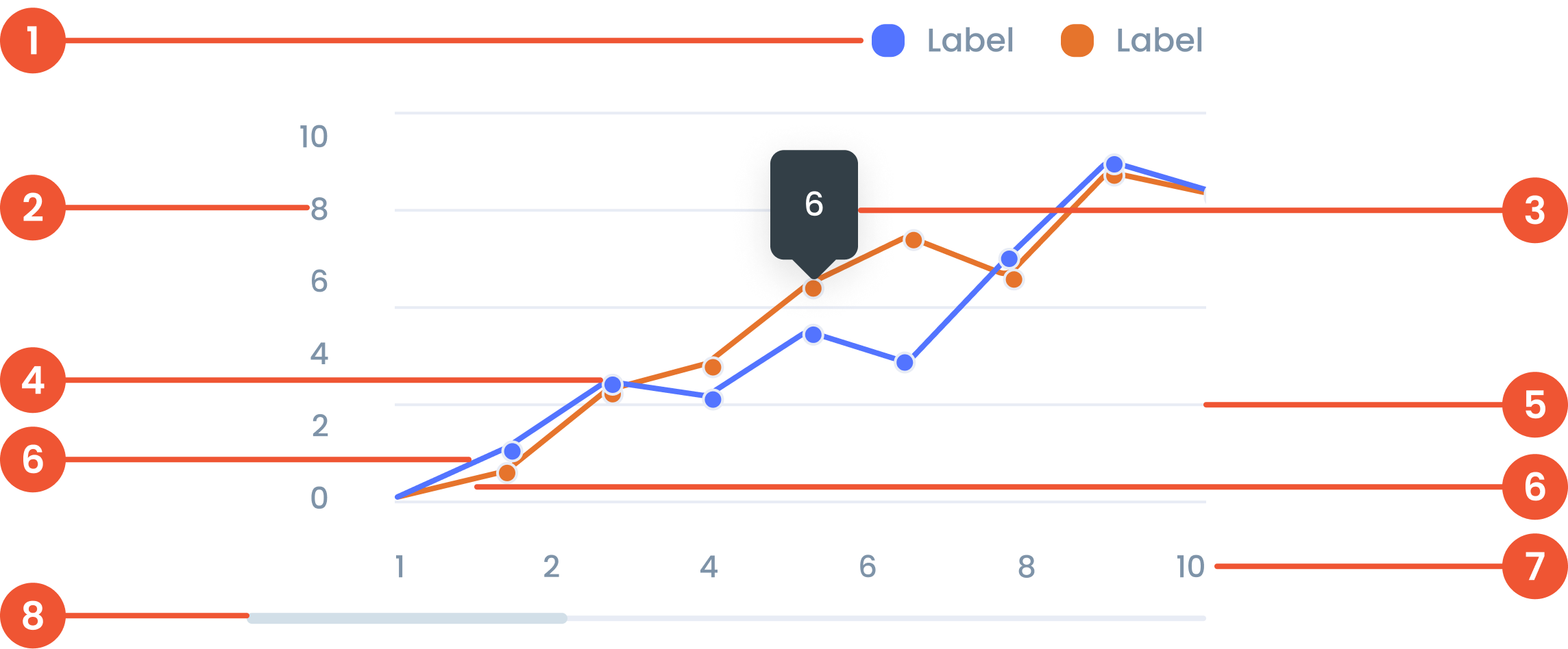
Anatomy
Text on a chart refers to any written information or labels included in a chart to provide context, describe data, or improve the readability and understanding of the visualization.
The label on the vertical (up-down) side of the chart, showing what the numbers represent.
A small box that pops up when you hover over a data point, showing more details about it.
A small dot marking a specific data point on the chart, making it easier to see exact values.
Faint lines across the chart that help you match data points to the values on the axes.
A line connecting points on a chart. that represent data value
The label on the horizontal (left-right) side of the chart, showing time, categories, or other data types.
A bar that lets you move around the chart when there’s too much data to fit on the screen.
Guidelines for Line Charts
- The maximum number of line series is 5 series.
- The Maximum number of Characters is 30 Characters per tooltip
- The minimum number of data points on X-Axis is 10 data points, and the maximum number of data points on Y-Axis is 10 data points.
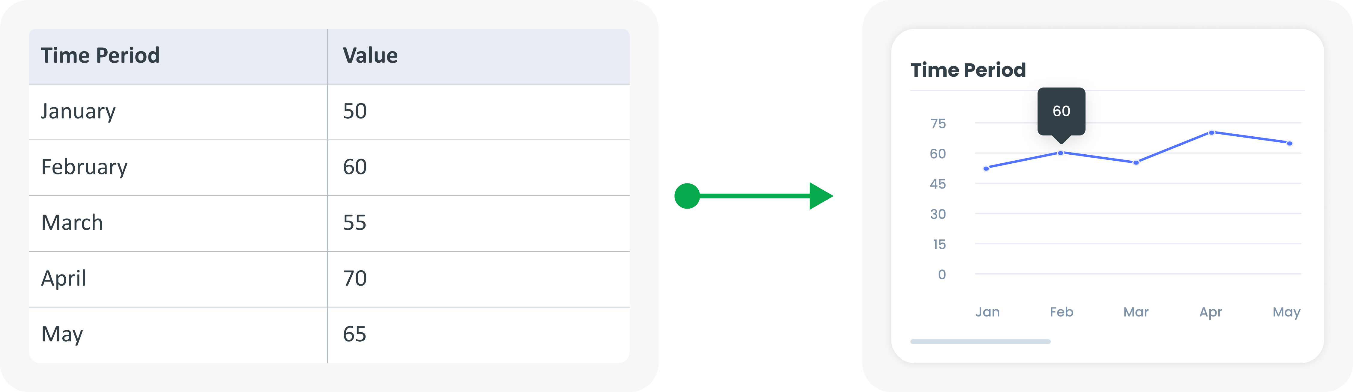
Example of Source Data
When to Use a Line Chart?
- Shows changes over time.
- Shows a continuous dataset.
- Identifying trends, patterns and fluctuations.