Buma UI - DocumentationBuma UI - Documentation
Get Started
Foundations
Components
Resources
Patterns
Data Visualization
Back to BSpace
Get Started
Foundations
Components
Resources
Patterns
Data Visualization
  • stacksFoundations
    • 💡 Overview
    • Color
    • Principle
    • Typography
  • brickComponents
    • 💡 Overview
    • Accordion
    • Alert
    • Avatar
    • Badge
    • Bottom Sheet
    • Bread Crumb
    • Button
    • Button Link
    • Button Navigation
    • Calendar
    • Card
    • Chat
    • Checkbox
    • Chips
    • Choice Tile
    • Comment
    • Date Picker
    • Divider
    • Download
    • Drawer
    • Dropdown
    • Empty State
    • Floating Button
    • Form Input
    • Header
    • Hint
    • Icon
    • List Choice
    • Loading
    • Modal
    • Navigation Bar
    • Notification
    • Pagination
    • Progress Bar
    • Radio Button
    • Search
    • Scrolling Bar
    • Segmented Switch
    • Side Menu
    • Side Tab
    • Slider
    • Switch
    • Tab
    • Table
    • Text Area
    • Text Input
    • Time Picker
    • Title
    • Toast
    • Tooltip
    • Wizzard
  • splitscreenPattern
    • 💡 Overview
    • Filter
      upcoming
    • Form
      upcoming
    • Notification
    • PWA
      upcoming
    • table
      upcoming
    • Upload Download
      upcoming
  • insert_chartData Visualization
    • 💡 Overview
    • Tiering
    • Pattern
    • Chart and Graph
      • Chart Selection Guide
      • Map Selector
      • Donut Chart
      • Donut Progress Bar Chart
      • Spider Chart
      • Line Chart
      • Chart Area
      • Speedometer
      • Heat Map
      • Scatter Plot
      • Pie Chart
      • Bar Chart
      • Waterfall Chart
      • Sunburst Chart
      • Tree Decomposition Chart
      • Scorecards
      • Table
      • Micro Visualization
    • Typography
    • Color Palette
  • data_objectTokens
    upcoming
  • inventory_2Resources
    • 💡 Overview
    • Mobile
      new
      • 💡 Introduction
      • Installation
      • General
        • Important Rules
        • Naming Convention
        • Clean Architecture
    • Web
      upcoming
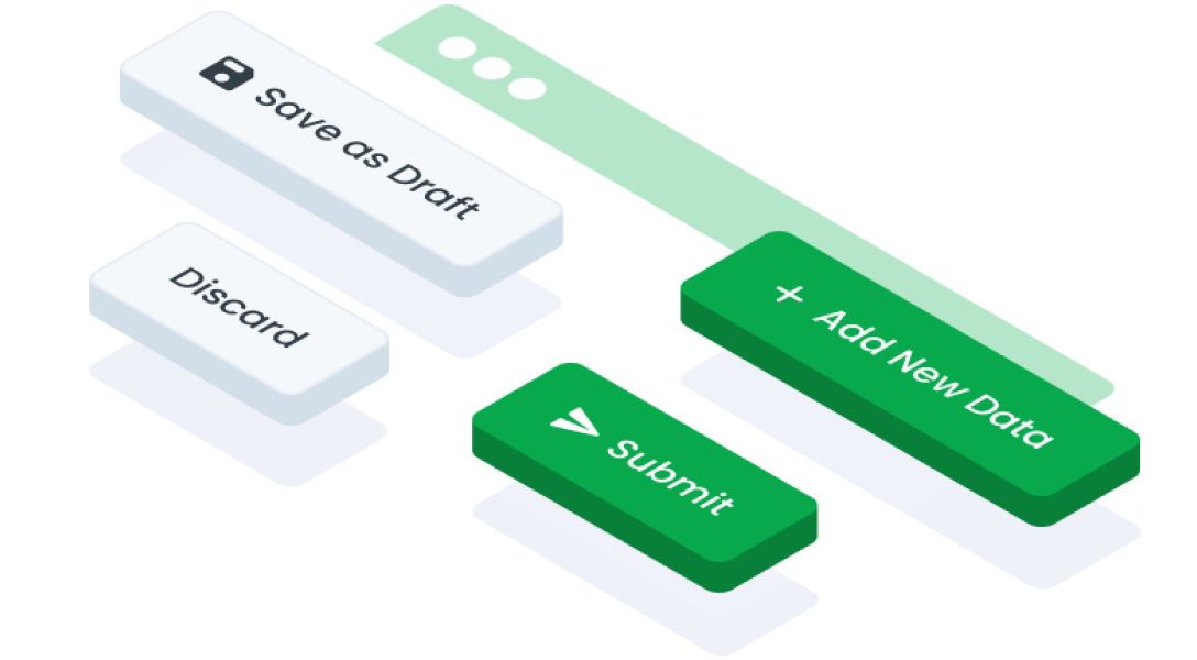
ComponentsButton LinkA button link in interface design is a clickable element that resembles a button but functions as a hyperlink, directing users to another location within the same website or to an external webpage.
Guidelines
Web
Mobile
Resources
  • You can use these components by accessing the provided resource files.
  • Preview animations are examples and may not suit Mobile Widgets. Press 'View Code' to access the Widgetbook Playground and see the Flutter widget displaying all created components and interactive.

Usage

Import this line to your file:

import 'package:buma_design_system/buma_design_system.dart';

Attributes

If there is a question mark ? in the Data Type, it means that the properties are optional

PropertiesData TypeDescription
labelStringDisplay text to the center of button link
variantUIButtonLinkTypeA type option to display several button link variants
leftIconIconData?Displays the icon on the left of label
rightIconIconData?Displays the icon on the right of label
onPressedVoidCallback?A callback from user interaction or gesture
UIButtonLinkType

A type for different button links.

NameDescription
primaryUse a primary button link for the main or most desired actions by the user
secondaryUse a secondary button link for alternative actions, additional options, or less urgent but still important actions

Variants

You can call the components with Class.namedConstructor() with different variants.

Primary
  • Used for primary or important actions within an interaction or process.
  • Suitable for actions that need to be promoted or encouraged for users to take.
 UIButtonLink.primary(
   label: 'Label',
   leftIcon: Icons.fiber_manual_record,
   onPressed: (){
     // Do something
   }
 )
Secondary
  • Default style recommended for most actions.
  • Alternate or negative closure actions (such as, Cancel Button, Back Button) in a form or dialog.
 UIButtonLink.secondary(
   label: 'Label',
   leftIcon: Icons.fiber_manual_record,
   onPressed: (){
     // Do something
   }
 )
arrow_back
Previous Button
Next Button Navigation
arrow_forward