- You can use these components by accessing the provided resource files.
- Preview animations are examples and may not suit Mobile Widgets. Press 'View Code' to access the Widgetbook Playground and see the Flutter widget displaying all created components and interactive.
Usage
Import this line to your file:
import 'package:buma_design_system/buma_design_system.dart';
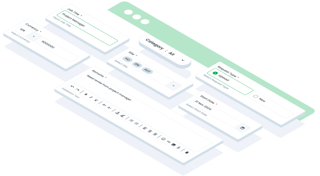
Attributes of all variants
If there is a question mark ? in the Data Type, it means that the properties are optional, this is namedConstructor from UIFormInput
UIFormInput
A custom design of TextFormField, in this class we have 4 variants of FormInput: base, field, date, and textarea
| Properties | Data Type | Description | Default Value |
|---|---|---|---|
| title | UIFormInputTitle? | Displays title above form input | null |
| placeHolder | String? | Displays placeholder inside form input | null |
| prefixValidationText | String? | Displays validation at the right below form input | null |
| suffixValidationText | String? | Displays validation at the right below form input | null |
| minLines | int? | Displays minimum lines of form input | 5 |
| maxLines | int? | Displays maximum lines of form input | 1 |
| maxLength | int? | Make length of text has limit | 255 |
| obsecureText | bool | Make text hide or obsecure | false |
| showNextPreviousDate | bool? | Displays previous and future of month date | false |
| focusNode | FocusNode? | A object that can be used by a stateful widget to obtain the keyboard focus and to handle keyboard events | null |
| enabled | bool | Enable form input all gesture | true |
| readOnly | bool? | Make form input read only | false |
| hasCounterText | bool | Displays a counter text of length form input | false |
| controller | TextEditingController? | A controller for an editable text field | null |
| textInputAction | TextInputAction? | An action the user has requested the text input control to perform | null |
| leftButton | UIFormInputButton? | Displays left button inside form input | null |
| rightButon | UIFormInputButton? | Displays right button inside form input | null |
| keyboardType | TextInputType? | The type of information for which to optimize the text input control | TextInputType.text |
| onTap | VoidCallback? | Callback when user tap the field | null |
| validator | FormFieldValidator<String>? | Signature for validating a form field | null |
| inputFormatters | List<TextInputFormatter>? | Creates a FormField that contains a TextField | [] |
| keyboardConfig | KeyboardActionsConfig? | Wrapper for a single configuration of the keyboard actions bar | null |
| prefixIcon | Widget? | Displays prefix icon | null |
| onTapClearText | void Function()? | Handle callback when user tap clear text | null |
| onChanged | ValueChanged<String>? | Called when the user initiates a change to the TextField's value: when they have inserted or deleted text or reset the form | null |
UIFormInput.date
Below are some properties that the base, field and textarea variants do not have.
| Properties | Data Type | Description | Default Value |
|---|---|---|---|
| initialDate | DateTime | Displays initial start date | DateTime.now() |
| minDate | DateTime | Displays minimum date | DateTime.now().year - 10 |
| maxDate | DateTime | Displays maximum date | DateTime.now().year + 10 |
| listEvent | List<DateTime>? | Displays conditional event or big day | [] |
UIFormInputMultiple
A custom multiple select input field with UIChips
| Properties | Data Type | Description | Default Value |
|---|---|---|---|
| title | UIFormInputTitle? | Displays title above form input | null |
| placeHolder | String? | Displays placeholder inside form input | null |
| enabled | bool | Enable form input all gesture | true |
| validationText | String? | Displays validation at the bottom of form input | null |
| initialValue | List<String>? | Displays initial multiple values | [] |
| listDropDown | List<String>? | Displays dropdown of multiple form input | [] |
| validator | FormFieldValidator<String>? | Signature for validating a form field | null |
| onChanged | ValueChanged<List<String>>? | Creates a FormField that contains a TextField, and return list values |
UIFormInputFilterCheckbox
A custom form input with dropdown filter checkbox, have 3 variants: avatar, left and right, you can call with named parameters UIFormIputFilterCheckbox.avatar
| Properties | Data Type | Description | Default Value |
|---|---|---|---|
| listDropDown | List<UIFormInputFilterInterface>? | Displays list dropdown filter | [] |
| enabled | bool | Enable form input all gesture | true |
| onChanged | ValueChanged<List<String>>? | Creates a FormField that contains a TextField, return data List | null |
UIFormInputFilterRadio
A custom form input with dropdown filter radio: avatar, left and right, you can call with named parameters UIFormIputFilterCheckbox.avatar
| Properties | Data Type | Description | Default Value |
|---|---|---|---|
| listDropDown | List<UIFormInputFilterInterface>? | Displays list dropdown filter | [] |
| enabled | bool | Enable form input all gesture | true |
| onChanged | ValueChanged<List<String>>? | Creates a FormField that contains a TextField, return data List | null |
UIFormInputUpload
A custom form input with upload method, This widget dedicated area for users to upload files to the system, supporting various file types and sizes, often with progress indicators and validation checks, essential for applications involving document submissions, media uploads, or file sharing.
This component have 2 different size: small & large, and you can call with named parameters UIFormInputUpload.large
| Properties | Data Type | Description | Default Value |
|---|---|---|---|
| onUpload | Future<dynamic> Function(List<UIFile> files) | Manage dynamic method of upload file | null |
| enabled | bool | Enable form input all gesture | true |
| title | UIFormInputTitle? | Displays title above form input | null |
| additionalText | String? | Displays additional text for UIFormInputUpload.large | null |
| validationText | String? | Displays validation at the belo form input | null |
| onTapRemoveFile | void Function(String id)? | Manage dynamic method of remove file | null |
| files | List<UIFile>? | List of files that have been uploaded | [] |
| maxFilex | int? | Maximum files that can be uploaded | 100 |
| bottomMarginProgress | double? | Add bottom margin position snackbar | 30 |
| maxSize | double? | Maximum size of file that can be uploaded | 2MB |
UIFormInputRangeSlider
The multiple form input with slider
| Properties | Data Type | Description | Default Value |
|---|---|---|---|
| label | String? | Displays text above of the slider | null |
| minRange | double? | Settings minimum value range of slider | 0 |
| maxRange | double? | Settings maximum value range of slider | 100 |
| initRangeValues | RangeValues? | Displays initial range values | RangeValues(minRange, maxRange) |
| leftRange | UIFormInputSlider? | Displays data range slider on the left | null |
| rightRange | UIFormInputSlider? | Displays data range slider on the right | null |
UIFormInputOption
This component have 2 different axis: vertical & horizontal, and you can call with named parameters UIFormInputUpload.vertical
| Properties | Data Type | Description | Default Value |
|---|---|---|---|
| title | UIForminputTitle? | Displays title above form input | null |
| controller | TextEditingController? | A controller for an editable text field | TextEditingController() |
| validationText | String? | Displays validation at the below form input | null |
| widthOptions | double? | Width of the options | 174 |
| validator | FormFieldValidator<String>? | Signature for validating a form field option | null |
| options | List<UIFormInputOptionItem>? | Displays options collection | [] |
| enabled | bool | Indicates if the form input is enabled | true |
| isClearAll | ValueNotifier<bool>? | Notifier to clear all options | null |
| onChanged | void Function(UIFormInputOptionItem item)? | Creates a FormField that contains a UIFormInputOptionItem | null |
UIFormInputDropDown
A custom single select input field, this components is inherit to UIFormInput
| Properties | Data Type | Description | Default Value |
|---|---|---|---|
| listDropDown | List<DataDropDown> | Displays all item for dropdown | [] |
| onTapDropDown | void Function(DataDropDown)? | Handle when user tap dropdown and return instance of DataDropDown | null |
Previews & Code
You can call the components with Class.namedConstructor() with different variants.
Form Input Base
To see the error state, click Validate button without filling out the form.
Form Input Field
To see the error state, click Validate button without filling out the form.
Form Input Date
- Press calendar button to show calendar components
- To see the error state, click button without filling out the form.
- To see the error state, click `Validate` button without filling out the form.
Form Input Text Area
To see the error state, click Validate button without filling out the form.
Form Input Multiple
To see the error state, click Validate button without filling out the form.
Form Input Filter Checkbox
Form Input Filter Radio
Form Input Upload
This component is required to be used on mobile devices, on this website the upload process will not occur.
Form Input Range Slider
To see the error state, click Validate button without filling out the form.
Form Input Option
Give some trigger button to make clear data options.
Form Input Dropdown
To see the error state, click Check button without filling out the form.