Buma UI - DocumentationBuma UI - Documentation
Get Started
Foundations
Components
Resources
Patterns
Data Visualization
Back to BSpace
Get Started
Foundations
Components
Resources
Patterns
Data Visualization
  • stacksFoundations
    • 💡 Overview
    • Color
    • Principle
    • Typography
  • brickComponents
    • 💡 Overview
    • Accordion
    • Alert
    • Avatar
    • Badge
    • Bottom Sheet
    • Bread Crumb
    • Button
    • Button Link
    • Button Navigation
    • Calendar
    • Card
    • Chat
    • Checkbox
    • Chips
    • Choice Tile
    • Comment
    • Date Picker
    • Divider
    • Download
    • Drawer
    • Dropdown
    • Empty State
    • Floating Button
    • Form Input
    • Header
    • Hint
    • Icon
    • List Choice
    • Loading
    • Modal
    • Navigation Bar
    • Notification
    • Pagination
    • Progress Bar
    • Radio Button
    • Search
    • Scrolling Bar
    • Segmented Switch
    • Side Menu
    • Side Tab
    • Slider
    • Switch
    • Tab
    • Table
    • Text Area
    • Text Input
    • Time Picker
    • Title
    • Toast
    • Tooltip
    • Wizzard
  • splitscreenPattern
    • 💡 Overview
    • Filter
      upcoming
    • Form
      upcoming
    • Notification
    • PWA
      upcoming
    • table
      upcoming
    • Upload Download
      upcoming
  • insert_chartData Visualization
    • 💡 Overview
    • Tiering
    • Pattern
    • Chart and Graph
      • Chart Selection Guide
      • Map Selector
      • Donut Chart
      • Donut Progress Bar Chart
      • Spider Chart
      • Line Chart
      • Chart Area
      • Speedometer
      • Heat Map
      • Scatter Plot
      • Pie Chart
      • Bar Chart
      • Waterfall Chart
      • Sunburst Chart
      • Tree Decomposition Chart
      • Scorecards
      • Table
      • Micro Visualization
    • Typography
    • Color Palette
  • data_objectTokens
    upcoming
  • inventory_2Resources
    • 💡 Overview
    • Mobile
      new
      • 💡 Introduction
      • Installation
      • General
        • Important Rules
        • Naming Convention
        • Clean Architecture
    • Web
      upcoming
ComponentsBreadcrumbA breadcrumb is a navigational element used to show users the location of the web page or application they are currently visiting in a hierarchy.
Guidelines
Design
v2.5.0
Updated
Vue
v2.0.0
Updated
Flutter
v2.0.0
Updated

Anatomy

Each element in the breadcrumb is a clickable button link (except the active state).
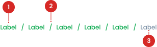
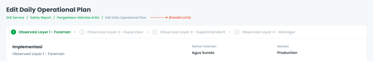
Separator is used to separate each level in the breadcrumb.
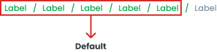
Indicates which page it is currently on and cannot be clicked on.
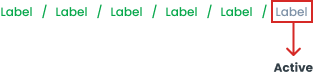
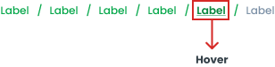
States
Active State
In the breadcrumb, the Active State cannot be clicked because it indicates that the user is currently on that page
Hover State
When the cursor hovers over a breadcrumb, its state is activated to create an animation effect. This effect includes increasing the color value by one step, such as from 500 to 600 in the color style, and adding an underline to the text.
Default State
The default breadcrumb has a Primary500 color, indicating that it is clickable and navigates to a specific page.

Usage


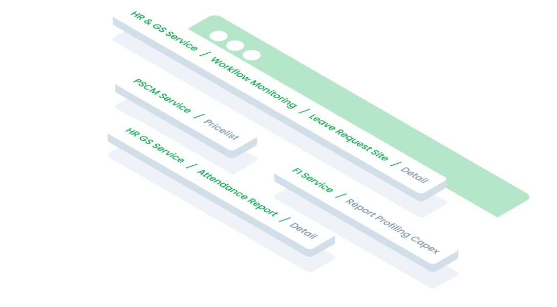
The following are some common uses for the breadcrumbs component in web and application design:
  • Display a hierarchy of pages with a structure of more than two levels.
  • Facilitate navigation back to the previous page or to a higher hierarchy level.
  • Improve user experience especially in applications or websites with complex structures.

Placement of breadcrumbs at the top of the page helps improve navigability and overall user experience.

Accessibility

Hover Effects

Provide clear visual feedback when users use the pointer or keyboard on the breadcrumb.

Content

Each link in the breadcrumb above should point to a unique page. Users should be able to click on each breadcrumb section to go directly to the corresponding page, such as the Home page, Product Category page, and so on. Because the "Culture" page does not have a separate page so it does not need to be written in breadcrumbs

Do's
Don't

Separators in breadcrumbs are used to distinguish between each page.

Do's
Don't

Writing labels on breadcrumbs must be short and clear and in accordance with the intended page.

Do's
Don't
Web
Resources You can use these components by accessing the provided resource files.

Usage

The package is already installed in the repository's shell. To use the component, you only need to add the following code:

<BBreadcrumb :items="items" />

Attributes

If there is a question mark ? in the Data Type, it means that the properties are optional.

PropertiesData TypeDescription
itemsItem[]label for button label

Item

The <BBreadcrumb /> items must be defined using the following structure. If there is a question mark ? in the Data Type, it means that the properties are optional:

PropertyData TypeDescriptionDefault Value
labelstringBreadcrumb labelnone
routestringBreadcrumb hyperlinknone
disabled?booleanDisable the breadcrumb item iffalse
arrow_back
Previous Bottom Sheet
Next Button
arrow_forward