 Design
 Vue
Vue Flutter
Anatomy


Number label explains the total number of tasks that can be worked on and completed by the user.
- A hint component is a UI element designed to provide helpful, brief guidance or suggestions to users, usually to improve usability or assist with interactions.
Variant on Type
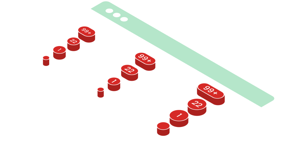
Hint components come in different variants to convey notification counts effectively: the dot variant is used to indicate new content or actions without specifying a number, often represented as a small circle. The 1 digit variant displays a single number (e.g., "1") to show a small count of items or notifications. The 2 digits variant is used for counts up to 99 (e.g., "12"), providing more detail without overwhelming the user. For counts exceeding 99, the 99+ variant simplifies the display to "99+" to indicate a large number of items or notifications, maintaining a clean and clear interface.


Variant on Size
In the breadcrumb, the Active State cannot be clicked because it indicates that the user is currently on that page


| VARIANT | USAGE RECOMMENDATION |
|---|---|
Small (16px) |
|
Large (24px) |
|
Usage
Usage Recommendation:
- Use hints to show the number of tasks left (e.g., "3 tasks remaining") or to offer guidance on what needs to be done next.
- Display hints in a small size (16px) for subtle reminders or in large size (24px) for more prominent, critical task information.
- Place hints near task-related elements to keep them relevant and contextually helpful.
- Ensure hints are brief and clear, providing actionable insights without overwhelming the user.
- Use dynamic updates to reflect real-time progress as tasks are completed or new tasks are added.
Accessibility
For accessibility, hint components should have good contrast for visibility and use simple, clear text for easy understanding. They must be keyboard accessible and work with screen readers for users with visual impairments. Hints should be non-intrusive, allowing users to dismiss them, and should appear at the right moment without disrupting the user’s experience.


Content
Hint components should provide clear, concise, and helpful information to guide users. Use simple language to explain what needs to be done next, like "3 tasks remaining." Keep the tone friendly and supportive, and make sure hints only appear when they’re relevant to the user's task.
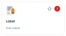
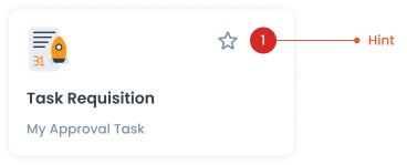
Example to use - Card
The Hint component integrated into a Card enhances the card's usability by providing contextual information or guidance related to specific content or actions within the card.
Example to use - Notification
Hint in notifications to enhance user comprehension of notification content, guide users on appropriate responses or actions, and improve the overall usability and effectiveness of notifications

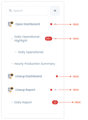
Example to use - Sidemenu
Hints in the side menu function as visual indicators to inform users that there are actions that need to be performed or items that need attention. By using hints in the side menu, users can easily identify tasks or notifications that require their attention without having to open each menu manually.
Example to use - Tab
Hints within tabs function as notifications prompting users to review important information or updates related to specific tabs. These hints serve as alerts, indicating that there is additional context or actions users should be aware of within a particular tab.

Example to use - Segmented Switch
In segmented switches, hints serve to explain the purpose and functionality of each segment, making it easier for users to understand the options available to them.

Guidelines use Hint
Hint has function as a notification that there is an action that needs to be performed in that function. Or to find out how many to-do lists are currently outstanding, so that the user can immediately find out the number of to-do lists that must be completed. The hint on the menu is just a red dot, while the hint on the sub menu has a number for the number of actions that must be performed.
Usage
The package is already installed in the repository's shell. To use the component, you only need to add the following code:
<BHint />
Attributes
If there is a question mark ? in the Data Type, it means that the properties are optional.
| Properties | Data Type | Description | Default Value |
|---|---|---|---|
| small | boolean | Determines the button's solid or dash border | false |
| number | number | variant used for change chips color | none |
- You can use these components by accessing the provided resource files.
- Preview animations are examples and may not suit Mobile Widgets. Press 'View Code' to access the Widgetbook Playground and see the Flutter widget displaying all created components and interactive.
Usage
Import this line to your file:
import 'package:buma_design_system/buma_design_system.dart';
Attributes
If there is a question mark ? in the Data Type.
| Properties | Data Type | Description | Default Value |
|---|---|---|---|
| value | T | Displays number in the center of hint and automatically convert to string text | null |
Previews & Code
You can call the components with Class.namedConstructor() with different variants
Hint
UIHint<int>(
  value: 1,
)