 Design
 Vue
Vue Flutter
Anatomy
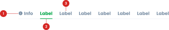
Provides a visualization of the active status of the current tab.
Display descriptive text for each tab.
Variant on State
Tab Default

Tab Active

Tab Error

Tab Disable

Tab Hover

Tab with Icon
- Circle as an instance of the swap component
- Select icons from Material Design Icons for consistency and ease of recognition.
- The icon alone can be confusing; add text for clarification. Use icons without text only if they are common, for example a cross (X) to close.
Usage
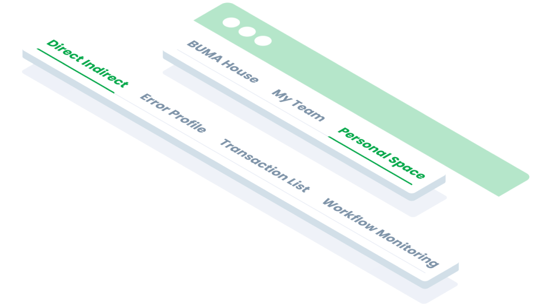
Tabs are components used to organise content into sections that are easily accessible without the need to switch pages. Use tabs in the following situations:
- Use tabs to group related information into different categories, helping to reduce cognitive load.
- Tabs can be used to organize content such as forms, settings, and dashboards so a user does not have to navigate away from their workflow to complete their task.
- When screen space is limited and content needs to be organised in sections that can be hidden.
When Not to Use Tabs?
- Don't use tabs if all the content can be displayed directly without causing confusion.
- If there are too many tabs, consider other navigation methods such as dropdowns or sidebars to avoid visual overload.
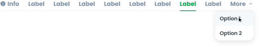
Overflow Tab
Mobile Behavior
- When the number of tabs exceeds the screen width on mobile devices, tabs should be horizontally scrollable using gesture scrolling. Users can swipe left or right to access hidden tabs.
- Ensure that the size and readability of tabs and their text are maintained by using responsive units such as em or rem and media queries.
Desktop Behavior
- If the number of tabs exceeds the screen width on desktop devices, hidden tabs should be collected under a 'More' dropdown. Clicking on this dropdown will display the list of additional tabs.
- Apply a hover effect to the 'More' dropdown to indicate it is clickable.
Hover and click tab ‘More’


Accessibility
Tabs should be designed for inclusivity so that they can be used by all users, including those with physical or cognitive limitations.
- Ensure tabs have a clear focus style (e.g. border or highlight) to support keyboard users.
- Ensure that tab text, active indicators, and other elements have a minimum contrast ratio of 4.5:1 against the background.
- Provide visual feedback such as hover states or colour changes to indicate which elements are being interacted with.
- Ensure tabs work well on mobile devices with swipe gesture support as an alternative navigation.
Content
The content inside the tab should be informative, concise, and easy to understand.
- Should be brief, usually 1-2 words, to provide a clear description of the content represented. Example: ‘Info’, “Settings”, “Reports”.
- Arrange the tabs in a logical order based on the frequency or relevance of the content. The most frequently used tabs are usually placed in the first position.
- Ensure that each tab only contains information that is relevant to its label. Avoid hiding too much important information within tabs.
- If any tab is empty or contains dynamic data, provide fallback content such as ‘No data’ or ‘Select option to view content’.
Usage
The package is already installed in the repository's shell. To use the component, you only need to add the following code:
<BTab :items="ItemTypes" />
Attributes
If there is a question mark ? in the Data Type, it means that the properties are optional.
| Name | Data Type | Description | Default Value |
|---|---|---|---|
| items | ItemTypes[] | Array of tab items. | none |
| vertical | boolean | Enables vertical tabs | False |
| switch | boolean | Changes tabs to switch type. | False |
| small | boolean | Sets the tab to small size. | false |
| itemFullBlock | boolean | tab item occupies the full block space. | False |
| itemClass | string | Custom class to style the item | none |
| linkClass | string | Custom class to style the link | none |
| id | string | ID for the tab. | none |
| icon | string | Icon for the tab. | none |
| hint | number | Hint number displayed on the tab. | none |
| dropdownOption | DropdownOption[] | Dropdown options for the tab. | none |
ItemTypes
The <BTab /> items must be defined using the following structure. If there is a question mark ? in the Data Type, it means that the properties are optional:
| Variant | Data Type | Description | Default Value |
|---|---|---|---|
| id | string | Unique identifier for the tab. | none |
| text | string | Text displayed on the tab. | none |
| icon? | string | Icon for the tab | none |
| hint? | number | Hint number displayed | none |
| disabled? | boolean | Disables the tab if set to | false |
- You can use these components by accessing the provided resource files.
- Preview animations are examples and may not suit Mobile Widgets. Press 'View Code' to access the Widgetbook Playground and see the Flutter widget displaying all created components and interactive.
Usage
Import this line to your file:
import 'package:buma_design_system/buma_design_system.dart';
Attributes
If there is a question mark ? in the Data Type.
| Properties | Data Type | Description |
|---|---|---|
| controller | TabController? | The controller for handle tabbar |
| tabs | List<UITabBarItem> | The collection items of UITabBarItem |
| onTap | ValueChanged<int>? | Signature for callbacks that report that an underlying value, when user pressed item |
UITabBar
A custom navigation tab bar. This navigation allows users to switch between different section or views. It displays tab header at the top, indicating the active tab and showing corresponding content below