 Design
 Vue
Vue Flutter
Anatomy
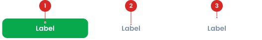
The text inside each segment that describes the option.
The outer structure that holds all segments together.
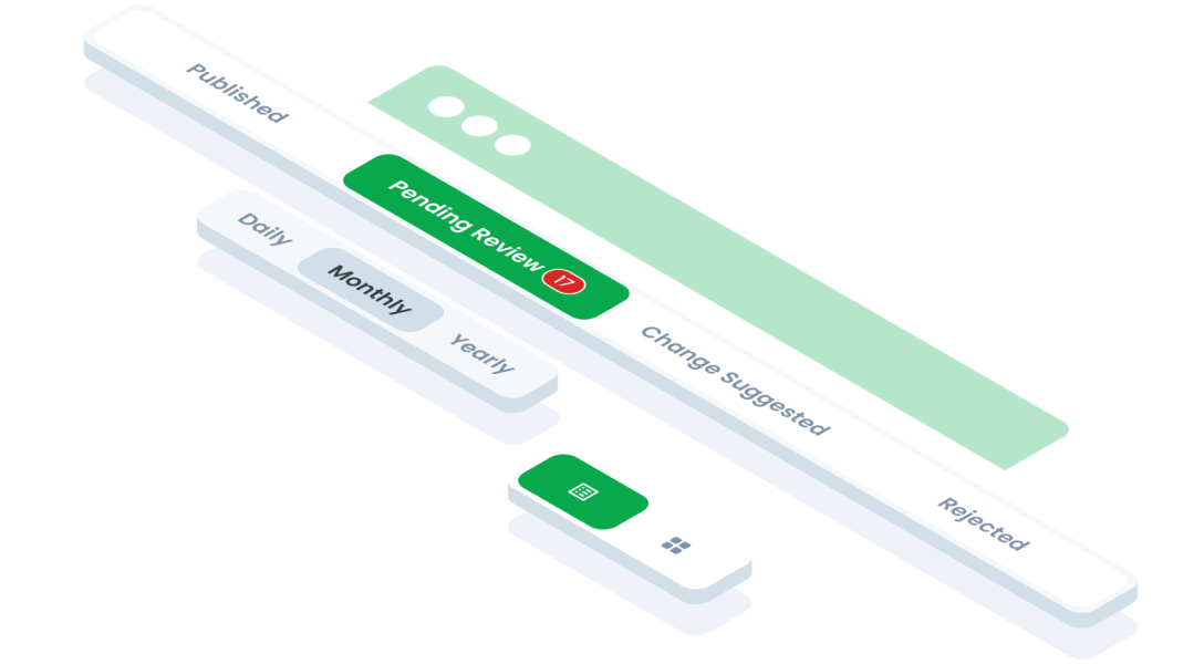
Segmented Switch Type


Segmented Switch Type
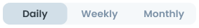
Large (Default)
Suitable for more prominent designs or larger spaces.

Small
Suitable for compact designs or limited space.

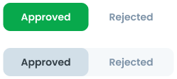
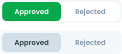
Segmented Switch State


Segmented Switch Variant
Text Only
Use this variant when you want to display only text without any icons. It is best for cases where you want the options to be purely text-based, offering a clean and minimalistic approach. This variant is ideal for simple choices where an icon might not add meaningful context.

Left Icon
Use this variant when you want to add an icon to the left of the text. This is helpful when the icon helps to clarify or represent the option’s purpose. It’s useful for indicating the type of action or content the user is selecting.

Right Icon
The icon in this variant can be replaced with other elements, such as a hint. A hint typically refers to a numerical indicator, like showing the number of outstanding tasks or notifications. This element provides additional context, such as the number of pending actions that the user should be aware of, making the interaction more informative.

You can use hint on segmented switch. Use hints to show the number of tasks left (e.g., "3 tasks remaining").

Icon Only
Use this variant when you only need to display an icon without any text. It’s ideal for situations where the icon alone is clear enough to communicate the action or option. This variant is used when space is limited or when the icon is intuitive enough to stand alone.

Since the icon is the only visual element, it is recommended to use a tooltip for accessibility. A tooltip will provide a text explanation of what the button does when the user hovers over it, ensuring clarity for users who might not immediately recognize the icon.
Invert Color Usage
The segmented switch has an invert color variant to ensure visibility based on the background:
- Invert Color On: Use when the background is white. The segmented switch will use a light background for active states and a white background for inactive states.
- Invert Color Off: Use when the background is light. The segmented switch will use a white background for active states and a light background for inactive states.
Select the appropriate variant based on the background to maintain contrast and usability.
Usage
Usage Recommendation:
- Use the segmented switch when users need to toggle between mutually exclusive options within a small dataset (e.g., switching between tabs like "Monthly" and "Yearly").
- When you need to display distinct views for varying content within the same context.
- During a user journey (e.g., filling out a form or adjusting settings), utilize segmented switch to structure related content and keep the user within the main page.
Examples of Appropriate Use:
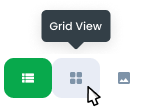
- Switching between views (e.g., "List" vs. "Grid").
- Filter options (e.g., "All", "Completed", "Pending").
Accessibility
If the number of options exceeds the available space or the labels are too long to fit in a single row, truncate text to ensure proper alignment. The segmented switch is not designed to accommodate scrolling.


Content
- Keep labels short, ideally one to three words.
- Use sentence case for text labels (e.g., "Need Approval" instead of "NEED APPROVAL").
- Ensure labels are distinct and unambiguous. Don’t make unclear label.
- Use consistent label styles within the same switch.


Usage
The package is already installed in the repository's shell. To use the component, you only need to add the following code:
<BTab :items="ItemTypes" switch/>
Attributes
If there is a question mark ? in the Data Type, it means that the properties are optional.
| Name | Data Type | Description | Default Value |
|---|---|---|---|
| items | ItemTypes[] | Array of tab items. | none |
| vertical | boolean | Enables vertical tabs | False |
| switch | boolean | Changes tabs to switch type. | False |
| small | boolean | Sets the tab to small size. | false |
| itemFullBlock | boolean | tab item occupies the full block space. | False |
| itemClass | string | Custom class to style the item | none |
| linkClass | string | Custom class to style the link | none |
| id | string | ID for the tab. | none |
| icon | string | Icon for the tab. | none |
| hint | number | Hint number displayed on the tab. | none |
| dropdownOption | DropdownOption[] | Dropdown options for the tab. | none |
ItemTypes
The <BTab /> items must be defined using the following structure. If there is a question mark ? in the Data Type, it means that the properties are optional:
| Variant | Data Type | Description | Default Value |
|---|---|---|---|
| id | string | Unique identifier for the tab. | none |
| text | string | Text displayed on the tab. | none |
| icon? | string | Icon for the tab | none |
| hint? | number | Hint number displayed | none |
| disabled? | boolean | Disables the tab if set to | false |
- You can use these components by accessing the provided resource files.
- Preview animations are examples and may not suit Mobile Widgets. Press 'View Code' to access the Widgetbook Playground and see the Flutter widget displaying all created components and interactive.
Usage
Import this line to your file:
import 'package:buma_design_system/buma_design_system.dart';
Attributes
If there is a question mark ? in the Data Type, this widget has 2 variants: primary & secondary
| Properties | Data Type | Description |
|---|---|---|
| items | List<UISegmentedSwitchItem> | A collections item of UISegmentedSwitchItem |
| initialIndex | int | A current position for first initialization |
| variant | UISegmentedSwitchVariant | A variant to make different segmented switch |
| size | UISegmentedSwitchSize | A type to create padding content spacing |
| onTap | ValueChanged<int> | Signature for callbacks that report that an underlying value, when user pressed item |