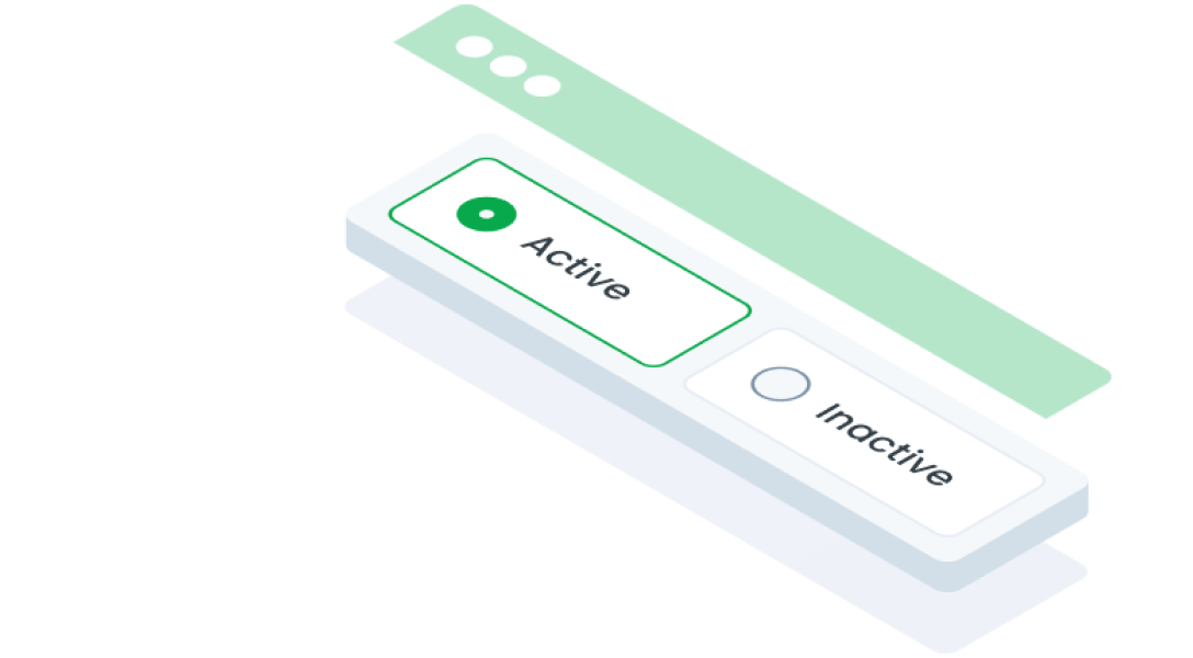
ComponentsRadio ButtonA radio button is a user interface element that lets users select one option from a group of mutually exclusive choices. Only one radio button can be selected at a time within the same group.
Guidelines
Web
Resources You can use these components by accessing the provided resource files.
Usage
The package is already installed in the repository's shell. To use the component, you only need to add the following code:
<BRadio />
Attributes
If there is a question mark ? in the Data Type, it means that the properties are optional.
| Properties | Data Type | Description | Default Value |
|---|---|---|---|
| id | string? | Identifier for the radio button | uuid() |
| modelValue | string | The value of the selected radio button | none |
| label | string? | Label text | none |
| validationText | string? | Validation text | none |
| required | boolean | Marks the field as required | false |
| error | boolean | Indicates an error state | false |
| disabled | boolean | Disables the radio button | false |
| options | OptionTypes[] | List of available options | none |
| block | boolean | Makes the radio button take full width | false |
| itemPerRows | string | Custom class for the wrapper element | none |
| wrapperClass | string | variant used for change chips color | none |
| labelClass | string | Custom class for the label element | none |
| filled | boolean | Style variation for filled buttons | false |
Option Types
The <BRadio /> component supports more than one option. Use an array that contains:
| Properties | Data Type | Description |
|---|---|---|
| label | string | Label for the option |
| value | string | Value for the option |
| class | string | class for modify wrapper |
Mobile
Resources
- You can use these components by accessing the provided resource files.
- Preview animations are examples and may not suit Mobile Widgets. Press 'View Code' to access the Widgetbook Playground and see the Flutter widget displaying all created components and interactive.
Usage
Import this line to your file:
import 'package:buma_design_system/buma_design_system.dart';
Attributes
If there is a question mark ? in the Data Type, it means that the properties are optional.
| Properties | Data Type | Description |
|---|---|---|
| value | T? | Displays value of actions. |
| label | String? | Displays additional label right of different action widget. |
| isFilled | bool | Make action has container, background and bordered. |
| isError | bool | When user interface indicates that something has gone wrong or that user input is incorrect or invalid |
| groupValue | T? | The currently selected value for a group of [UIActionType.radio]. |
| onChanged | ValueChanged<T?>? | Callback when action has changed. |
Previews & Code
You can call the components with Class.namedConstructor() with different variants.
Radio
This radio button variant introduces a hierarchical structure. The custom functionality allows a parent radio button to update dynamically based on the selection of its child options, ensuring a seamless interaction and clear indication of the selected state within grouped options.