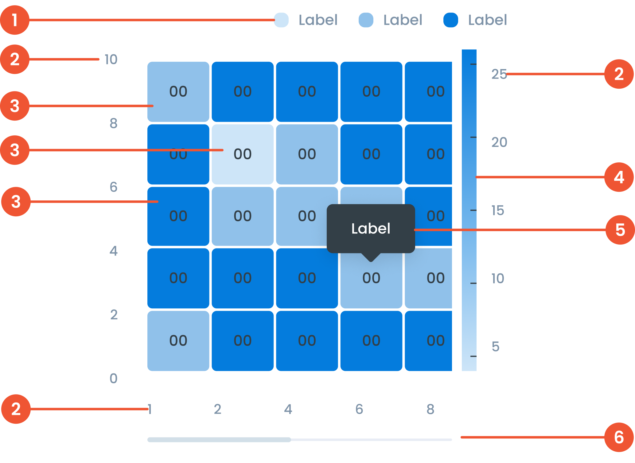
Buma UI - DocumentationBuma UI - Documentation
Get Started
Foundations
Components
Resources
Patterns
Data Visualization
Back to BSpace
Get Started
Foundations
Components
Resources
Patterns
Data Visualization
  • stacksFoundations
    • 💡 Overview
    • Color
    • Principle
    • Typography
  • brickComponents
    • 💡 Overview
    • Accordion
    • Alert
    • Avatar
    • Badge
    • Bottom Sheet
    • Bread Crumb
    • Button
    • Button Link
    • Button Navigation
    • Calendar
    • Card
    • Chat
    • Checkbox
    • Chips
    • Choice Tile
    • Comment
    • Date Picker
    • Divider
    • Download
    • Drawer
    • Dropdown
    • Empty State
    • Floating Button
    • Form Input
    • Header
    • Hint
    • Icon
    • List Choice
    • Loading
    • Modal
    • Navigation Bar
    • Notification
    • Pagination
    • Progress Bar
    • Radio Button
    • Search
    • Scrolling Bar
    • Segmented Switch
    • Side Menu
    • Side Tab
    • Slider
    • Switch
    • Tab
    • Table
    • Text Area
    • Text Input
    • Time Picker
    • Title
    • Toast
    • Tooltip
    • Wizzard
  • splitscreenPattern
    • 💡 Overview
    • Filter
      upcoming
    • Form
      upcoming
    • Notification
    • PWA
      upcoming
    • table
      upcoming
    • Upload Download
      upcoming
  • insert_chartData Visualization
    • 💡 Overview
    • Tiering
    • Pattern
    • Chart and Graph
      • Chart Selection Guide
      • Map Selector
      • Donut Chart
      • Donut Progress Bar Chart
      • Spider Chart
      • Line Chart
      • Chart Area
      • Speedometer
      • Heat Map
      • Scatter Plot
      • Pie Chart
      • Bar Chart
      • Waterfall Chart
      • Sunburst Chart
      • Tree Decomposition Chart
      • Scorecards
      • Table
      • Micro Visualization
    • Typography
    • Color Palette
  • data_objectTokens
    upcoming
  • inventory_2Resources
    • 💡 Overview
    • Mobile
      new
      • 💡 Introduction
      • Installation
      • General
        • Important Rules
        • Naming Convention
        • Clean Architecture
    • Web
      upcoming

Heat Map

Anatomy

Text on a chart refers to any written information or labels included in a chart to provide context, describe data, or improve the readability and understanding of the visualization.
 label in a heatmap refers to the text that identifies rows, columns, or specific data points. Labels provide context and help users understand what each axis or cell represents.
 The data item refers to the actual value or metric represented by each cell in the heatmap. The intensity of the color in each cell corresponds to the magnitude of the data item
 The level in a heatmap refers to the range or category of values represented by specific color intensities. Levels are often defined by thresholds or gradients to show data distribution.
 A small box that pops up when you hover over a data point, showing more details about it.
 A bar that lets you move around the chart when there’s too much data to fit on the screen.
Guidelines for Heat Map
    • Number of Digits: Use a maximum of 3 digits for ease of reading.
    • Decimal Points: limit to 2 decimal places for clarity. Example, use '12.34' instead of '12.3456'.
    • Diverging Colors: According to the diverging color palette, Heat Map diagrams can use these colors to represent conditional data.z
    • Sequential: In addition to a diverging color palette, you can also use a sequential color palette from green to red.
  • Add a legend to explain the color gradation and corresponding value.
Example of Source Data

When to Use a Heat Map?
  • Displays data density and variation.​
  • Identifies patterns and correlations.​
  • Suitable for large data sets where specific values ​​are less important than the overall value.​
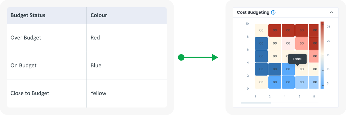
  • Use color coding to visualize value status: red for over budget , green for on budget, yellow for threshold border.​
arrow_back
Previous Speedometer
Next Scatter Plot
arrow_forward