 Design
 Vue
Vue Flutter
Anatomy
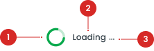
indicates that content is being loaded, often used when specific text elements are temporarily unavailable.
visually indicate a process in progress using a sequence of animated dots.

- Explain what the user is waiting for. The explanation is a Body Formatting/Body, so do not show another Body Formatting/Body with the loading spinner.
Usage
The Loading Component serves as a critical visual cue to inform users that a process is actively running in the background. It prevents users from perceiving the application as unresponsive, especially during periods of delay. By providing real-time feedback, it reassures users that their action—such as fetching data, processing a request, or saving changes—is being handled. This enhances the user experience by maintaining clarity and reducing frustration during interactions that require waiting for system responses. Usage Recommendation:
- Use indeterminate loaders for processes where the duration is unknown (e.g., fetching data from a server).
- Use determinate loaders when progress can be quantified (e.g., file uploads).
- Avoid overusing loading indicators; use only when there is a delay longer than 500ms.
- Pair the loading indicator with contextual feedback (e.g., "Loading your dashboard...").
- Ensure loaders fit naturally within the UI hierarchy (e.g., not overly prominent or distracting).
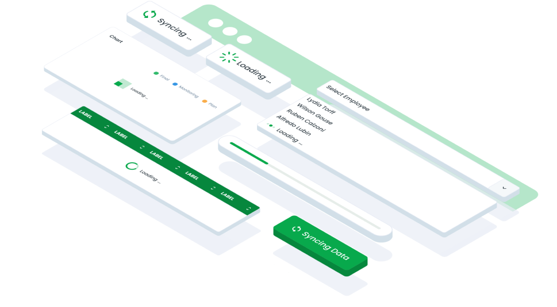
Type of Loading
Data Load
Implement the Loading Data indicator to signify the retrieval or loading of data from a remote source, such as a server or database.Sync
Used to denote synchronization processes between local and remote data sources, ensuring consistency and accuracy.Refresh Mobile
Used to prompt users to refresh or update content on mobile devices, ensuring the latest information is displayed.Table, Process and Page Loading
Used to tables, pages, or processes to inform users about loading activities related to specific elements or interactions within the interface.Chart
Used to denote the loading of data or rendering of charts and graphs within data visualization components.Skeleton
Used to provide a temporary placeholder or outline representation of content while it is being loaded, enhancing perceived performance and user experience.Accessibility
When a change occurs in the UI, such as entering a loading state, it’s important to notify users about what is happening. While a spinner visually indicates that a process is occurring, it may not be sufficient for all users. To ensure accessibility, the loading component should include clear and visible text, such as "Loading" or "Please Wait" to provide context. This helps users understand that the application is actively processing their request and that they should wait for the process to complete. Additionally, the contrast ratio of the spinner and any accompanying text should adhere to WCAG standards to ensure visibility against the background, making it easy to perceive for users with low vision. By combining clear visual feedback, text, and appropriate adjustments for motion sensitivity, the loading component can effectively communicate its purpose to a diverse range of users.
Content
The content in a loading component plays a vital role in ensuring that users understand what is happening during a delay. Clear, concise, and context-specific messaging helps set user expectations and reduces confusion. Here’s how to structure content effectively:
Clarity and Simplicity
Use short and direct language to describe what is being processed. Avoid using overly technical or vague terms like "Processing" or "Working" unless they are contextually relevant. Specificity reassures users and prevents frustration. Examples include: - “Loading your dashboard…” - “Fetching data…” - “Saving your changes…”Contextual Relevance
Tailor the loading message to the action or task. Avoid generic messages like “Please wait” without further context unless the process is universally understood. For example:
- If a user is uploading a file, use: “Uploading your file…”
- For loading a report: “Generating your report…”
Tone and Language
Match the tone to the application's overall voice and branding. Use positive and reassuring language to create a smooth user experience. Avoid phrases that imply uncertainty, like “This might take a while…”. For example:
- “Please wait while we process your request.”
Optional Text for Visual Spinners
While a visual spinner can be sufficient for simple loading states, adding optional text helps improve clarity, especially for longer delays. For example:
- Spinner alone: Use this for processes under 2 seconds.
- Spinner with text: Include descriptive text for processes that take longer than 2–3 seconds to reassure users.
Fallback Content
In scenarios where a loading state might fail (e.g., due to a timeout or error), prepare fallback messages. This ensures users are guided even in cases of unexpected delays. Examples include:
- “Still loading? Please check your internet connection.”
- “This is taking longer than expected. Please refresh the page.”
Dynamic Updates
For determinate loaders (like progress bars), update content dynamically to reflect the loading progress. Dynamic updates improve engagement and keep users informed about the status of the task. For example:
- “Uploading file: 25% complete…”
- “Loading report: Step 2 of 3…”
Usage of BLoading
The package is already installed in the repository's shell. To use the component, you only need to add the following code:
<BLoading />
Attributes of BLoading
If there is a question mark ? in the Data Type, it means that the properties are optional.
| Properties | Data Type | Description | Default Value |
|---|---|---|---|
| variant | String | BLoading variant Explain what the user is waiting for. | data |
| label | boolean | BLoading with label | true |
Variant of BLoading
The <BLoading /> component supports the following variants:
| Size | Description |
|---|---|
| data | Implement the Loading Data indicator to signify the retrieval or loading of data from a remote source, such as a server or database. |
| sync | Used to denote synchronization processes between local and remote data sources, ensuring consistency and accuracy. |
| refresh | Used to prompt users to refresh or update content on mobile devices, ensuring the latest information is displayed. |
| process | Used to tables, pages, or processes to inform users about loading activities related to specific elements or interactions within the interface. |
| chart | Used to denote the loading of data or rendering of charts and graphs within data visualization components. |
Usage of BSkeleton
The package is already installed in the repository's shell. To use the component, you only need to add the following code:
<BSkeleton />
Attributes of BSkeleton
If there is a question mark ? in the Data Type, it means that the properties are optional.
| Properties | Data Type | Description | Default Value |
|---|---|---|---|
| height | string | Define skeleton height in px. | 100 |
| width | string | Define skeleton width in % | 100 |
Usage of BLoadingBar
The package is already installed in the repository's shell. To use the component, you only need to add the following code:
<BLoadingBar />
Attributes of BLoadingBar
If there is a question mark ? in the Data Type, it means that the properties are optional.
| Properties | Data Type | Description | Default Value |
|---|---|---|---|
| width | string | Define skeleton width in % | 100 |
BLoading
BSkeleton
BLoadingBar
- You can use these components by accessing the provided resource files.
- Preview animations are examples and may not suit Mobile Widgets. Press 'View Code' to access the Widgetbook Playground and see the Flutter widget displaying all created components and interactive.
Usage
Import this line to your file:
import 'package:buma_design_system/buma_design_system.dart';
Attributes of all variants
If there is a question mark ? in the Data Type, it means that the properties are optional, this is namedConstructor from UILoading
UILoading
You can call all variants on UILoading such as: data, sync, refresh, process, chart, and progressbar, with same properties.
| Properties | Data Type | Description | Default Value |
|---|---|---|---|
| label | String? | A text of loading content | null |
| variant | UILoadingVariant | A variant for displays different properties loading | UILoadingVariant.primary |
UILoadingSkeleton
A custom loading skeleton from Shimmer, This widget is an integral part of UILoading, skeleton effect have complex definition and have dynamic content to displays skeleton and [child] to show the content.
| Properties | Data Type | Description | Default Value |
|---|---|---|---|
| isLoading | bool | A loading handler to show skeleton | false |
| child | Widget? | Displays a widget when isLoading is false | required |
Previews & Code
You can call the components with Class.namedConstructor() with different variants
UILoading.data
Implement the Loading Data indicator to signify the retrieval or loading of data from a remote source, such as a server or database.UILoading.data(
label: 'Loading...'
)
UILoading.sync
Used to denote synchronization processes between local and remote data sources, ensuring consistency and accuracy.UILoading.sync(
label: 'Loading...'
)
UILoading.refresh
Used to prompt users to refresh or update content on mobile devices, ensuring the latest information is displayed.UILoading.refresh(
label: 'Loading...'
)
UILoading.process
Used to tables, pages, or processes to inform users about loading activities related to specific elements or interactions within the interface.UILoading.process(
label: 'Loading...'
)
UILoading.chart
Used to denote the loading of data or rendering of charts and graphs within data visualization components.UILoading.chart(
label: 'Loading...'
)
UILoadingSkeleton
Used to provide a temporary placeholder or outline representation of content while it is being loaded, enhancing perceived performance and user experience.UILoadingSkeleton(
isLoading: true,
child: YourWidget(),
)